 Adobe Community
- Home
- Premiere Pro (Beta)
- Discussions
- Re: DISCUSS: New export workflow
- Re: DISCUSS: New export workflow
DISCUSS: New export workflow
Copy link to clipboard
Copied
The new export workflow streamlines the process of delivering completed videos by focusing on the destinations of the content. Optimized render settings for popular social platforms like YouTube, Facebook and Twitter are presented. Advanced settings are easily accessed for customizing exports.
This isn’t the end of the road for this redesign, though – not by a long shot. We are still working on the exact layout of the settings accordions and finding the exact right place for everything. And the most exciting part . . . background rendering! Yes, that’s right, no more waiting for encoding progress bars to grow. Check back often for updates.
More detailed info on the workflows: New import & export in Premiere Pro (Beta)
FAQ: FAQ | New import and export in Premiere Pro (Beta)
We want to know what you think about the new Export workflow. Please join the conversation below.
Copy link to clipboard
Copied
Yes, this is unfortunately still a known issue and tracked as a bug
Copy link to clipboard
Copied
Thanks for commenting, Ward.
Neil
Copy link to clipboard
Copied
This new export panel is driving me up the wall.
Copy link to clipboard
Copied
Ann,
Would love to see which parts are still bugging the Hades out of you.
The whole discernment of the team on the part of "this" being an export, but "that" is simply outputting data ... and not an "export" ... is simply nuts.
I've tried to be calm about it but the sheer "engineerality" of the reasoning is insane. We export digital data, no matter whether that's mov, AAF/EDL/XML, ProRes, or subtitles. Separting them is clearly an artificial distinction satisfactory to engineers but totally useless to users.
Parts of the new format are ok ... but some of the details really, truely are horrid.
Neil
Copy link to clipboard
Copied
Here's my take, please consider:
I'm generally not in favour of the new "Modes" as a replacement for the popout window.
I do appreciate the Work that has already been done on the Beta, but I feel this is not ready to release.
If this is released, I fear it's going nowhere fast with the professionals.
I think most long time users would not need it nor ask for this change in the workflow (Modes).
For beginners, it's a possible tourney though.
I do like the import as an optional feature though, but NOT the Export.
Heres Why:
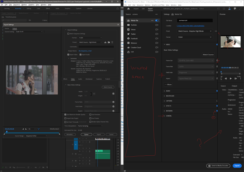
The EXPORT MODE is a messy waste of space in Beta v22.4.0.3 and not very efficient for regular changes in report settings.
- Program Window MUST(!) be extremely wide to actually see anything. Panels can NOT be scaled individually below a certain width, which is a pain. I can imagine a lot of frustration down the road with this. (See Attached Screenshot)
- Too many tedious dropdown menus now. I need A LOT more clicks than before to set and check my options.
- Source and Output overview info takes up a lot of space now and is no longer located next to settings where it would be expected to compare parameters? This does not make sense to me.
- Can't see my Timeline/Project Window in the background anymore, since exporting is no longer a popover. Sometimes I like to double-check on something last minute before export like prerendering status, mute/visibility switches...
- As others pointed out already: Text is blurry and too large or too small.
- Dropdown must all be opened individually and close on auto. Please don't make them solo open, we do have a mouse wheel.
- Entering a custom resolution takes a checkbox, dropdown click and "custom" click now... as before it was just one drag, klick on a number!
- At a locked aspect ratio, resolution can sometimes no longer be set by height, only by with, as it was before possible!
- Custom croping with a bounding box style in source view is no longer available. Heck, even source view in generals is gone! I used this quite often. Especially when exporting assets for AE.
- General Settings like "Use Preview" and "Use Proxies" should always be visible instead of hiding in a dropdown!
- Markers from Timeline do not show up on export preview, which is expected with this overhauled Exporttime line.
- Captions do not show up in the preview, or, sometimes, seems bugged.
The Problem
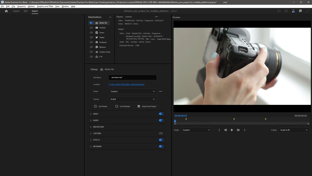
A Solution
- My first take to improve all this would be to change the layout from 3 to 2 rows in Export mode, moving the content from the left media destinations above or below the Settings/Preview window. (Similar to old layout)
- As you can see: Space is more efficiently used, even some space left for other features:
- A layout in 3 columns can also be efficient, as u can see in the 2nd layout:
Why do I take this so seriously?
I a (Motion) Designer and Editor for over 10 Years and also work in UX/UI design on Adobe projects.
I do love the Software and want to contribute to make it a better experience for all users!
Copy link to clipboard
Copied
It's getting there but plenty room for improvement.
General:
Different export settings and custom added ones seem to be tied to a specific sequences instead of the entire project. If it would be project wide you can have a templated project file with your projects or company's presets already in place and ready to go for any sequence.
Design:
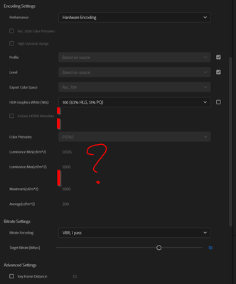
The vertical spacing in the export settings is just redicolous. Can't it just have the same spacing as the Source/Output info panel? It looks like you have it pre-emtivly set to double height too for small screens to prevent side scrolling but it remains this big when you do give it enough width. H.264 video settings is almost double screenheight when all it's settings can easily fit 1. Overal the spacing is also very unbalanced and inconsistent.
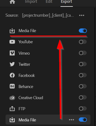
The Media File icon is now a Download icon. You can argue that it's a save to disk icon but the FTP one is an upload icon so it becomes assumed download. A more clear file/disk icon would make more sense imo.
Multi Source Export:
For exporting multiple sources, a preview of the first selected sequence/file can be nice with a dropdown menu to view others in the selection instead of no preview at all.
Source/Output info panel:
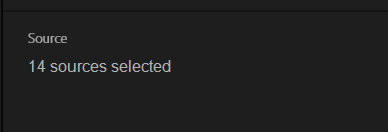
The Source / Output panel under preview changes it's label from 'Source' to '[amount] Sources'. This is weird to me because it's a title/label. Why not leave it as 'Source' and put text under it stating '[amount] sources selected.' as the actual information.
Destinations panel:
Needs better organization.
The header above destinations says 'Source: [sourcename]'. This doesn't make any sense. Why not move this to the top of the preview window? The available space to see the full title of your selected sequence is redicolously short anyway now and you wouldn't want to widen that panel just for seeing the title.
For context this is our sequence naming convention: [projectnumber]_[client]_[campaign-name]_[asset type]_[assetname]_[length]_[ratio]_[language/subs/misc info]_[version] and we already lose the visibility after client.
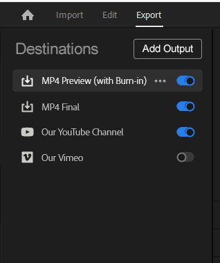
The current Source text above the destinations can be replaceced with 'Destinations' title.
Instead of the dots menu (with just 1 entry), a plus icon or button labeled 'Add' or 'Add Output' makes more sense. Outputs should also be categorized. If you add a file output, the main file output sits at the top but the other at the bottom? For users only ever using file outputs this is not very clean. Always keeping similar types together is better.
The ability to customize which types of outputs you see there is even better so you don't have to see direct uploads for companies that never work this way. They could have a template .pproj with only their inhouse presets set there. Very clean. In the Plus/AddOutput icon you would get a dropdown menu instead giving you the file output option but also the other upload types. Below's mockup is what a custom company setup could look like.
Copy link to clipboard
Copied
There is also no indication in the Preview window of the General (import into project etc.)
Always have to twirl down so see how they are set.
Copy link to clipboard
Copied
Same goes for max render and max depth.
No easy way to turn them on or off without having to click twice first.
Copy link to clipboard
Copied
So here we are almost 2 years later and not a single layout update or UI change to the new export window, despite the massive amount of feedback offered. Is there going to be ANY improvements made at all ? We keep getting told the feedback is being taken on board and things are happening ... but it's 2 years without a change.


