Hello,
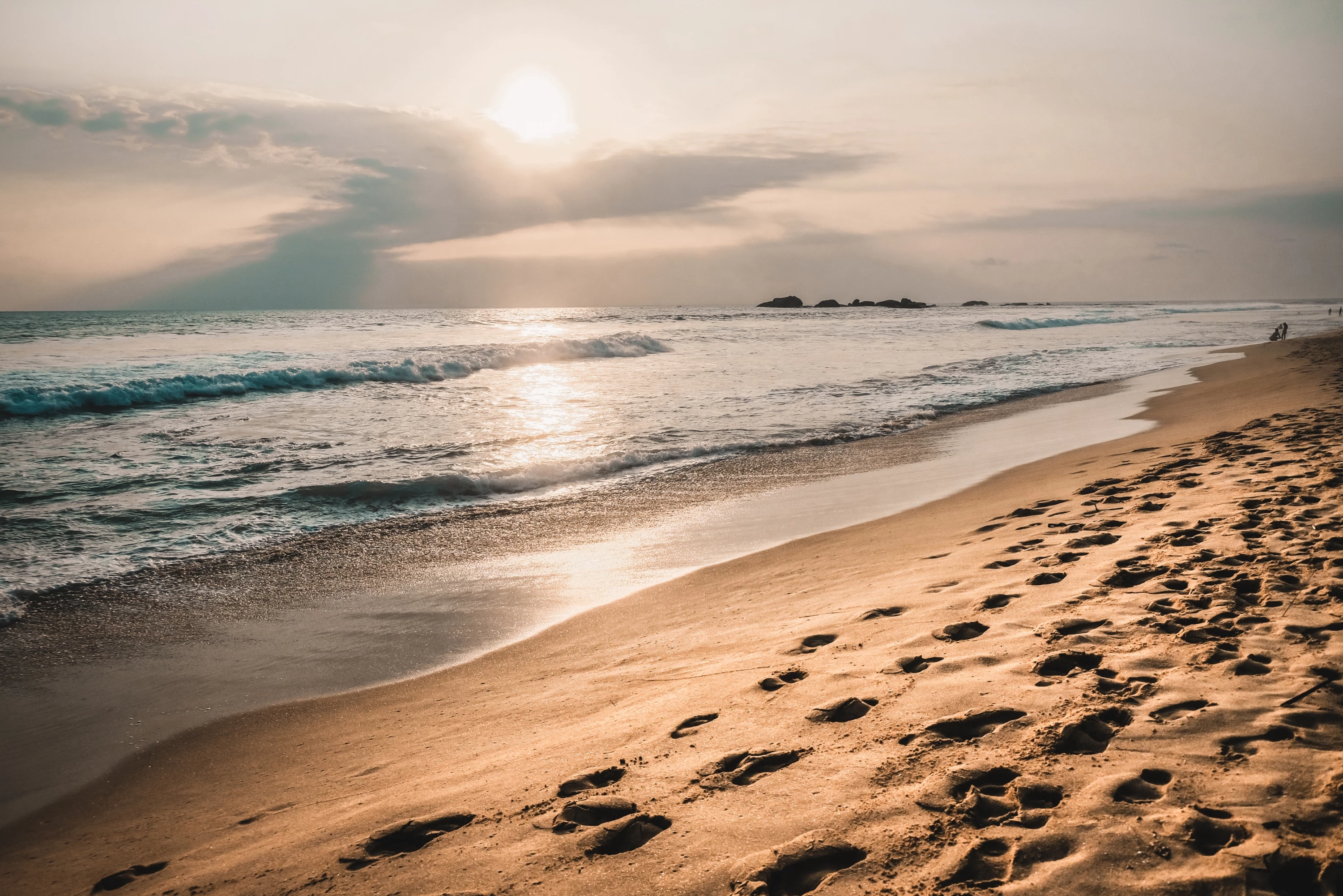
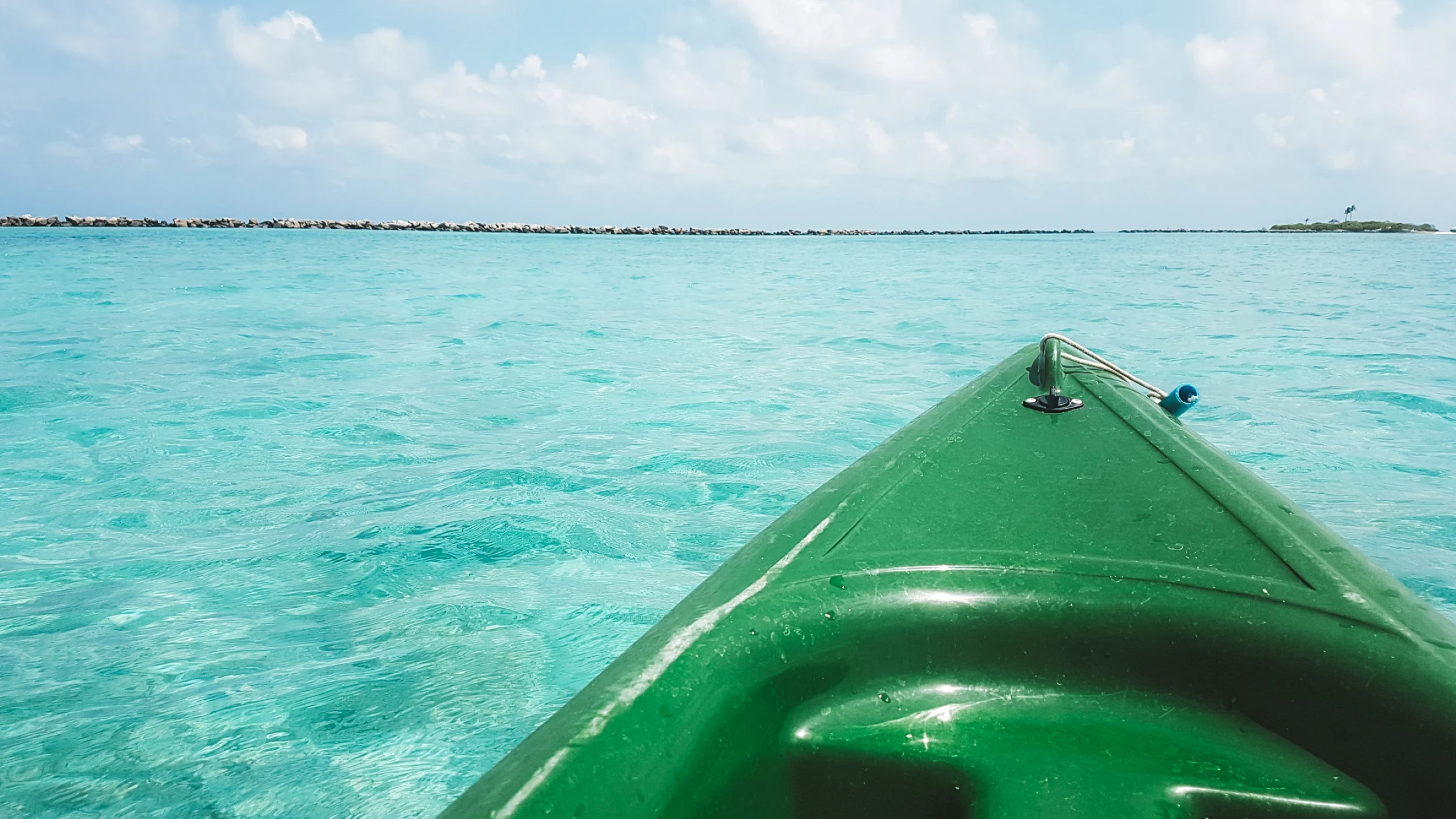
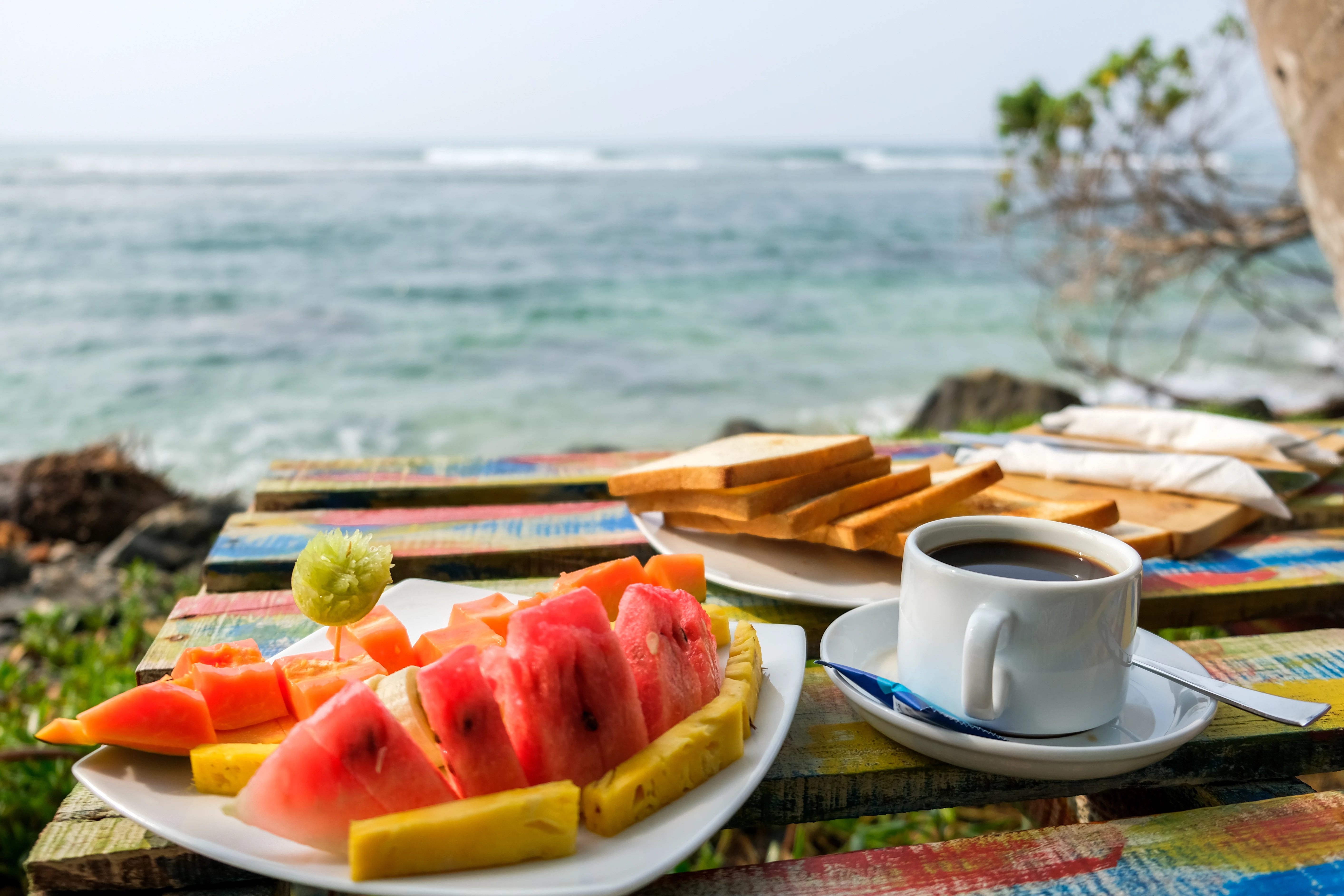
I think the main issue is the composition. What do you want to show? In your beach picture, perhaps it is a little too warm, the canoe picture, composition - it is unbalanced. The canoe weighs down too much on the right of the picture. I think the colour of the water is fine, as it looks like a lagoon, so the water does take on this colour hue! 3rd picture, composition. It is a bit of a mess here. 4th picture and 5th picture, nothing special really.
So, in my overall view the main issue is composition - which comes under technical issue/image quality.
These shots are great for holiday snaps, (and they look like holidays snaps) but probably not really good for Adobe Stock photos. (They have different standards compared to other stock sites.)
Have a read of this. It's a brief guide on image quality.
https://helpx.adobe.com/stock/contributor/help/quality-and-technical-issues.html