 Adobe Community
- Home
- Stock Contributors
- Discussions
- Re: High rate of rejections this week
- Re: High rate of rejections this week

Copy link to clipboard
Copied
Been uploading about 4 years now to Adobee and don't get that many rejections, the ones I get seem reasonable. However this week rejections have shot up mostly technical issues or lack of aesthetic appeal.
handfridge: technical issues - accepted without issues at other agencies
clockbooks22 - technical issues accepted at other agencies
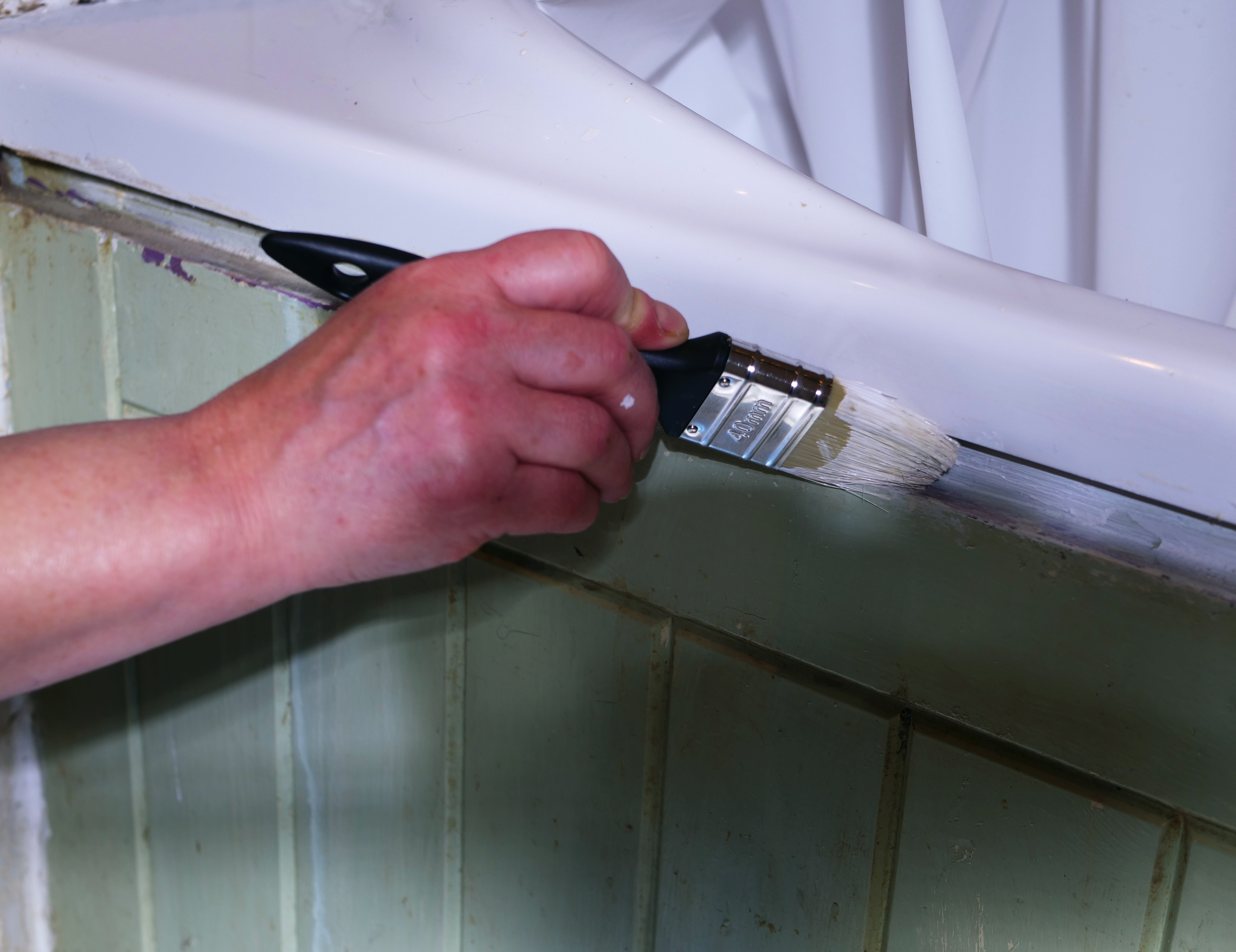
paintwood - focus issues.
A video of woman putting washing in machine (can't upload file size) aesthetic appeal. However this is the 4k version of a clip where the cutdown virtual zoom version was accepted. Again accepted at other agencies.
A video of a man dumping garden waste into a tip - aesthetic appeal. Accepted at other agencies.
Getting a bit confusing what sort of content Adobe want.
Any suggestions?
Thank you


 4 Correct answers

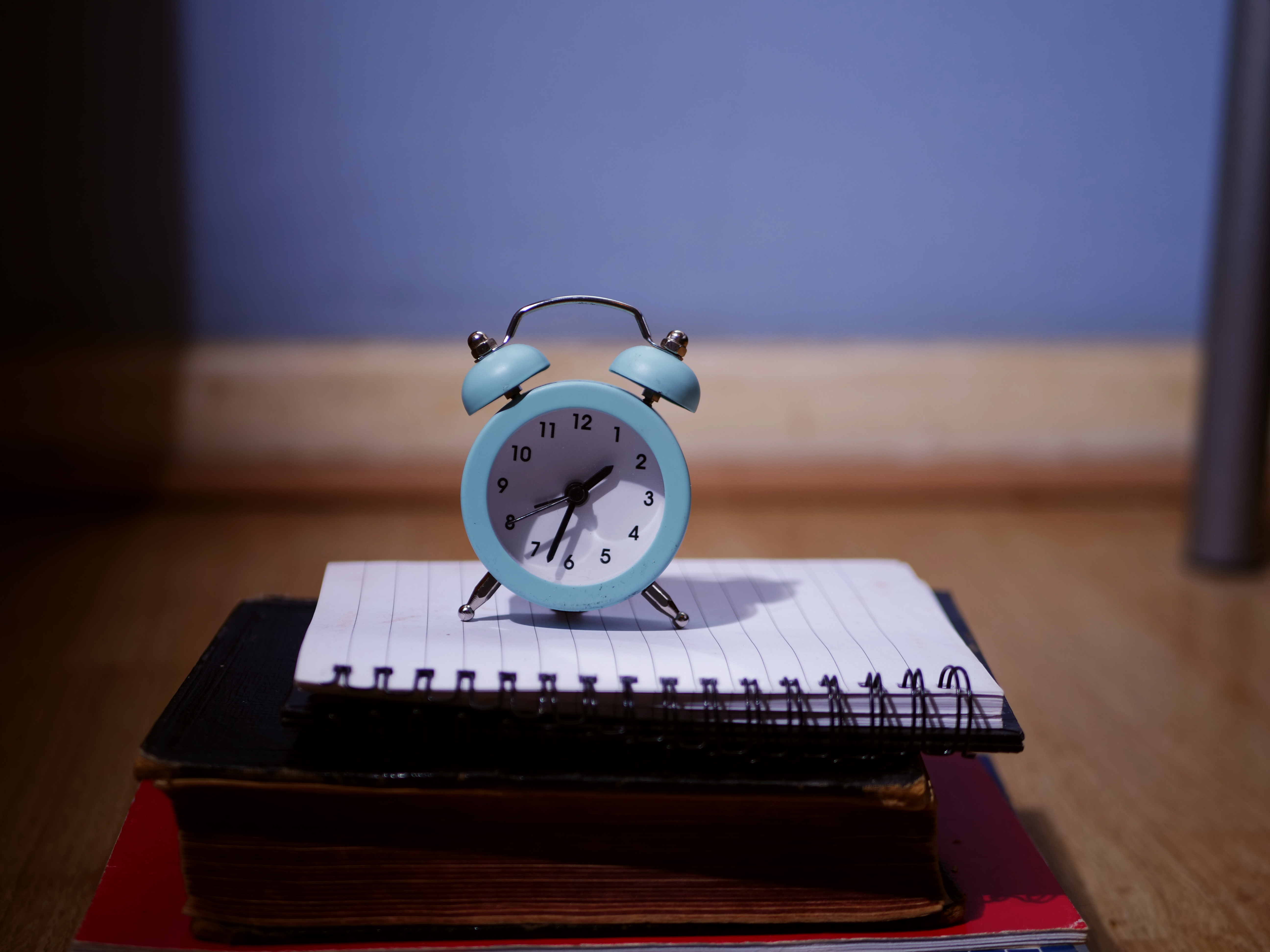
The clock isn't sharply focused throughout due to shallow depth of field and could be cropped tighter to eliminate the distracting elements on the sides.
The hand in the paint picture is quite out of focus and the lighting is harsh.
The fridge image is underexposed, and the bright spot of light to the right of the frame is distracting. The dirty smudges in the fridge also make it unappealing aesthetically.
Acceptance by other stock sites is not an indication that Adobe will find it acceptable.
...
Hi @angelaa93195398 ,
Nice composition. It would have been more desirable if the entire book was in focus, however, that might not be an issue since the subject is completely in focus and is large enough to stand out.

Take a close look at the clock face and you'll notice it's not white but pale blue. That's because there is a white balance issue. Also look on the edges and you'll notice purple and blue fringing. That too is not desirable. Once you correct those with a photo editor you'll be go
...
Hi @angelaa93195398 ,
The video seem sharp, however, I'm asking what is he throwing out. The focus is on the bag with its mysterious content. I'd have included the entire hand motion, or at least the entire half of the man.
Best wishes
Jacquelin

Some days we have heros; other days we have zeros. It comes with the territory.
I'm not loving the harsh shadows on your clock's face. I feel the lighting is uneven in all three still images. All nice ideas but the execution could have been better.
 18
Replies
18
18
Replies
18
Copy link to clipboard
Copied
Video of man dumping waste is at: https://www.shutterstock.com/video/clip-1091064271-man-emptying-garbage-waste-into-landfill-crate (rejected by Adobe on Aesthetic Appeal
Copy link to clipboard
Copied
Hi @angelaa93195398 ,
The video seem sharp, however, I'm asking what is he throwing out. The focus is on the bag with its mysterious content. I'd have included the entire hand motion, or at least the entire half of the man.
Best wishes
Jacquelin

Copy link to clipboard
Copied
I agree with @jacquelingphoto2017 . Lack of aesthetic appeal is about right! It doesn't show anything actually!
Copy link to clipboard
Copied
The clock isn't sharply focused throughout due to shallow depth of field and could be cropped tighter to eliminate the distracting elements on the sides.
The hand in the paint picture is quite out of focus and the lighting is harsh.
The fridge image is underexposed, and the bright spot of light to the right of the frame is distracting. The dirty smudges in the fridge also make it unappealing aesthetically.
Acceptance by other stock sites is not an indication that Adobe will find it acceptable. They have a high bar for quality.
Zoom in between 100-200% and carefully inspect your images prior to submitting. Also look at other accepted images in the same category to get an idea of what is acceptable.
Copy link to clipboard
Copied
Hi @angelaa93195398 ,
Nice composition. It would have been more desirable if the entire book was in focus, however, that might not be an issue since the subject is completely in focus and is large enough to stand out.
Take a close look at the clock face and you'll notice it's not white but pale blue. That's because there is a white balance issue. Also look on the edges and you'll notice purple and blue fringing. That too is not desirable. Once you correct those with a photo editor you'll be good to go.
Remember to inspect you files at between 100 and 200%.
Best wishes
Jacquelin

Copy link to clipboard
Copied
There is no need for me to repeat what has already been pointed out, but the one thing that jumped out at me is that the clock face is askew. Oddly the numbers 12 and 6 are not in the 12 and 6 position. The image seems to have a level horizon, so perhaps the clock itself has a slightly rotated face. I find it distracting, but perhaps it is just me.
You also have what appears to be a sensor / dust spot on the baseboard just to the right of the clock. Perhaps it is just a shadow on the baseboard, but either way, you may want to clone it out.
Best of luck with your future submissions.
Rob R, Photographer
Copy link to clipboard
Copied
Thank you all for taking the time out to respond it is appreciated.
jacquelingphoto2017 - fair comment it's obvious to me because I was there but yes I see your point not obvious to a viewer.
White balance on clock face. I was shooting in a room with blue walls not excusing myself. I do need to pay more attention to the white balance in post processing.
Inspect at 100 to 200% - noted.
Jill_C I was trying to get the focus on the paintbrush rather than my hand. To be honest I've always struggled with light my house it's pretty dark even with a monolight. So I shoot a lot with shallow depth I guess it backfires on me sometimes. Yeah fridge needs a good clean 😞
reedesign1912 - yeah clock does look a bit off now you mention it. Sensor dust - cleaned my sensor about 3 weeks ago - this photo was before the clean so I'm sure there are spots I've missed.
Didn't mean to go on so long but comments are very helpful - lot to think about.
Thanks Again
Angela

Copy link to clipboard
Copied
You definitely have a problem with light.

(The other two pictures have similar problems)
I agree with @Jill_C that the clock is not as sharp as it could be. But I think that with a correctly lit picture and a bit of postprocessing sharpning, this could be solved. It may be that the lens is a tint too soft. I disagree with @Jill_C on the hand with the brush picture. The brush should absolutely be in focus, the hand can be blurred because of DOF. However, this picture has a bunch of other problems, the most important is the white balance. Then the picture is slightly underexposed and you should have done something to weaken that big patch of a shadow in the lower right of the image.

The fridge picture has also a white balance problem, but the biggest issue is that dark patch to the right.
I think you will need to acquire a pair of flashes for unleashed flashing. This will enhance your pictures a lot.

Copy link to clipboard
Copied
the clock has underexposed shadows.

Copy link to clipboard
Copied
I have also been a contributer for many years and the past few weeks have also seen an unusally high level of rejection and all for the same reason, technical issues which I find highly irregular. Other rejections have had various different reasons but I definately think something is amiss here.
Copy link to clipboard
Copied
Technical issues are used for numerous rejections. Formerly they were called out separately, but as the first rejection reason seen, people resubmitted and got rejected for a different reason. As of my knowledge, there is no increased quality requirement. The pictures presented here have all one or more defects, so rejections are really justified.
Copy link to clipboard
Copied
I have also been a contributer for many years and the past few weeks have also seen an unusally high level of rejection and all for the same reason, technical issue...
By @charlese33409330
============
The reviewers are rarely wrong about rejections. Although it's impossible to comment without seeing the rejected photos.
If you're seeing a flurry of recent rejections, check your equipment. Maybe your camera, sensor & lenses need a good cleaning. Dust causes unwanted artifacts, spots and missing pixels which can ruin an otherwise good photo. Also see my reply to a similar post from yesterday.
Alt-Web Design & Publishing ~ Web : Print : Graphics : Media
Copy link to clipboard
Copied
Some days we have heros; other days we have zeros. It comes with the territory.
I'm not loving the harsh shadows on your clock's face. I feel the lighting is uneven in all three still images. All nice ideas but the execution could have been better.
Alt-Web Design & Publishing ~ Web : Print : Graphics : Media
Copy link to clipboard
Copied
Thanks Abamo - difficult to argue with such specific advice (very helpful). Shadows in this shot are not intentional just bad lighting as I'm now seeing. Somtimes my eagerness to just get the shot overrides my attention to detail shadows and backgrounds in this case.
I do video as well so I use constant light sources rather than flash but good tip.
Thank you again
Copy link to clipboard
Copied
Thanks Nancy - watched a few videos of this chap he's very good.
Copy link to clipboard
Copied
Constant light may also be adequate, but flash is, what it tells: a shorttime, high power light. Video lights need to be much more powerfull and constant over a longer time, but light works the same, unrelated to the technology.
Copy link to clipboard
Copied
It is a good idea to take photos in camera raw image file, e.g. DNG, CR2, etc. Then you can alter the exposure, white balance, etc using software such as Adobe Lightroom/Adobe Lightroom Classic or Adobe Photoshop. If taken in and saved as JPEG, then it is much harder to make alterations.
In all of your shots, there is a problem with the colour temperature.
Using flash, especially if on the camera can make the lighting very harsh and give harsh shadows.
Copy link to clipboard
Copied
Thanks my camera is GH5 unfortunatley Pshop doesn't give the option for these raw file types. My old Nikon was fine. I don't use flash but a constant light as I do a lot of video work - but yes my monolight is harsh - I can always soften it though.
Thank you everyone
 AdChoices