 Adobe Community
Copy link to clipboard
Copied
 5 Correct answers
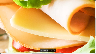
@CaglarUbay What was the reason you were given? I see technical problems with focus but in my opinion, this is not a suitable stock image representing a sandwich. The bread is torn, it appears half-eaten already, the perspective is off, and the plating is dirty. This makes for a very unappetising image from my point of view! Food photography is highly specialized and if it is a direction you want to pursue, you'll need to do much more studying and practicing. Always be thinking about who will wa
...Compare your work with what successful Stock Contributors are doing in the same category.
Aside from the technical issues, your image lacks much WOW factor that would appeal to potential Stock customers.
Study the links below:
...Poor focus, messy background, strange shadows, and an unappealing composition due to the angle and too-tight crop. Food images should be mouthwatering, and the food should be perfectly arranged and well lit.
Hi @CaglarUbay ,
Your frame is out of focus. I don't see that bread as eaten, but that it is a whole wheat bread that is crummy because of the absence of gluten. This could tell a story about the difference between baking bread with whole wheat flour and white flour. Or making sandwich with whole wheat bread and white flour bread.
Best wishes
JG
Photographer and Nutrition Author
1. blur and focus problems
2. Your sandwich is at an angle
3. Overall it hard to say what you are trying to say in your photo. Your photo needs a story.
4. Next time try to place the sandwich flat and photo it horizontally.
Copy link to clipboard
Copied
@CaglarUbay What was the reason you were given? I see technical problems with focus but in my opinion, this is not a suitable stock image representing a sandwich. The bread is torn, it appears half-eaten already, the perspective is off, and the plating is dirty. This makes for a very unappetising image from my point of view! Food photography is highly specialized and if it is a direction you want to pursue, you'll need to do much more studying and practicing. Always be thinking about who will want to use your stock image in the first place.
Copy link to clipboard
Copied
Compare your work with what successful Stock Contributors are doing in the same category.
Aside from the technical issues, your image lacks much WOW factor that would appeal to potential Stock customers.
Study the links below:
- https://helpx.adobe.com/stock/contributor/help/reasons-for-content-rejection.html
- https://helpx.adobe.com/stock/contributor/help/quality-and-technical-issues.html
- https://helpx.adobe.com/stock/contributor/user-guide.html/stock/contributor/help/photography-illustr...
- https://helpx.adobe.com/stock/how-to/tips-stock-image-acceptance.html
Hope that helps.
Copy link to clipboard
Copied
Poor focus, messy background, strange shadows, and an unappealing composition due to the angle and too-tight crop. Food images should be mouthwatering, and the food should be perfectly arranged and well lit.
Copy link to clipboard
Copied
Hi @CaglarUbay ,
Your frame is out of focus. I don't see that bread as eaten, but that it is a whole wheat bread that is crummy because of the absence of gluten. This could tell a story about the difference between baking bread with whole wheat flour and white flour. Or making sandwich with whole wheat bread and white flour bread.
Best wishes
JG
Photographer and Nutrition Author
Copy link to clipboard
Copied
1. blur and focus problems
2. Your sandwich is at an angle
3. Overall it hard to say what you are trying to say in your photo. Your photo needs a story.
4. Next time try to place the sandwich flat and photo it horizontally.
Copy link to clipboard
Copied
Hello,
As others have said, you basically have poor composition and it is not in good focus; it's not appealing. Imagine if a MacDonald's burger was presented like this? Would you eat it?
Copy link to clipboard
Copied
Thank you all for great comments. I really apreciated each words....
Copy link to clipboard
Copied
Copy link to clipboard
Copied
Hi @CaglarUbay ,
The first file is out of focus and highlights destroys some of it s details.
The second was cropped poorly, and over exposed. Highlights destroys some of its details. Also you need to improve on your composition.
Best wishes
JG
Photographer and Nutrition Author


