Copy link to clipboard
Copied
 1 Correct answer
Hi @roanm34154489 ,
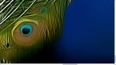
It's a beautiful image. However, it has soft edged. Your image must in in sharpt focus with sharp edges.
Best wishes
Jacquelin
Copy link to clipboard
Copied
Hi @roanm34154489 ,
It's a beautiful image. However, it has soft edged. Your image must in in sharpt focus with sharp edges.
Best wishes
Jacquelin
Copy link to clipboard
Copied
I agree with @jacquelingphoto2017 , the details appear both soft when viewing between 100%-200%. It also appears some noise reduction or heavy sharpening has been applied resulting in some unwanted artefacts.
With small print such as a magazine, I suspect this image would be fine. But I think it's important to keep in mind all of the uses a commercial stock asset may be used. I don't believe this would stand up well with a large print scenario.
Being rejected as a commercial asset doesn't mean it's a bad photo though. Congrats on being published in a magazine!
George F, Fine Art Landscape Photographer
Copy link to clipboard
Copied
Adobe Stock customers expect the highest visual and technical quality for use in commercial projects. Posters, billboard ads & TV commercials, merchandise like t-shirts, tote bags and calendars... Read your Stock Contributor User Guide for more details on what's expected.
- https://helpx.adobe.com/stock/contributor/help/reasons-for-content-rejection.html
- https://helpx.adobe.com/stock/contributor/help/quality-and-technical-issues.html
- https://helpx.adobe.com/stock/contributor/user-guide.html/stock/contributor/help/photography-illustr...
- https://helpx.adobe.com/stock/how-to/tips-stock-image-acceptance.html
Better luck with your next submission. 🙂
Copy link to clipboard
Copied
It's beautiful in an artistic sense; but some of the feather quills (eyes?) are sort of pasted in and not attached to a quill and just sort of floating... I think Adobe is looking for more realism in these sort of images.
Copy link to clipboard
Copied
Be happy with your publishing experience. Even is the asset has been used in a Nikon magazine, that does not mean that it is fit for stock. I do not know the QA of that magazine, but I would not have used this asset.
You have random out of focus parts...well and other errors.


