- Home
- Stock Contributors
- Discussions
- Re: Technical Issue Rejection Help
- Re: Technical Issue Rejection Help
Technical Issue Rejection Help
Copy link to clipboard
Copied
Hi,
You were so great the last time and nailed the problem. I've had 3 images rejected for technical issues, and I'm hoping you can give me some insight as to why.
Thanks so much for any input, it's really appreciated.
Best,
He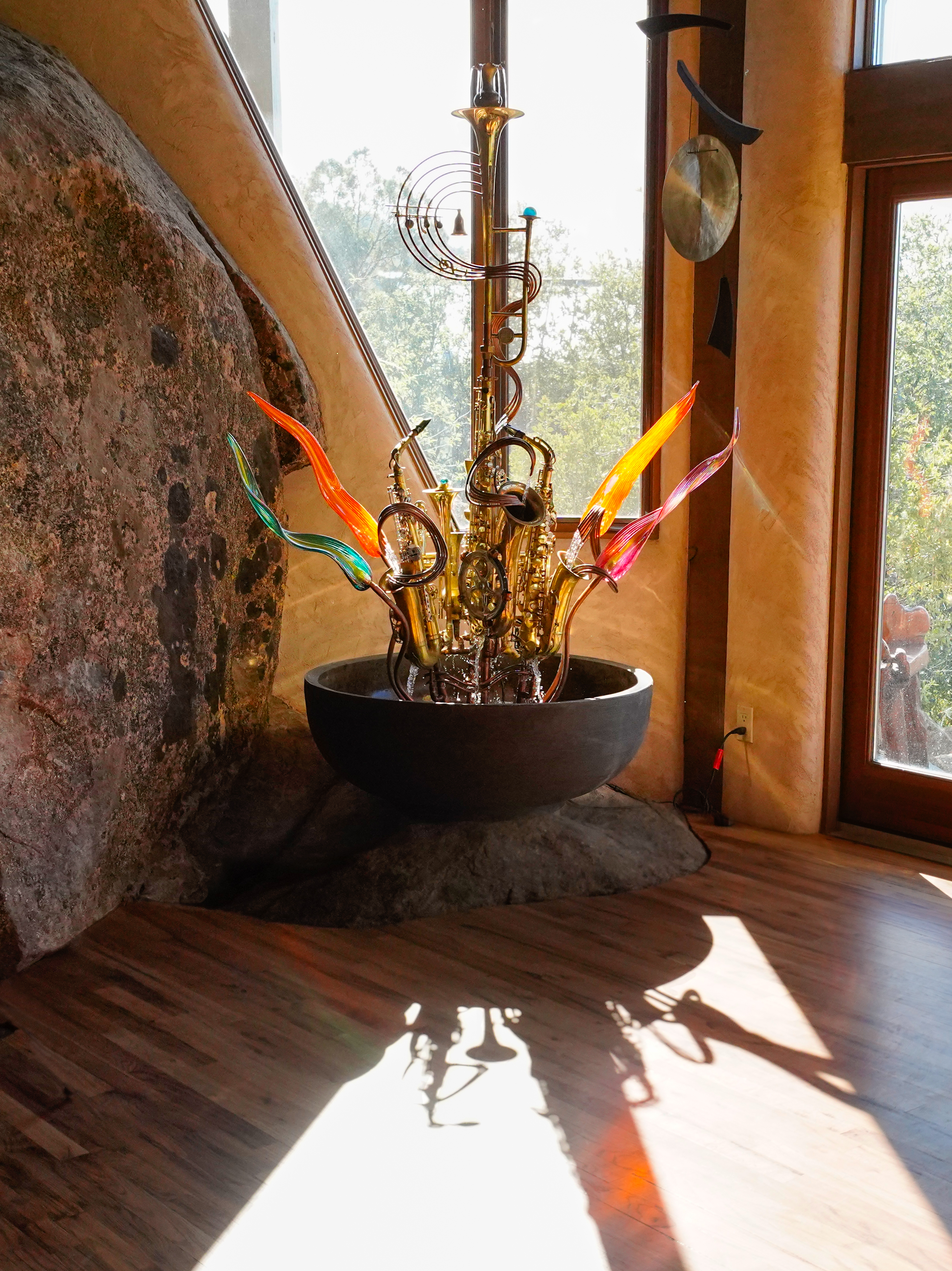
 ather
ather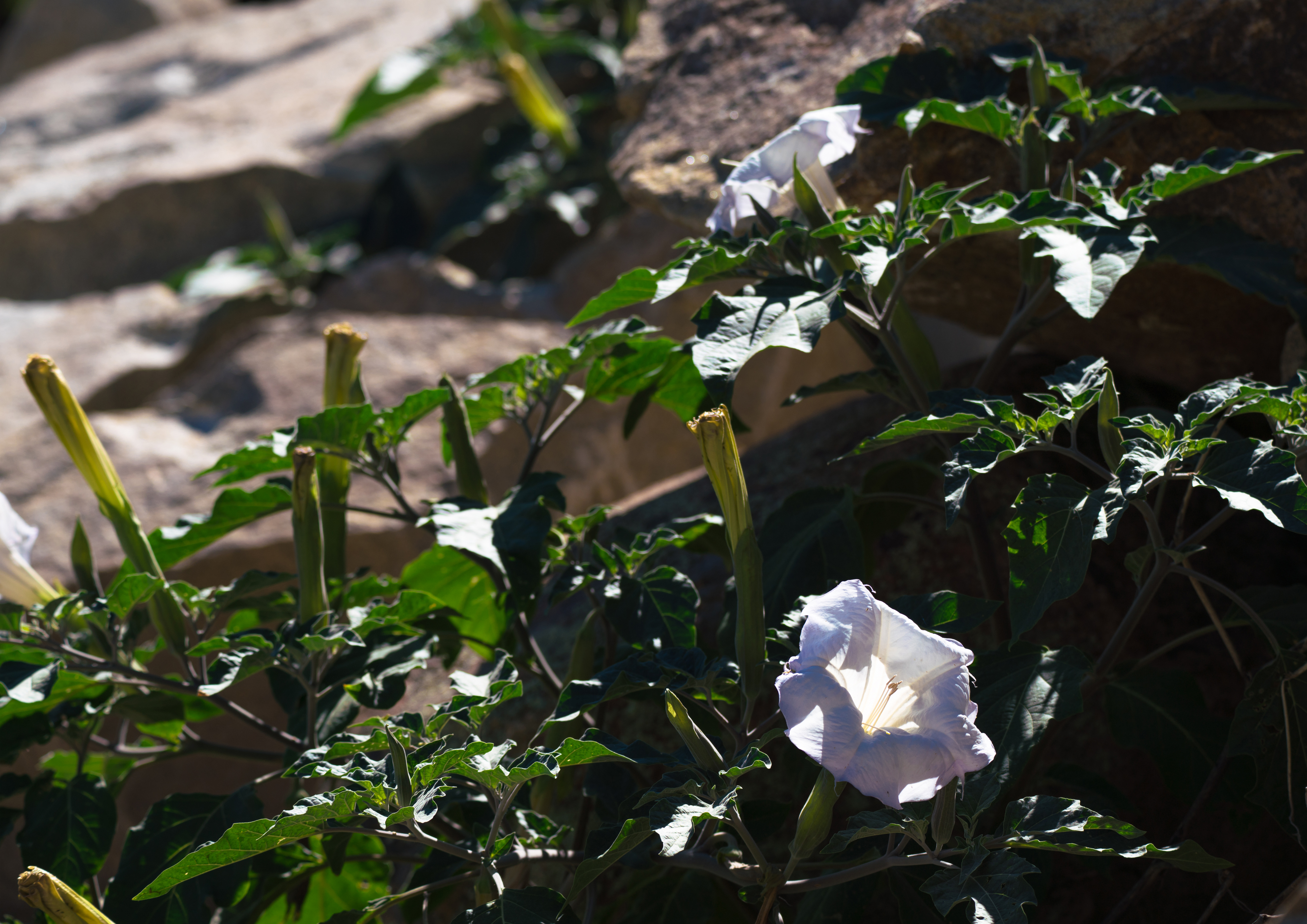
Copy link to clipboard
Copied
Hello Heather6527, To my eyes, all three should be cropped and made into close-up shots.
When you do this, be sure to examine them at 200 % magnification to see noise and spots needing repair. Each one will also require exposure adjustments and extreme white areas toned down. Cropping for Morning glories focuses on right 1/3 of the photo. Try several croppings for
the best close shot. Regards, JH
Copy link to clipboard
Copied
Thank you so much Joan for your time and thoughts. I really appreciate it.
Copy link to clipboard
Copied
Looking at this on my iPad, I may miss something, but my first impressions are, that you need to work your light situations. You have big surfaces that are either completely dark or completely blown out.
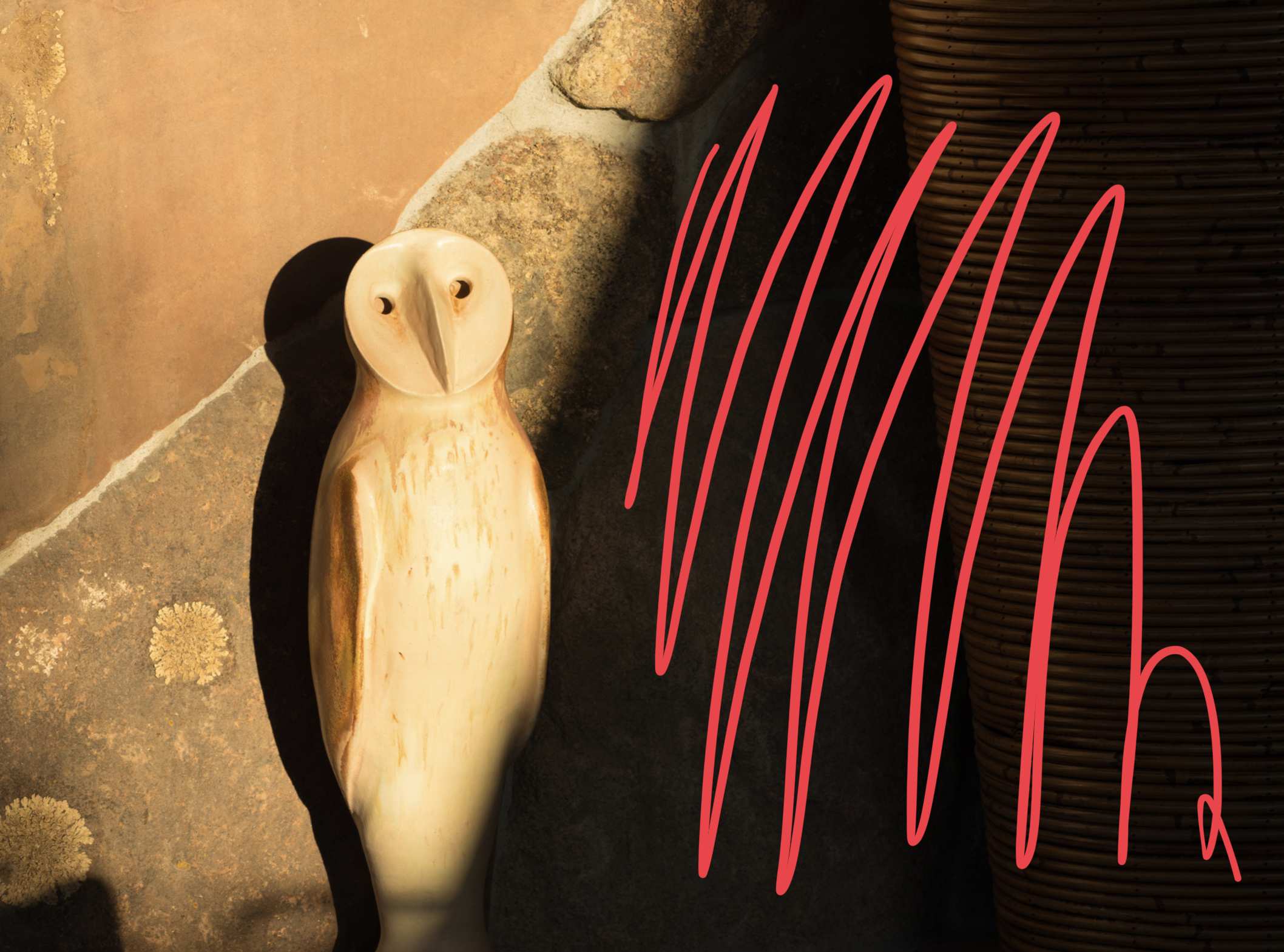
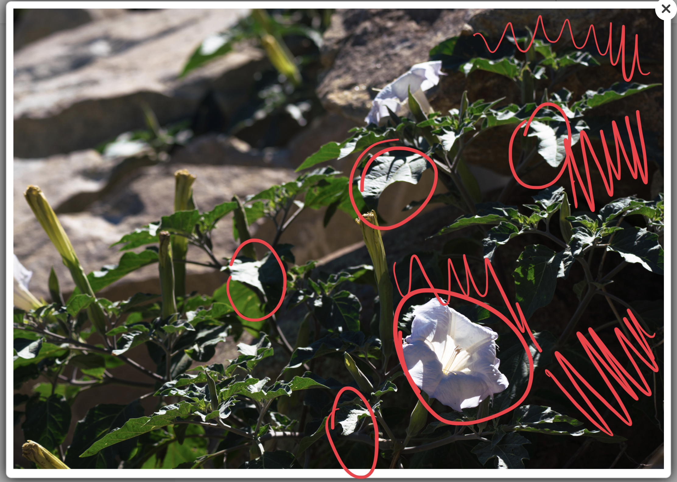
Your also have problems with your white balance (owl) and the framing as indicated by Joan.
Copy link to clipboard
Copied
Thank you so much for taking the time to comment. I really appreciate your input.
Copy link to clipboard
Copied
You're welcome.
Copy link to clipboard
Copied
Hi heather,
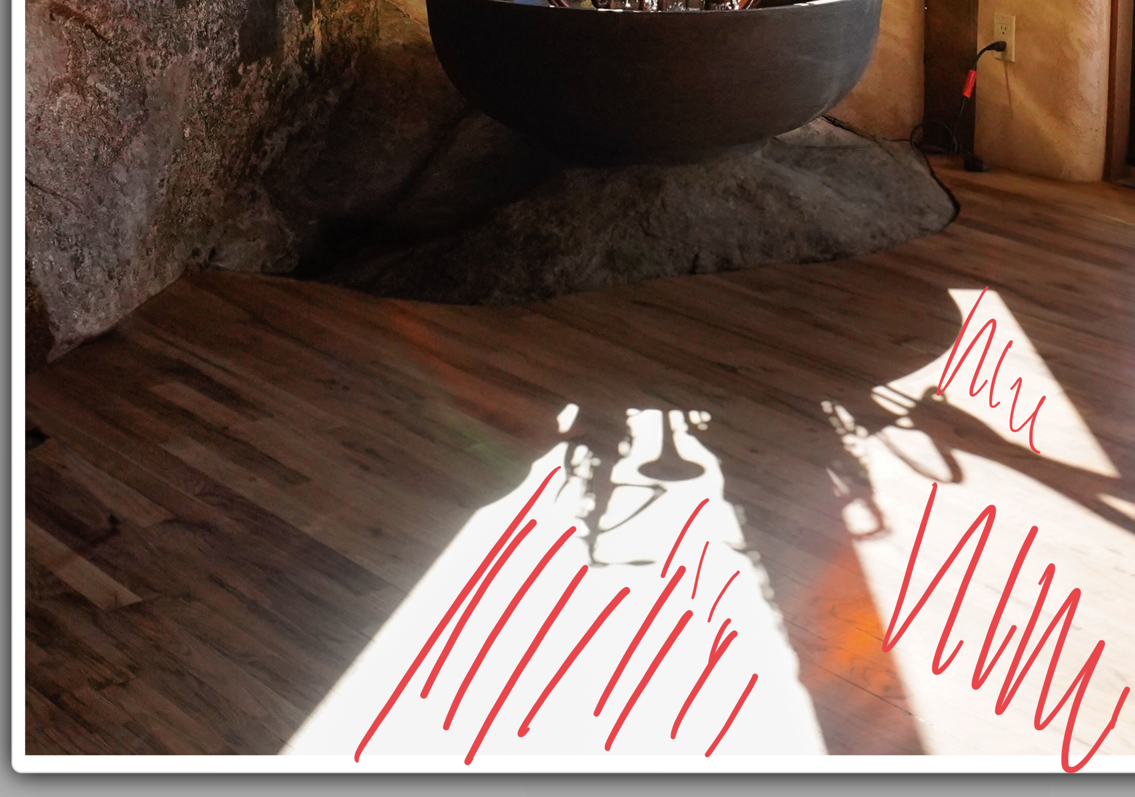
In addition to what Joan and Abambo point out, the areas circled are where the technical issue is with this image. If you notice the floor at 100% magnification, you will notice it has multi-colors that are artificial to its natural color. However even at normal image size you can see that rainbow I circle in blue. That is a technical issue. The orange color I also circle in blue is another technical issue. The pink is at an area that is blown out by high light from the door - another technical issue. There is the need to reduce high light and increase shadows and black along with other adjustment to get proper white balance..

Copy link to clipboard
Copied
Thank you so much for your help. I really appreciate you taking the time and effort.
Copy link to clipboard
Copied
Hello, ready for a fourth opinion.
1st picture - overall white balance, i.e colour temperature. It is too warm, so I think - the yellow, being from the sunlight, needs to be toned down a bit. e.g. Decrease the yellow - more blue, and decrease the tint - more green to get a more natural balance.

The highlight on the floor, as pointed out by Abambo, however, cannot be recovered, so this could be another problem - exposure! And I think it might be!
2nd - It's white balance again. Owl is too yellow - too warm, so again decreasing the yellow by adding more blue.
Cropping should be done as well to get rid of the pipe. It's not necessary. (In my view.)

3rd picture:
White balance and cropping!
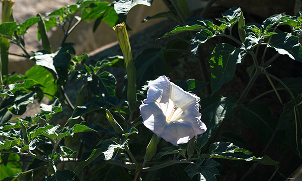
Try to think more about your composition as well when taking the photos. The owl needs more bottom.
Copy link to clipboard
Copied
Oh, even though you wanted the flower 'among the rocks' I don't think it shows it very well. The flower should be 'among the rocks' and not just in the background - it's like an afterthought.
Copy link to clipboard
Copied
Thanks Ricky for your input. I really appreciate the feedback. Thank you for your help.

