Participant
September 14, 2023
Under Review

I wish the gradient map tool was like the one in photoshop or designer

  • September 14, 2023
  • 返信数 8.
  • 890 ビュー

I work on a quite large game studio with with an old school handpainted style for our MMORPG and throughout the years we have heavily relied on coloring everything with gradient maps in photoshop. Now the team has slowly migrated over to using substance painter instead. We are very happy with the workflow and the software but we are all very unhappy with how the gradient tool work in substance painter.


In substance you have these sliders, they are not very intuvetive and you have very little control of how the colors will affect your grayscale. The transition gets choppy and the colors feels almost washed out.

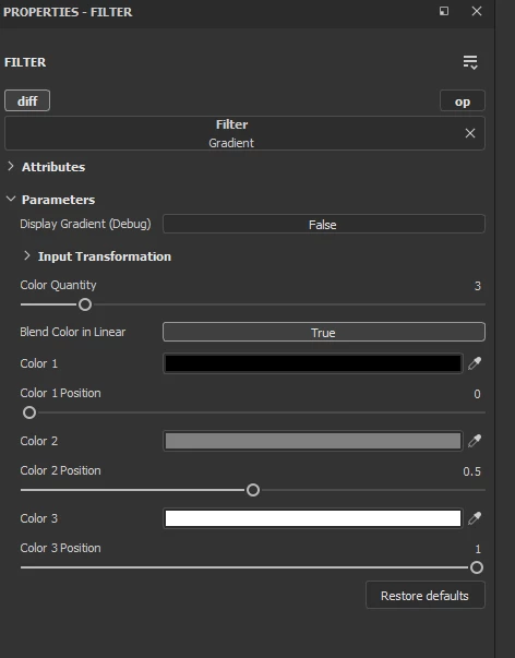
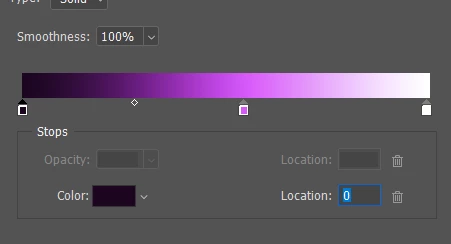
In Photoshop and designer you have this gradient map tool where tou see the whole scale and you can control the transission much better. In designer you can ever colorpick gradients from external images. You also get a much smoother transission between colors.

I'm thinking since we have this feature in both Designer and photoshop, wouldn't it be relatively easy to add it to painter as well?

Kind Regards
Lotta Sörensen
Character art lead at Star Stable Online

返信数 8

Participating Frequently
October 19, 2024

I had an additional idea for a visual improvement to the gradient filter. In my opinion, the gradient filter would benefit from a visual representation of colors in a histogram, similar to the levels layer. This would allow users to quickly pinpoint where the values are, making it easier to iterate efficiently. Naturally, the histogram would need to adapt based on the chosen blending method, such as blending in linear or other alternatives, to accurately reflect those changes.


I think this would be an exceptional upgrade to the existing gradient filter. Please let me know if you’ve seen my suggestion, as I would be highly interested in seeing this implemented. Otherwise, I might create a separate thread to ensure it gets noticed.

Participating Frequently
October 18, 2024

Regarding the colors looking washed out, is it possible that you are overlooking the "Blend Color in Linear" option? I've made this mistake in the past, and I noticed in the images you've posted that it is set to "True." As for the gradient filter, I think a visual overhaul would be beneficial, and perhaps the "Blend in Linear" option should default to "False." An option for image input would also be useful for those who utilize them.


I think Blender, with its Color Ramp node, serves as a good example of how the filter could be improved. The UI is compact, provides a visual option along with specific values for positioning, and includes an option to cycle through selected colors in order, along with additional options for color mode and interpolation.

Cyril Dellenbach
Community Manager
Community Manager
February 28, 2024

We're currently reworking the "Idea" section of the forum to have a better view on users needs.

To keep everyone updated, this is clearly something we would like to work on, but unfortunately nothing new to share on the topic.


Regards,

Cyril Dellenbach (Micro) | QA Support Artist | Adobe
Cyril Dellenbach
Community Manager
Community Manager
September 29, 2023

Thanks for the details.


The steps issue seems to be a matter of bitdepth. It's worth a try to switch the bitdepth for 16 bits and see if the problem persists.


Also, if not already done, I advise you to always check the colors with the 3D view displayed as "Base Color" instead of "Material". This way, you'll have a more realistic vision on how the gradient is applied.


Cyril Dellenbach (Micro) | QA Support Artist | Adobe
Participant
September 28, 2023

I've color-picked the exact same colors. And you can clearly see how the SP one feels a bit grayer and less saturated. You can also see how the furr details looks diffrent.


Here you can clearly see how the shadows behave diffrently


Participant
September 28, 2023

Thank you for looking into the issue Cyril!

This is a comparison of how it looks with just three colors in the gradent. It's imposible to get the same contrast and vibrancy in the colors in Painter as in photoshop 😞 You can clearly see in the transistions from one color to the other how there is clear steps in painter while in photoshop there's a smooth transition.


Aslo the darkest and the brightes color kind of disapears. If I try to get them back by pulling in the sliders the steps between colors gets worse. Here's another comparison, side by side SP and PS. I've done the exact same thing in the two softwares here. I've pulled up the darkest hue and down the brightest one to get more contrast in the gradent.


Cyril Dellenbach
Community Manager
Community Manager
September 25, 2023

Hi Lotta, hello Leslie,


Thanks for the detailed insight.


I can agree that the gradient isn't very intuitive to use, and it could be a bit more visual. With that being said, I'm not sure what you meant mentioning choppy transitions and washed out colors. Could you share a screenshot of the issue, so I can take a better look on what you're mentioning.


I'll share your message with the team, so we can have a discussion on the subject.


Best regards,


Cyril Dellenbach (Micro) | QA Support Artist | Adobe
Participating Frequently
September 16, 2023

+1 i`ve been requesting this since 2015
https://polycount.com/discussion/154264/substance-painter-gradientmap
i was happy to at least get the filter version but its so much less user friendly than an actual gradient with control points