Participant
June 14, 2022
Question

design improvement

  • June 14, 2022
  • 3 replies
  • 272 views

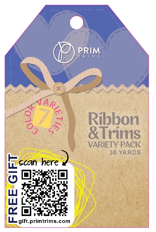
if you can change just 1 design element from this label, what would it be? thanks!


This topic has been closed for replies.

3 replies

Abambo
Community Expert
Community Expert
June 20, 2022

The left lower corner is too crowded. So, I would add more canvas, to have more space (also free space).

ABAMBO | Hard- and Software Engineer | Photographer
EuanWilliamson
Community Expert
Community Expert
June 18, 2022

Firstly, we don't know what physical size this will be.

Thus it's difficult to comment on the readability.

I'm with @J E L but I'd go further and remove the scratch lines altogether.  
I feel it doesn't help the call to action that is the QR code.

If I'm allowed a second change - I'd put the 30 YARDS in larger type down in the bottom right. 

Best regards, Euan.
Ricky336
Community Expert
Community Expert
June 22, 2022

I too would remove the scratch lines as well. Why have them there? What purpose do they serve?

J E L
Community Expert
Community Expert
June 17, 2022

Hi @ralph24817191d0b0, I'm aware that your post could be a sneaky promo for a Prim product offer, but I'll bite and say that I'd change the color of the yellow scratch lines behind the QR code. Don't be surprised if your post is moved to another forum, as yours is not a Photoshop question. Carry on!

Participant
June 17, 2022
thank you very much for the feedback. i understand your concerns regarding a
promotion intention but that was not the case. i have agonized for hours
over this design and find that the longer i wait the more changes i feel
necessary.
J E L
Community Expert
Community Expert
June 18, 2022

Oh, I do want to apologize for my assumption.... it's just that we've seen about everything tried here! Please don't agonize over it anymore. It's totally fine as is. It's great to get some feedback, though, and we could become very picky, but the main thing is you've created a lovely-looking tag. I think the yellow color is a bit too off palette, but that is just one small criticism. Please feel free to always share your designs for feedback here in the Lounge... but only if it doesn't add to your agony!