- Home
- The Lounge
- Discussions
- Looking for creative feedback and suggestions..
- Looking for creative feedback and suggestions..
Looking for creative feedback and suggestions..
Copy link to clipboard
Copied
I am a writer of short stories. I also make slide show stories using various old bit of software and a mix of Apple mac & Windows 10 laptops. I have tried to make a video link to a single you tube video, but it didn't work.
So try this link to see some of my slide show video clips on you tube.
(Edited several times to get the links to work) RR.
Copy link to clipboard
Copied
Hi Roseline,
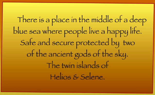
I watched your 4 videos, they're cute but, rather simplistic. What is their intended use? By the way, you have a spelling error in "Words Colour Pictures" the slide "Sparking Silver", did you intend it to be Sparkling Silver? Also, you slide show "Helio & Selene" the transitions are too fast, they don't allow enough time to read the pages completely, I'd suggest you increase the time between pages, not everyone is a fast reader and your font choice with the gradient applied doesn't help the readability. Another observation is that the frame containing the text is crooked in relation to the bounding frames; was that intentional?
This is intended as some constructive criticism, good luck in what you're trying to accomplish.
Copy link to clipboard
Copied
Yes your right about almost all of the errors in the slide shows. I am still experimenting
Copy link to clipboard
Copied
I am hoping to eventually make short story slide show video clips. Using my own stories and then 'Animate' them as a slide show. I just have to learn the technical side of 'Animation' (Since I already have my own stories) So I am hoping to use Adobe Spark to improve my slide shows and 'video' story telling. RR.
Copy link to clipboard
Copied
Roseline, you are very brave asking for feedback in so public a forum. I'm actually uncomfortable about providing some of it, but you did ask.
Dotty Dot. 'Then there _were_ two dots'.
The background gradient made it difficult for me to scan the lowest two lines, and the transition occurred before I'd done so. All the slide transitions were too fast for me. Perhaps if I'd been able to scan the page more easily, but even then, I think too fast.

Some of the colour combinations in Words Colour Pictures grated a bit for me. I'd be inclined to add a wee warning for those poor people liable to fit.
Best of Words worked better. Best of Care is on the screen for less than a second.
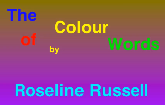
Words of Colour has better colour combinations (IMHO) but the timings are all over the place.
I couldn't parse this page for the life of me. My brain wanted to read it as 'The Colour of by Words'. I am thinking of some of those geometric layout shapes like the Golden Spiral, and/or a progression where the words get smaller in the order they should be read, but leave your name full size. The thing with layout is it can be difficult to put it into words. We have a feel for what works learned over many years of doing it, and it won't necessarily conform to the rule of thirds, or Golden thingie. At least it's easy to change our minds and experiment nowadays. That was not the case when we used to cut stuff out with a scalpel, and paste onto a sheet of paper.

Copy link to clipboard
Copied
Thanks for all of that, I agree that the slide shows are sometimes not a good as they should be. I am still experimenting and hope with this sort of feedback I can get better. Thanks RR.
Copy link to clipboard
Copied
Thanks for the feedback on my slide shows. I needed someone else to point out my mistakes and errors. Hopefully I will now be able to make better slide shows in the future. RR.
Copy link to clipboard
Copied
I think it is fun to see how people express themselves creatively!
Theoretically your videos could be cute for an Instagram feed. Some people might enjoy them there as well. Could be an idea of something for you to try.
You could make daily or weekly motivational posts on Instagram in this style. People might enjoy them!
Always experiment and have fun!

