


Copy link to clipboard
Copied
The letter U in the Avenir Next bold font (which installs with the Mac OS) has a problem that is showing up only when used in Adobe applications. Look at the letter U in this screenshot. It appears larger than it should All characters are the same size, no stroke, no scaling applied. This does not occur in any non-Adobe application. Is there a bug that needs to be fixed?


 1 Correct answer

Make sure you have the latest version of Photoshop installed as well as the latest updates to you Mac OS, because it seems the issue is fixed with the latest updates.
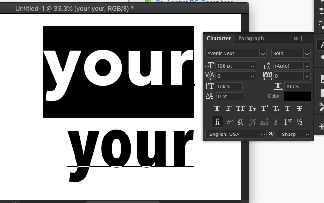
Top row is Anenir Next. Bottom is the condensed version
 30
Replies
30
30
Replies
30

Copy link to clipboard
Copied
Yep! I know! I just wrote to Monotype and asked if they would allow me to at least test the Pro version and see if the rendering is still wonky. Somehow I don't think they will, though their customer service has been very nice so far. Unfortunately, my client does own the license for the font, but cannot find the actual font files. They may have to re-invest!

Copy link to clipboard
Copied
Unfortunately, my client does own the license for the font, but cannot find the actual font files. They may have to re-invest!
By @hadleyk78468788
If your client bought a retail version of Avenir Next through a site like MyFonts it may be possible for them to log into their customer account and download the font files again. I'm just saying that if they lost their font files. The EULA for those fonts does limit how many computers on which they can be installed.
Copy link to clipboard
Copied
Thanks for the info!

Copy link to clipboard
Copied
Is it also looking bad, when zoomed to max? It may well be also a display error.
Copy link to clipboard
Copied
It starts to look ok above 200%. It seems to be a hinting problem (though I don't know too much about that). It looks somewhat better on higher resolution monitors and worse on lower resolution.
The important thing is that my client is not happy with the results and this is their brand font, so I need to try every possible soluton before I tell them there is nothing I can do about it.
Copy link to clipboard
Copied
For branding purposes (logos, other brand-supporting graphics, etc) the type objects should be converted to outlines. I would only leave lettering as live, editable type if it is headlines or blocks of body copy in a page layout.
-
- 1
- 2
Get ready! An upgraded Adobe Community experience is coming in January.
Learn more
 AdChoices