Community Manager
April 3, 2026
News

New in Beta: Modernized Effect Controls Panel

  • April 3, 2026
  • 7 replies
  • 600 views

New in After Effects Beta 26.3x34: Modernized Effect Controls Panel 


After Effects has a long and storied history, and a lot of today’s UX still sits on a legacy framework. That foundation has made it harder than we’d like to fix bugs, ship new ideas, and keep panels feeling fast. We have been reimagining what’s under the hood for the Effect Controls Panel to make the experience easier to evolve, more reliable, and genuinely better to use. 

With that in mind, we have been working to modernize the underlying framework of the Effect Controls Panel. We are essentially rebuilding it from the ground up. This is the first stage of a larger project to modernize the UX framework of After Effects. 
 

What is changing? 

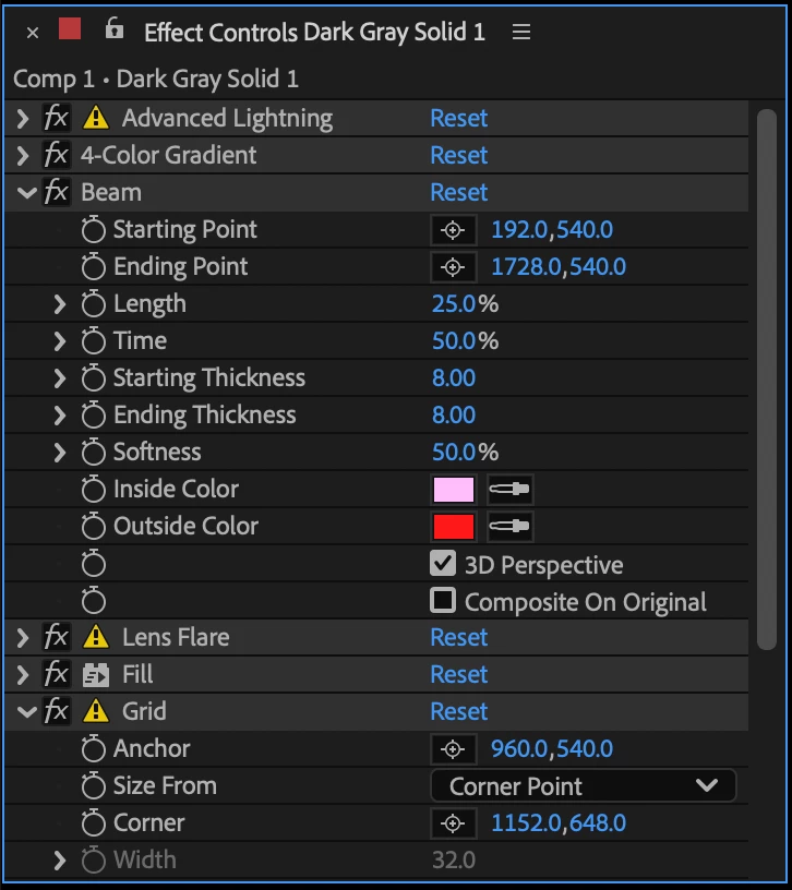
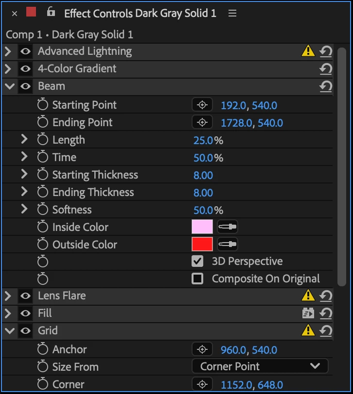
For now, the panel will look nearly identical to the existing version and retain all current behavior and functionality. However, this architectural shift allows us to deliver incremental improvements to the AE user experience moving forward. 

You may already notice a few subtle changes: 

  • We've changed the effect visibility icon to match the familiar eyeball used everywhere else in the ecosystem. 
  • We've consolidated informational icons to the right-hand side for a cleaner experience! And all of the informational icons now have tooltips to further explain what they’re indicating. 
  • We’ve changed the "Reset” command to an icon button. 
Existing Effect Controls Panel


New Effect Controls Panel


Known Issues 

  • Empty panel after workspace switch: Resize the panel or apply a new effect to refresh the display.
  • Checkbox actions: If clicking a checkbox doesn't register correctly, ensure the effect is selected in Effect Controls Panel first. 


Documentation and Feedback 

The existing documentation remains accurate and can be found under the Effect Controls Panel section here: Adobe Help: Effects & Animation Presets 

Our goal is for the experience to be identical to the previous version and while we have worked hard to preserve every piece of functionality, we need your help to ensure we haven't missed anything. Keep an eye out for any layout issues or things that aren't working as you'd expect, and please let us know if you encounter any bugs or performance regressions so we can address them quickly. 

    7 replies

    sskaz
    Inspiring
    May 7, 2026

    I’m happy to see any UI modernization. Hopefully it draws faster than before, and any UI performance improvements come over to the Timeline when we have lots of layers/keys/anything visible.


    Tweaks/Suggestions:

    • I prefer the fx icon instead of the eyeball. The change makes sense when only looking at the Effects Control panel in isolation, but in the Timeline, the fx icons stand out among the sea of other eyeball toggles (e.g. a twirled open layer with many effects and nested shape layer groups).
    • A bit depth icon should always be visible. Currently, the only way to check an effects’ bit depth is the Effects & Presets panel.
      • If it’s always visible, it should be directly to the left of the reset icon so it lines up with other effects’ bpc icon.
      • Then 8-bit effect icons in a >8bpc project should get an exclamation point badge over it, instead of the generic caution icon. This will match 3D-aware effects that get an exclamation point badge when they’re applied to a layer switched to 3D.
      • This icon can go away entirely once everything is 32bpc :)
    • Tooltips are great. Please add more for warnings such as bit depth mismatches.
    • The current status of layer and masks names and effect mask references don’t update until you select another layer and then re-select the layer.
      • i.e.: If you have a Layer control effect and rename the current layer, the layer name is not updated in the layer dropdown. If you rename a Mask, any Mask selector dropdowns (like the Fill effect) don’t update. Or if you add a mask reference, the mask reference icon is not added immediately.
    • Sometimes, but not always, simply clicking on an Effect name updates the Info panel to say “Cancel drag. Cannot drop item onto itself.” For a very brief moment, the mouse cursor changes to the drag-not-allowed cursor.
    • When actually dragging to reorder effects, the mouse cursor (at least on Mac OS) changes to the copy/duplicate mouse cursor with a + badge. (Further testing, this happens in many places in the UI when reordering effects/items.)

    Feature Requests:

    • Please add Composition Options and Effect Mask References directly in the Effects Control panel under each effect. These features should not be tucked away in the Timeline panel. (I submitted this idea previously: https://community.adobe.com/feature-requests-530/add-compositing-options-to-effect-controls-panel-1214992#M4321)
    • Add (i) buttons to effect documentation. Right now these are only in the Effects & Presets panel (and has been a nice feature!). The effect’s About menu (right-click an effect’s name) is a good place since it already has a short summary. I don’t think a permanent button next to Reset/bit depth is needed, let’s not add too many icons here!


    Most of all, I am happy to see the secret shift-click for the sheep sound returned in these betas. Truly the worst regression :)

    RobBarrett
    Community Expert
    Community Expert
    April 15, 2026

    A pickwhip would also be very welcome in the Effects panel, if you wanted to, say, link a value between two effect instances.

    Shebbe
    Community Expert
    Community Expert
    April 15, 2026

    That would be welcome. If the desire is to keep icons to a minimum, a keyboard shortcut would already help a lot. E.g. hold [ALT]/[OPT] drag the name or the stop watch or the value to what you want to parent it to.

    Known Participant
    April 15, 2026

    I really do not understand why eyeball icon is better than “fx”, which is related to switches panel and is clearly dedicated to effects. Eyeball means for me, that something is visible, what is not case of effects.. They are on / off. 
    Please consider this again.. Other ideas about icons on right side is welcome..

    QuietRobot
    Known Participant
    April 11, 2026

    This is great news! don't forget to make sure these elements have rounded edges.


    These other elements should also receive the same treatment.


    Bruno Quintin
    Inspiring
    April 10, 2026

    It's a minor detail, admittedly, but it's always bothered me. Perhaps a closer look at the Effects panel would finally provide an opportunity to improve it: why is it impossible to directly select properties in this panel, and why do we have to go through the Timeline panel to apply an action, a script, or drag and drop properties into the Essential Graphics panel?

    Furthermore, would it be possible to prevent a layer's Effects panel from disappearing as soon as a camera or light is selected, given that these panels are empty and have never been used?

    Shebbe
    Community Expert
    Community Expert
    April 10, 2026

    This! Especially data transfer process to Essential Graphics is unnecessary slow and clunky because of this limitation.

    RobBarrett
    Community Expert
    Community Expert
    April 9, 2026

    I agree with ​@Shebbe that using an “fx” icon to turn on/off effects in the Timeline panel and an “eyeball” icon to turn them on/off in the Effects panel opens the potential for confusion.

    Shebbe
    Community Expert
    Community Expert
    April 7, 2026

    I do not know what the future plans are, but I can share some thoughts on this.


    “ We've changed the effect visibility icon to match the familiar eyeball used everywhere else in the ecosystem.”


    What does this mean? Adobe's ecosystem? AE’s ecosystem?  A layer can be hidden with an eye icon which makes sense. Effects in isolation also makes sense but disabling effects on the layer switch or on an individual effect means the same but now they’re different icons? Making the layer FX switch an eye too wouldn't make any sense. Premiere also still uses FX icons for it unless it’s planned to change that as well. But also there it wouldn't make sense because the clips would still have the FX icon on the right side and program monitor global FX Mute.


    So I doubt this actually helps or is at all necessary.


    Then some more thoughts on current design and future development.

    Overall there is a lack of information presented to the user. The ideal would be that all of it is visible rather than hidden for sake of ‘clean UI’. Especially for professionals this matters.


    1. Control layers that are not able to influence the pixels directly are treated as ‘things that can be turned off’. There should be a new design that can distinguish pixel manipulation effects from data only ‘effects’. A Slider Control for example shouldn't have a visibility switch.
    2. You can not at all times see what the supported/working bit depth is of an effect, only a warning when the project depth is higher than what it supports. Ideally the bit depth icon is always displayed.
    3. Warning icons require a click into pop-up window to read the information. This info or a shorter version of it on mouse over tool-tip would remove the need to click on it to understand what the issue is.
    4. The new format right aligns additional effect info icons but they themselves aren't in fixed columns so it’s still appearance varying.

    It would be welcome if the above are solved in a more elegant and clear manner. Here is an idea of what it could look like. The slider data icon is just to get the point across but can be a nicely designed icon.


    Inspiring
    April 8, 2026

    Cosign this. I mean I wish everything was GPU accelerated and 32bit at this point so those icons were redundant, but while that is still not the case, these are solid ideas. 

    Shebbe
    Community Expert
    Community Expert
    April 8, 2026

    All native tooling supporting floating point and GPU would be the ideal, totally agree!