




The 80s Trend Isn't Over Yet! Create a Retro Record Cover Using Halftones in Photoshop
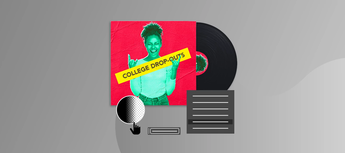
The 80s aesthetic has taken over the internet, and honestly, we're here for the retro revival! From bold typography to grainy textures and vintage print effects, everything old is cool again.
But have you ever wondered how those iconic retro visuals were created before digital design took over?
Back in the day, designers relied on a clever technique called halftoning, turning photographs into patterns of tiny dots. By varying the size and spacing of these dots, they recreated highlights, shadows, and depth, giving printed images their signature textured look.
And in the 80s, designers took this technique beyond traditional printing, embracing its imperfections to create bold, experimental graphics that defined an era.
Let’s recreate them in Photoshop by designing a record cover..
Step 1: Create a new square Photoshop document, I chose 2000 px X 2000 px, but you can use any size you want.
Leave the default parameters as is.
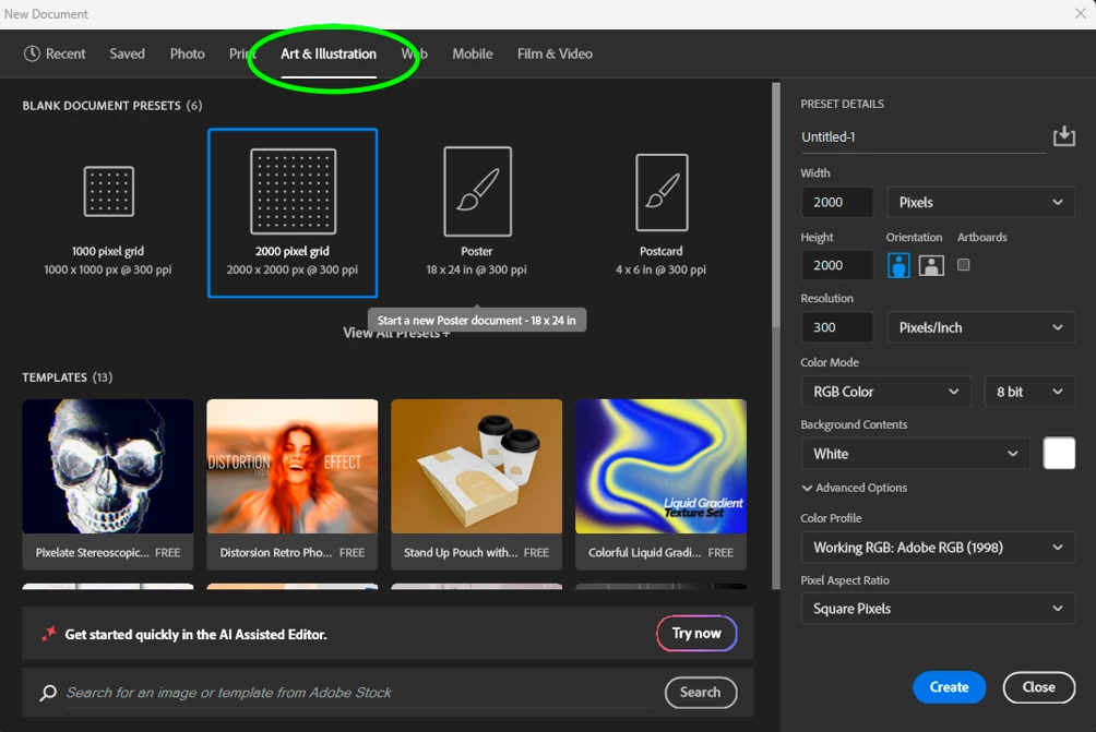
There’s already a 2000 x 2000 new file preset within Photoshop in the “art & Illustration” section if you need one.
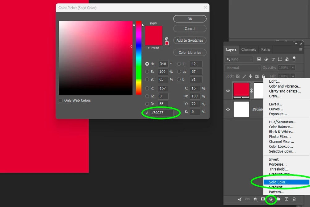
Step 2: Add a new solid fill layer (Layer>new fill layer>solid colour or click on the “new fill or adjustment layer” icon at the bottom of the layer’s panel), choose a saturated dense colour for maximum impact. Mine is #a70037
Step 3: Add your image on top of the layer stack by going to “file>place embedded”, and locate the image on your system. Resize using the handles and press enter to confirm and place. Holding ALT while dragging allows you to resize from the centre, making it easier to place accurately.
I downloaded mine for free on Adobe Stock - > #AdobeStock_273942975
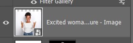
Top tip:You will notice that the file comes with a small icon at the corner. It indicates you are dealing with a smart object.
Smart objects are really useful as they retain all their original state and anything done to them are simply added dynamically. Any adjustment, filter and transformation can be reversed. It’s called “non-destructive” workflow and ensures that if you change your mind, you can still go back to the layer original state.
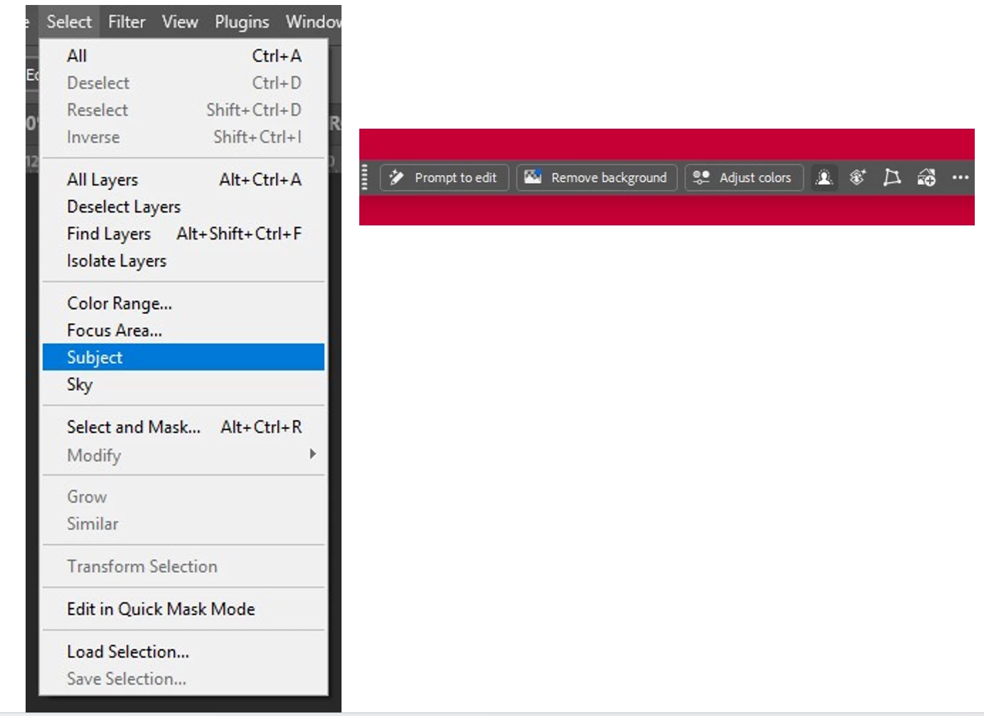
Step 5: We are now going to select the subject, allowing us to hide the background. Choose a method of selection of your choice, but the easiest is to use the “select subject” option, either from the selection menu, or from the contextual bar. You can also use the “object selection tool” (Shortcut W) and choose the “select people” option in the application bar at the top.
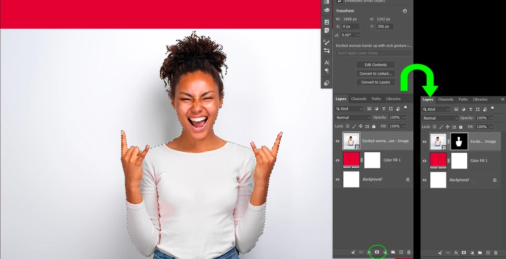
Step 6: Once the subject is selected in its entirety, create a mask from this selection by clicking on the “create mask” icon in either the layers panel or the contextual bar. Your image is now masked, with the mask hiding the background.
Step 7: Create a new solid white layer using the same method as step 2, and duplicate the mask from the image to the new solid layer. Do do that, simply hold ALT and drag the mask to the new solid layer. Be sure you select the mask first, and not the layer thumbnail.
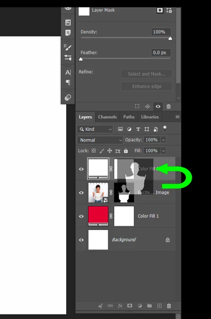
Step 8: Drag the new solid colour layer underneath the image. Wait until a blue double line appears between the two layers so you know your layer is correctly placed.
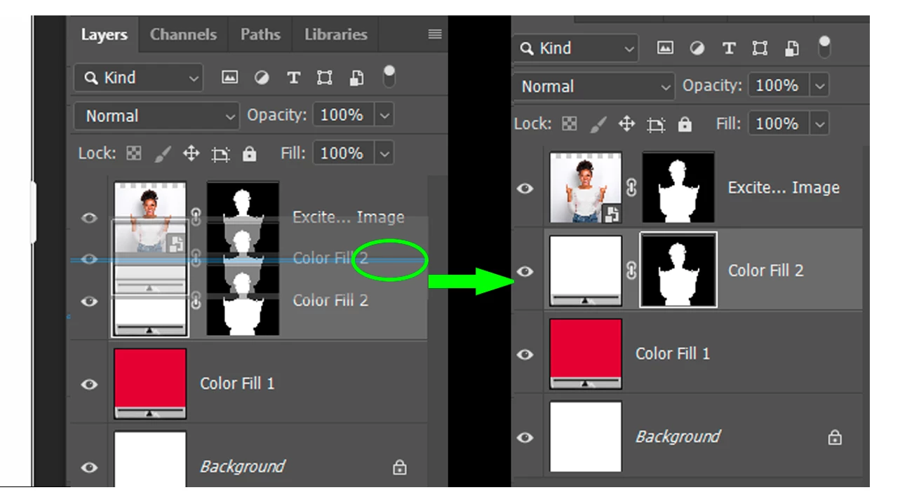
Step 9: Now we are going to add a slight white gap between the image and the bright background to mimick what is called a “registration error”, when the different colour plates on the printing machine are misaligned.
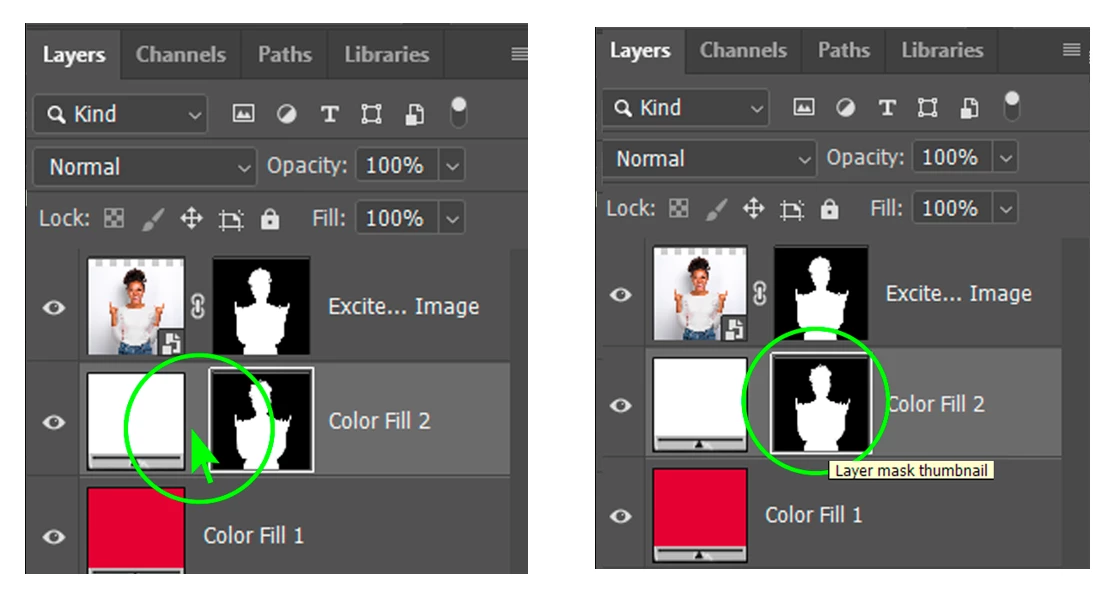
First unlock the link that binds the layer to its mask and select the mask (note the white border around the mask now it’s selected).
Now simply enlarge the mask a little (by a few %) by using the transform handles (CTRL/OPT+T or edit→ free transform) and nudge it to one side using the arrow keys of the keyboard. You should now see a white gap on one side of the image.
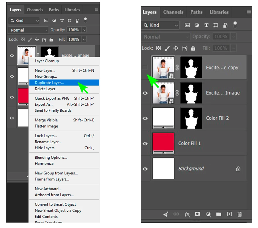
Step 10: Now go back to the image and duplicate the layer (either layer→ duplicate layer or drag the layer to the + sign at the bottom of the layers panel), hide it by clicking on the “eye” icon on the left side of the layer
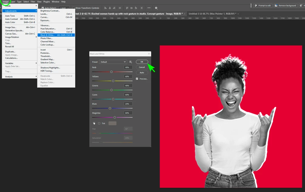
Step 11: Go back to the image layer below and turn it into black and white (image → adjustment→ Black and White), accept default settings.
Step 12: Lighten that layer until the white areas are washed out (image → adjustment → levels and then push the right rectangle (white) until most light areas loose their details, the exact number depends on your image but my white point is at 177)
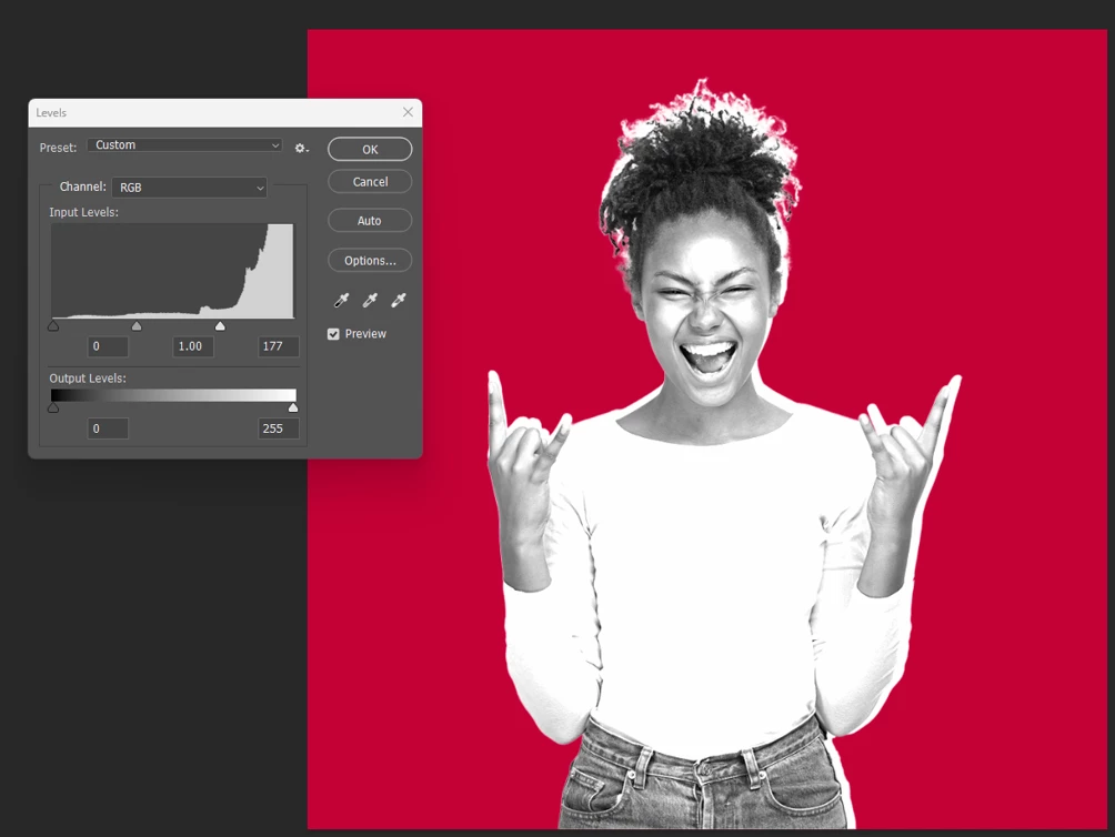
Step 13: Select the top, still hidden, image layer and show it by clicking on the eye icon again. Apply a halftone pattern by going to filter→ filter gallery → halftone pattern. Choose the different settings until you find something you like, mine are: Size: 3, Contrast: 40. Pattern type should be “dot”.
In the foreground and background layer, replace the default foreground with a bright colour that clashes with the original background of the artwork, I chose green #0b824c. Background should be white.
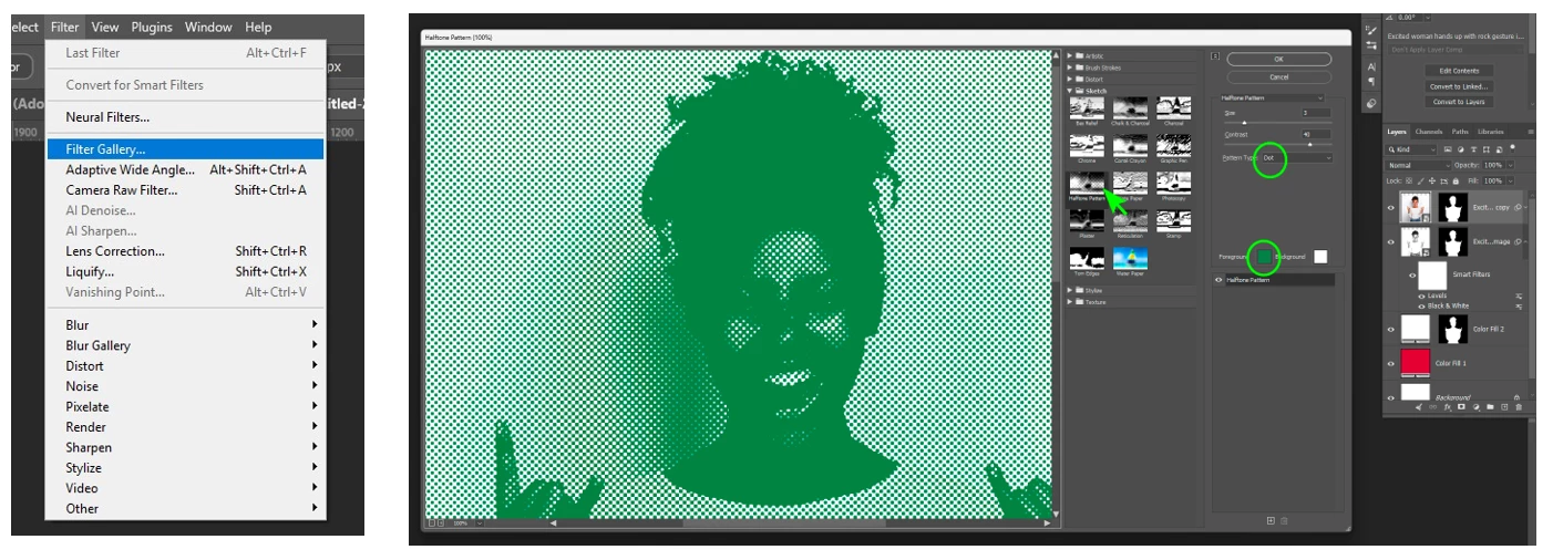
Step 14: Change this layer’s blending mode to “hard light” so the black and white layer underneath interacts more boldly with the top one, and lower the opacity to 75%.
Bonus Tip: You can add a worn out texture on top, for added vintage look simple by going to file → search Adobe stock and toggle the free search option, choose a texture of your choice and click on “download”. Resize, move and change the blending mode and opacity to suit.
The file I chose is #196393610 with a “hard light” blending mode and a 30% opacity.
Now add some type if you want to, you got a bona fide 80s record cover!
Join the conversation
Please feel free to share where you used these tips! I hope these tips were helpful. If you have any more questions or need further assistance on this topic, feel free to reply here.
 AdChoices