Community Manager
May 15, 2024
Question

Now in Beta: New Premiere Pro Spectrum UI

  • May 15, 2024
  • 32 replies
  • 26819 views

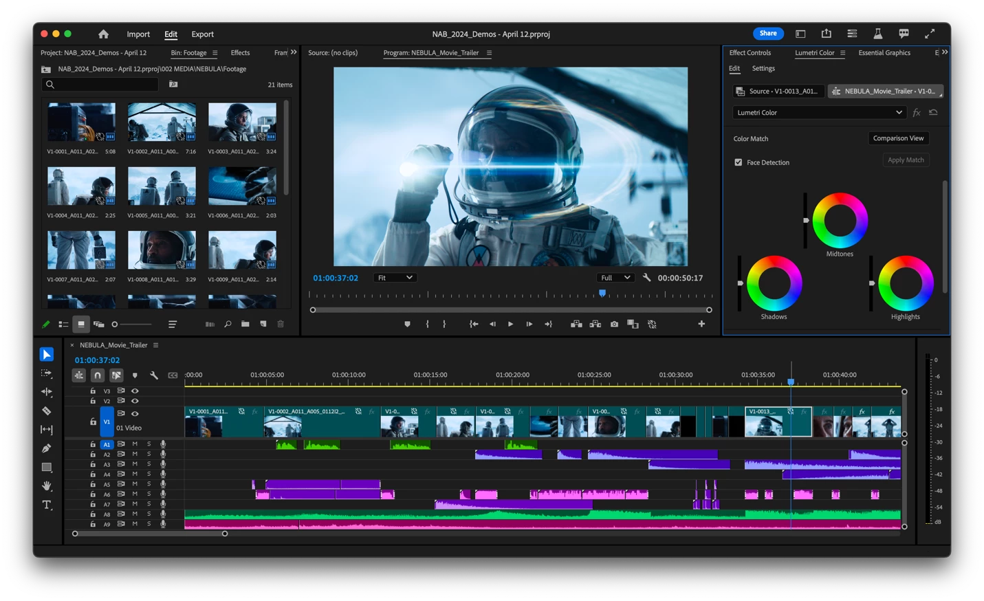
We’re proud to announce a new look for Premiere Pro!  In Beta — available today — Premiere Pro is themed and styled using Adobe’s Spectrum design with a new modern look across the entire app. 

Premiere Pro now includes three different themes: Darkest, Dark and Light. 


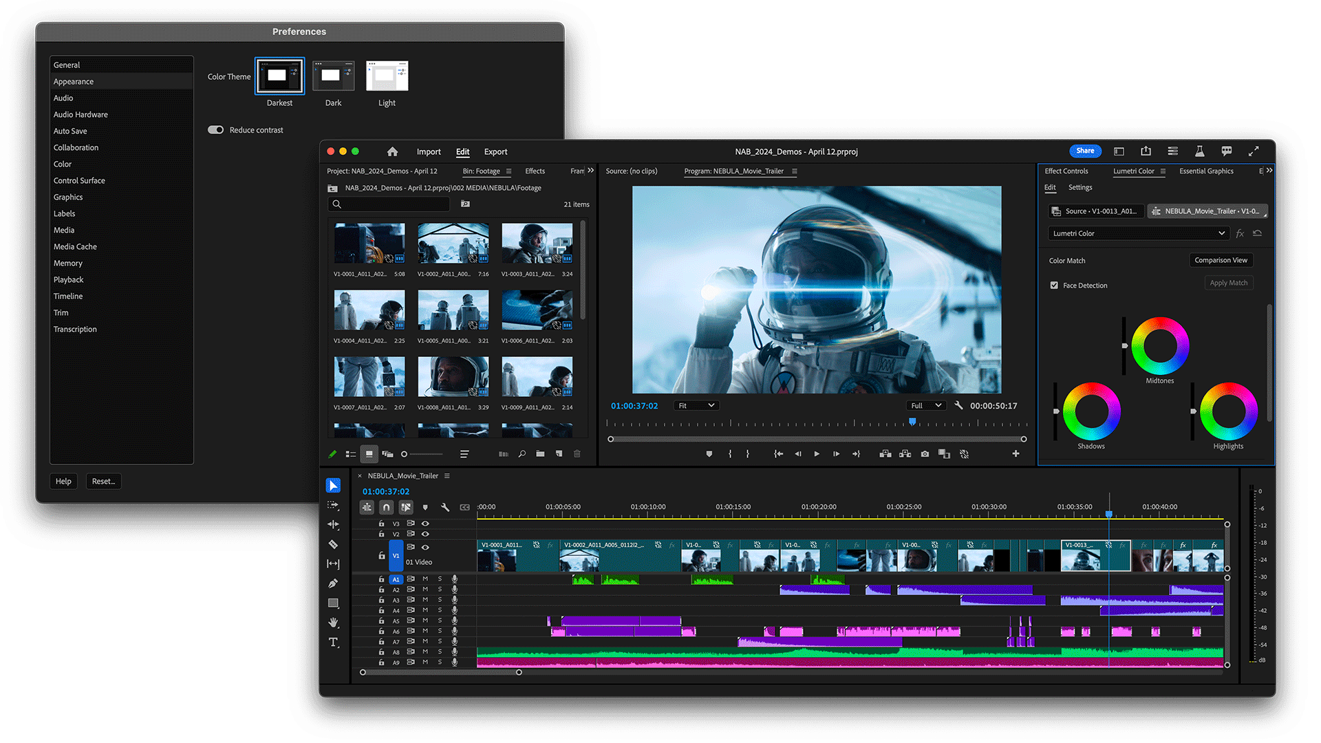
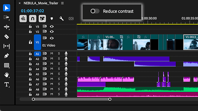
There’s also a new toggle for switching between a high-contrast mode for easier visibility and accessibility or a low-contrast mode for focusing on your content. 


With this design system in place, you’ll see more visual continuity across Adobe applications, better legibility, and easier UI interactions. The Spectrum design system unifies Adobe’s app design behind principles that make it inclusive, scalable, and focused. 


Questions to our beta community: 

  • Is there one theme you prefer over the others? 
  • Do you switch between themes? 
  • Is there anything you miss from the previous interface design? 
  • Is the new design confusing or distracting? If so, in what way? 


We want to know what you think.  Please join the conversation below.  

32 replies

Known Participant
June 13, 2024


Is the Audio Track Mixer ever going to get any love? I imagine that hideous dark grey to light grey gradient isn't part of the new Spectrum guidelines 😉

Everything about the top Effects & Sends section feels like the UI hasn't been touched in decades. So many awful gradients

The whole mixer also scales down very poorly and has a very large max height (with Effects, and inevitably Sends open). The first thing that gets shrunk vertically when resizing is the faders, which isn't great.


  • I use audio effects all the time, but I don't really need to see 5 slots at all times if I'm only using two effects
  • I have almost never used even one of the 5 sends that are permanently open. Let me twirl close just the sends themselves?
  • Shrink down the panning knobs before starting to shrink the volume sliders? They're pretty large
lbernier
Known Participant
June 13, 2024

Overall, the UI design finally looks consistent. I like the new color scheme and appreciate the option to customize UI and label colors even more. However, I believe there's room for improvement in the Timeline, which is where I spend most of my time. Please note that I'm not a designer at all, so I'll try my best to explain myself.


  • The removal of the colored FX badges results in a lack of information at a glance.
    There's another well-supported discussion here that elaborates on this issue.

  • The way waveforms are highlighted seems inconsistent and creates an unpleasant contrast.
    Looking at the audio tracks, it appears the new design prioritizes labeling the rectangle itself over the waveform, creating a need to choose between highlighting or shadowing the waveforms, and all of that happens on clips sometimes side by side. New design:

    To me - and I think for most of us - the waveforms are an important visual representation when editing, and for that reason, I like them to be prominent. In the old design (when waveforms are visible), I prefer how it mutes the background color to make the waveform color the same as the labels. Old design:

    Applying the previous design principle to the new "Vibrant" color scheme for instance could look like this:

    Or highlighted if it has to be (not my favorite) : 

    Plus, I think the brightness tolerance for white text to switch to black could be higher.

  • The Production Panel looks different from the others.
    It feels like we were in a transition between old and new UI with the introduction of the Text panel. Now that everything looks consistent, I just noticed the Production Panel has a darker area, which seems unnecessary since the Project panel and all the others don't have it.

Hope it helps and users can relate!
Cheers!

Inspiring
June 6, 2024

meant to post this on the AE spectrum thread. 

Ann Bens
Community Expert
Community Expert
June 1, 2024

Highlighted stopwatch is hard to see


Participant
June 5, 2024

What happened to be able to customize the UI colors. I used to be able to change the accents to another color so it was easier to see.


Gabby16bit
Known Participant
May 26, 2024

Also a thing Premiere Pro should try to do is gives us the Option to make Clip Edges Round and not Squared. Like more modern softwares like capcut and davinci. I Prefer this look, so having an option for that would be nice!

Inspiring
May 22, 2024

I see in the latest v24.6 beta (24.6.0.001) audio waveforms no longer render on the smallest track size. If this isn't a bug can we at least get an option to turn this back on?? As someone constantly using 5+ lav tracks, condensing audio tracks is an essential part of my workflow and just losing those waveforms is crazy.


new

previous beta


Community Manager
May 23, 2024

Thanks Tom!  I've logged this for us to take a look.

Inspiring
May 22, 2024

I've been trialling the new beta Spectrum UI a lot in the last week on a longform project and it is generally really nice and looking forward to using and training with it. I definitely prefer "Dark" with Reduce Contrast on. (I really have no idea why anyone would use the light version).

My main points are about the new Labels in combination with the new audio timeline. Whilst I welcome this new functionality, I feel it is a bit convoluted to understand and I suspect it is going to throw quite a lot of people.

1. In regard to the new Audio Clip Header, whilst I can see this being useful in certain situations, in general I think I will just find it distracting. Would it be possible to just be able to toggle it off? I realise you can do this for Small Tracks only - I'd love to be able to do this on any sized track. I am also aware that if you turn off all the elements, such as FX badge, name etc, you can effectively hide the Clip Header but I'd like to be able to do this in one click but still be able to see the clip name.


2. Would it be possible to move the "Audio Waveforms Use Label Color" fucntion from the flyout menu to the wrench menu, which to me would seem to be its natural home.

Thank you

Adobe Employee
June 14, 2024
quote

(I really have no idea why anyone would use the light version).


I also prefer dark UI not only in Premiere (I personally use the Darkest theme) but also in most of the apps I use.

But to my surprise I found myself being glad to have the new Light theme when using a projector in a room with a lot of natural light, which I had trouble with in the past even with the lightest gray you could reach with the old brightness sliders.


And thanks for the feedback about the audio clip header and waveform customization!

The team is actively looking into these things, and will send your comments to the relevant team members 🙂

Ann Bens
Community Expert
Community Expert
May 20, 2024

Text from the (blue) guides in Program window are most of the time unreadable with this new UI.

4K monitor, PM set to fit. Dark mode, contrast turned off.

I often move guides around for positioning assets.

stasym
Known Participant
May 18, 2024

- Track locking and unlocking is less visible at the left side of each track. I think a locked track icon (on the left of each track) should be accompanied by a more distinct locker.

- Also, when there are two Subtitle Tracks, now the track eye icon is not blue, so it is more difficult to distinguish between active and inactive subtitles.

Aiden Soave
Inspiring
May 18, 2024

ive made posts about this before but. can we just improve overall timeline performance? if the timeline can run at speeds like other editing softwares. running at Monitor native framerates. and not lagging at all.