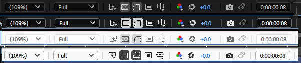
Accesible color contrast not very accesible for transparency icon
Please improve the appearance of the transparency grid icon when enabled because you can not read it otherwise. The checkerboard pattern disappears cognitively while it's enabled.
Observed in both dark and light modes. See below the differences. Contrast on the icon is actually reduced while in accessible contrast mode compared to that mode being turned off.