
P: Interprets colors differently than Photoshop 2017
[Edited: No one has commented on, or perhaps even read, my post below, which means that I can still edit it. So I changed the title from the more sanguine "Photoshop CC 2018 interprets Vibrance/Saturation layer differently than CC 2017."
I think that this bug is a complete show-stopper. If Photoshop 2018 changes the colors, and the effect of flattening, compared to Photoshop 2017 and earlier versions, then I can't use it. And I find it surprising that others can use it, at least on images that were edited with earlier versions.
Perhaps I am being overly shrill — I would love it if someone would check out and confirm or deny that this is a widespread bug.
My original post follows.]
I installed Photoshop CC 2018 (Macintosh, Sierra v. 10.12.6) and I find that the colors displayed in a file are different than they are in Photoshop CC 2017. This makes it impossible for me to use Photoshop CC 2018.
I have a test file with two layers — an image and a Vibrance/Saturation layer. The file is in 8-bit Pro Photo. I have one color sampler in it (set to 5 x 5 in both versions of the program). If I turn on the Vibrance/Saturation layer, the colors are much less saturated in PS CC 2018 than in PS CC 2017. There are also small differences in hue. The following table shows the differences seen: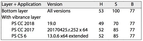
This difference can also be seen visually, and if you show out-of-gamut (CMYK gamut) colors the areas shown are different between the two programs. And, if you flatten this image, the values shown in the two versions of the Photoshop above are "baked into" the file — which means that the difference I am seeing is not a difference in reporting HSB values, but is a difference in interpreting a Vibrance/Saturation layer.
The file, and versions flattened in PS CC 2017 and PS CC 2018 can be found at https://www.dropbox.com/sh/35yds87iocpglup/AAAd-QVKoztY2HDxonkgxXQca?dl=0
It would be great if someone else could test this bug report and see if it can be replicated on other machines.
