
This is that intuitive UX that truly sets Adobe apart from the competition
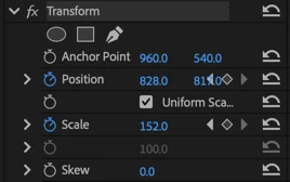
I keep having this premonition that the last thing I see before I die will be these keyframe buttons overlapping the values. It may kill me. Look how much whitespace is wasted. I can't even say there was NO thought put into this, it's like there was negative thought put into this. I also love how expanding the collapsed Position group feels like it should fix the problem by putting each value on its own line,
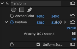
but no.
Been a Premiere user for 15+ years, at what point does this UX go from making me want to take a bath with the toaster to being nostalgic? Nobody can convince me this fix is not a 15 minute enhancement by a senior dev. The product team just needs to find the will to....improve their product.