UI Alignment Issue on Adobe Careers Page
Hi Team,
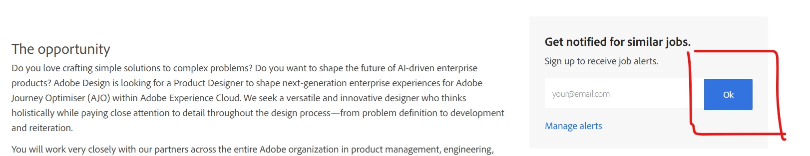
I was exploring UI/UX design opportunities on the Adobe Careers website and noticed a minor alignment issue. While scrolling the page, I found that the email input field and the button are slightly misaligned, likely due to a height inconsistency.
I’ve attached a screenshot for reference. You can view the page here: [Careers]
Thought I’d share this in case it helps improve the user experience.
Best regards,
Shashi Shekhar Pandey