
Properties window text issues
Overall, the 'Properties' window was a good addition to my workflow as it condenses parameters that are normally spread across different panels into one place. However, rather than being redundant copies of other panels, 'Properties' has its own version of them that are slightly different enough to be annoying and confusing. For example, I was having a difficult time figuring out why a stroke on a font wasn't blending the same as another layer with the exact same parameters. It turns out that faux bold was turned on but that wasn't immediately obvious because the 'Text' sections of the 'Properties' panel is different enough from the standalone 'Character' panel that faux bold and faux italic are hidden in a dropdown menu instead of being selectable buttons like in the 'Character' panel.
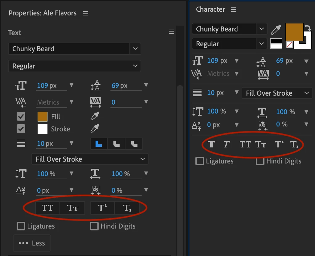
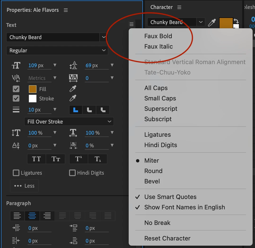
I'm all for having fewer panels open and for appropriate layer parameters and variables appearing in one easy place, I just don't understand why what appears in the 'Properties' panel would look so different from the standalone panel it is pulling from. This seems to defeat the purpose of the 'Properties' panel by changing the familiar functions of the original panel its pulling parameters from.
