
Menu Appearance is Inconsistent with other Adobe Products (Win11)
Hello all,
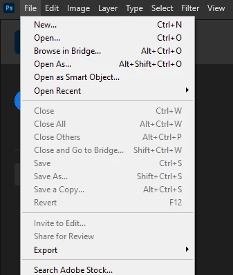
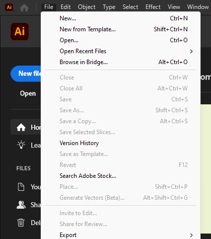
I'd like to share a frustration/feature request I have with the Photoshop UI. On Windows 11, when moving between Photoshop and, let's say, Illustrator, the pull-down and context menus appear differently. Illustrator has the clean, spacious, rounded look of Windows 11, while Photoshop has the- in my opinion- more crowded and harder-to-read Windows 10 menus. See the photos below.
I asked Adobe Support if there was an option to make Photoshop's UI consistent with the look & feel of the other Adobe apps. They said that this difference is by design. But... why?
If you use Adobe on a Mac, all of the apps have an identical look & feel. Why not on Windows? Why does Photoshop look like it's running on a different opperating system? I know I'm nit-picking, but when I have these programs open side-by-side, the differences are distracting. And, the menus are harder for me to read in Photoshop.
I recognize that Adobe won't force a whole new UI on their users, but please, just give us the option. All I'm asking for is a little "Windows 11 Menus" checkbox under preferences that will give me peace.
And, while we're at it, can we please have dark menus on Windows? Why is this exclusive to MacOS?
That is all. Thank you for indulging me.
Windows 11
Ps 25.12
Ai 28.7.1