Known Participant
June 2, 2012
Open for Voting

Photoshop: Make "Blend Colors Using Gamma" a document setting

  • June 2, 2012
  • 28 replies
  • 3043 views
"Blend Text/RGB Colors Using Gamma" should be a document or layer setting instead of a global setting. The user should have the ability to set the default option. There could still be a global setting for documents that don't have specified gamma blending settings.

Here's a simple scenario:
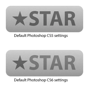
A designer makes a graphic in Photoshop CS5. The Star shape and text layers are each set to black with layer fill set to 45%. All Photoshop color settings are at default. The file is sent to a user with CS6 or the designer upgrades to CS6. The Shape and Text layers no longer look the same. Mass confusion.


The current settings are hidden away, like they aren't supposed to be messed with, yet I am seeing recommendations to disable Blend Text Colors Using Gamma: http://bjango.com/articles/photoshopc...

I was tempted to label this as a "Problem" rather than an "Idea."

There are simple workarounds for this issue, but you can't expect users to know what is happening in the first place, especially with how well hidden the gamma blending preferences are.

28 replies

Inspiring
February 24, 2017
Second this comment. We create text lockups to be used in multiple designs as linked smart objects. If any text within these smart objects has transparency, then it looks lighter than live text with the same transparency on it.
Participating Frequently
July 6, 2016
Instead of making a new post I want to chime in here. I see most people here are commenting regarding the gamma setting for text objects, but I want to focus on the "Blend RGB Colors Using Gamma" setting (a setting that *could* be useful but is currently poorly implemented).

That setting *really* is something that should be possible to enable per document, or per layer (like in Affinity Photo). Yes, it is an advanced feature and should be labeled as such (and disabled by default).

Gamma 1,0 gives the most correct/realistic blending of colors, and thus this is a setting we should have available. Right now, if you want to blend a single document using Gamma 1,0 (without converting to a linear color profile) it will not only affect your current document, but it will mess up the appearance of every layered document created since the dawn of time. That means you have to dig into the settings and remember to enable/disable it manually when switching between images. Not nice.  

It also means that if you create a document relying on custom gamma blending and send it to someone, it will render wrong when they open it (as on their computer the setting likely isn't turned on so it blends with the gamma defined by the color profile instead). Photoshop should know what settings a PSD document was created/saved with.
December 18, 2014
Chris, it makes sense that this is a bug fix, and it would be great if it ONLY affected the anti-aliasing. But it's not a complete fix and that's what's ticking us users off:
1. Gamma blending also affects transparent text, making resulting colors unpredictable.
2. Rasterizing text outputs the 'raw' un-gamma'd pixels, again making text appearance unpredictable.
3. Same goes for Smart Objects - text appearance changes when converting to Smart Object.

I think that text looks better, but the inconsistency is a killer for a UI designs where I'm using smart objects regularly My 2 cents...
December 17, 2014
As a UI designer, I've been really taking advantage of Photoshop CC's expanded SmartObject features; like linking external files and exposing SmartObject's layer comps to the parent document.

However, any text used in smart objects looks jagged and harsh, comparatively.

This might be due to the font I'm using, but the sudden change in blending is disconcerting.
December 17, 2014
Agreed!

It's maddening to have text layers look one way when 'native', and completely differently when rasterized or converted to smart objects.
Wolfgang Bremer
Participating Frequently
December 4, 2014
So, Adobe, how will this be addressed? The current situation is terrible.

I simply cannot use the same amount of transparency for text and a different kind of layer and expecting the same color result? This is not only sad but a terrible UX.

Please, please, please fix this.

Thank you so much!
Wolfgang Bremer
Participating Frequently
December 4, 2014
Thanks! But that just means there basically is no solution to this terrible issue. Quite sad.
Inspiring
December 4, 2014


Why does a text-layer look that different to a form or a pixel-layer. The color and opacity settings are identical for all layers. I didn't noticed this behaviour in previous versions than CS6.

Wolfgang Bremer
Participating Frequently
December 4, 2014


I created a shape, using #005eb8 as border color and set the opacity of the whole layer to 50%.
Then I created a text, using #005eb8 as color and set the opacity of the whole layer to 50%.

Looking at both next to each other, the colors look very different. The text way more purple-ish, the shape way more blue.

Then as a test I added a layer style to the font, coloring it again with #005eb8 through the layer style. Same result.

Now, when I rasterize the font layer keeping the layer style, suddenly the difference vanishes for this layer and suddenly the color of this layer looks just as blue as the color of the shape, and not purple-ish anymore

How's that possible? Please fix this!
Known Participant
June 21, 2013
I was very disappointed to see this has not been alleviated in any way in Photoshop CC, especially with the introduction of better text anti-aliasing. Over the past few months it's caused a whole slew of problems for me, for example...

1) Making simple things like matching the opacity of a shape and a text layer like in David's original example way too cumbersome.
2) Making it impossible to share documents with people on different versions of Photoshop (or just with the setting turned off!).
3) Preventing developers I work with from directly taking the opacity values I set for text layers to use in web or UI designs.

Please do something about this, Adobe.