

Open for Voting
Accessible color contrast slightly too 'accessible': reduce row lines
Hi,
I welcome the "Accessible Color Contrast" mode and use it in After Effects because without it feels to have way too little contrast for text/icons compared to previous UI design.
What I really struggle with in Premier Pro though is the fact that row lines are accentuated too much making it actually harder to read imo because the lines distract you.
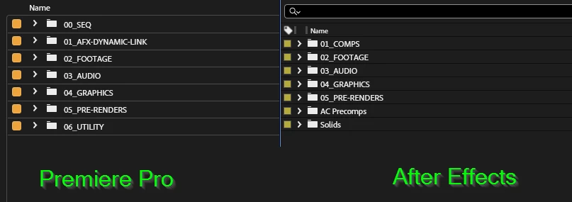
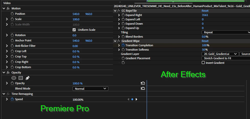
It would be nice to adjust this to match the appearance of the Accessible Color Contrast from After Effects instead for the project panel and Effect Controls window.
