
UI DESIGN!! Dark context menu in PPro and design fixing (menu, roundness on timeline) and etc.
Hello Adobe Community. So, when I am working with Adobe Products, I prefer "dark theme", but why context menu in white(I am working on Windows 10)?
Okey, you will say "On Windows the contextual menus have always been white", but why in Avid MC and DRV they got own context menu with dark theme?
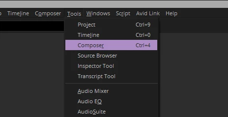
And I think, will be great to create a "new context menu design", because on Mac and Windows they got differect menu
But why you cant create a bar menu like in DVR, because for DaVinci is doesnt matter wich OS do you use


And about this roundness on timeline. Right now I'm working on a trailer where I have a lot of cuts and, frankly, it's impossible to see the cuts when moving away from the timeline, click on the file without pressing the fx button.
Yes, you took these roundings from DaVinci, but even there it's not done very clearly and well. Previously, when there were straight edges, the fx button was normal - no complaints at all. Now yI have to think, is there a gap between the clips or is it because the design is so new and incomprehensible. The new fx button is not intuitive because before when using this or that effect, it was displayed in color (yellow, green, purple), now it is impossible to understand what is applied, plus since this button was not active, then when selecting a clip I did not think whether I pressed this button or not, now I select a clip, but in fact I press the fx button and the effects control panel opens, which is annoying and I have to turn off the display of this button altogether, which is also not an option, because I want to see in which clip I applied the effect and in which I did not.
