MarketingGD
Participant
February 1, 2021
Answered

Problem with the capital letter 'I' not viewing properly

  • February 1, 2021
  • 3 replies
  • 2580 views

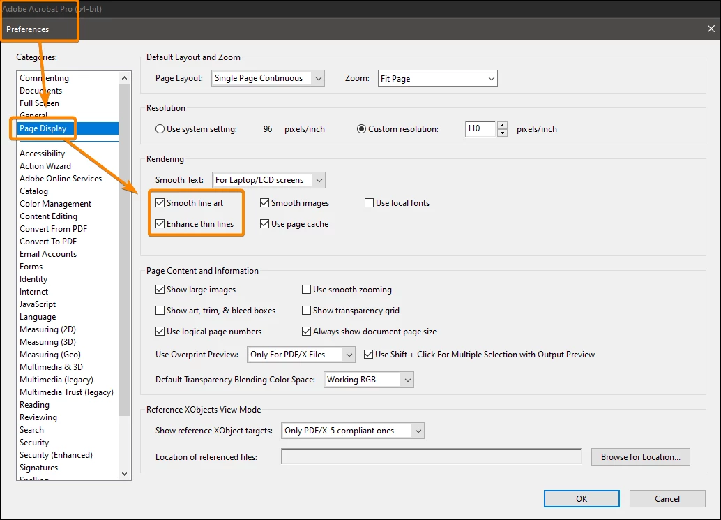
I've seen this happen for a few years now when converting documents from AI / EPS / or INDD to a PDF that the "I's" look larger almost thicker. I've heard that this is just a viewer issue. I've seen it tend to happen on Sans-Serif fonts like Avenir and Myriad Pro? It looks fine on my system, but co-workers are seeing something completely different? When it goes to print it looks fine, but sometimes it just views badly.  I had someone send me a screenshot this morning

Is there something on my end that I can do to help prevent this from happening?
Things I've tried
  - Converting fonts to points

  - Not converting fonts to points


Any advice would be greatly appreciated!

This topic has been closed for replies.
Correct answer JR Boulay

You should try with or without these settings:


3 replies

JR Boulay
Community Expert
JR BoulayCommunity ExpertCorrect answer
Community Expert
March 29, 2023

You should try with or without these settings:


Acrobate du PDF, InDesigner et Photoshopographe
Participating Frequently
March 29, 2023

oh yes good point I forgot about the preferences settings options.

Participating Frequently
March 28, 2023

If you have to convert to pdf to show a client, just add an extra anchor point on each long line of your CAP 'i's in illustrator/indesign , this foxes the pdf conversion and views correctly when converted to pdf.

Legend
February 1, 2021

This WILL happen if you convert text to curves/outlines, and the font contains any characters that are pure rectangles. The solution is to never, never convert text to curves/outlines. There are many myths which say this is needed, almost all are false. If you aren't converting to outlines there are some more subtle causes; don't save as PDF 1.3, PDF/X-1a or PDF/X-3 if you use transparency.

MarketingGD
Participant
February 2, 2021

I'll try that out, probably happening because they are pure rectangles. Most of my press printers require converting text to outlines. Most of what I'm designing is going in local newspapers and magazines. Some things are digital, but that whole process has enough issues for another day. I'll go with the standard PDF Press quality (Saves Acrobat 5, 1.4) for now and see how it goes.

Speaking of transparency and PDFs...like the I's only sometimes will there be funky boxes around my graphics. Most of the time they are just in the viewer and don't print, but that is a scary moment when the postcards come in. I've gotten used to double-checking my transparency settings are always on the highest setting possible, just wondered it if was possibly a similar issue.