AwayWeGo50
Participating Frequently
February 28, 2022
Question

Fixable in Lightroom or Not?

  • February 28, 2022
  • 5 replies
  • 273 views

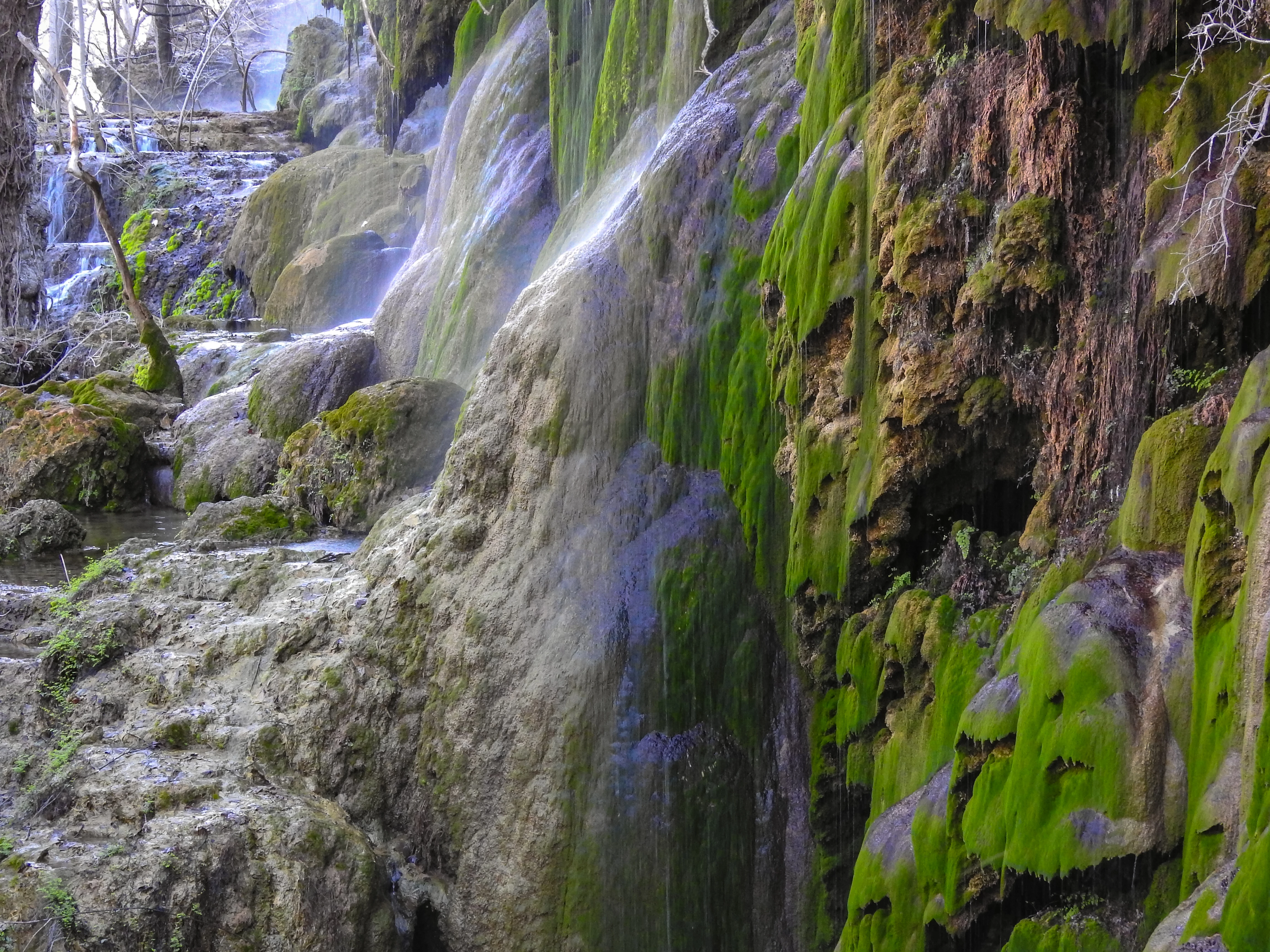
First, let me say thanks to everyone here as I have learned a lot recently from reading through posts and examples. Now I get many more approvals and few rejected. I ask your critique on this photo. I like this waterfalls pic but haven't submitted it yet cause I don't think it will get approved. It's not as sharp focused throughout the range as I would like. I've made some adjustments in Lightroom but don't think it's enough. Is it fixable or not? Give me your goods and bads please. Thanks in advance.

This topic has been closed for replies.

5 replies

AwayWeGo50
Participating Frequently
March 1, 2022

Thanks for the suggestions. I tweaked it a little more and got rid of the purple. I didn't even notice the purple in it. But now with the change, it does have less of a "fantasy" feeling to it. I still like it though and will submit it. Who knows, maybe I get lucky and it's accepted. Don't know if I will ever get a chance to get back to that area to try it again in the morning instead of mid day.

smaasteve
Inspiring
February 28, 2022

Nice photo! Here's 2 things that might work in Lightroom Classic:


HSL/COLOR

  1. On the right tool pane, select HSL/Color
  2. Select the Hue tab
  3. It will take some doing, but I've had luck, at times, redefining various colors to turn something to a more natural shade.


MASKING

  1. Navigate to the top of the tool pane and select the dashed-line, shaded circle, or masking icon. (Shift/W)
  2. select brush, then in the context box toggle the "show overlay" box
  3. your pointer should now be a round mask-painting tool with a double line. The inner is the brush size, the outer the feather (effect transition) size. 
  4. Once sized appropriately, paint over the purple selections, adding them to the mask--will be a bit painstaking.
  5. once they are selected, begin to adjust temp/tint/hue/saturation. One or all. I'll bet you can adjust the purple to something that doesn't stand out nearly as much and still looks real.


Of course the best way would arguable be to send to PS and use replace color.


Hope that helps!

S

Nancy OShea
Community Expert
Community Expert
February 28, 2022

I agree with other comments.  I really like this subject.  But there's too much purple, probably due to seasonal atmospheric & lighting conditions.  I would make a copy and play with correction settings.  But don't spend too much time on it.   If it's not good enough for Adobe Stock, it might get accepted by another agency.


Good luck!


Nancy O'Shea— Product User & Community Expert
Ricky336
Community Expert
Community Expert
February 28, 2022

Hello,

What's with the magenta/purple water colour? It will be rejected as it stands for sure!


reedesign1912
Inspiring
February 28, 2022

@AwayWeGo50 going through past posts is a great way to become more critical of our own works.  It's great to hear your refusal rate is going down - good job!  I would say your instincts on this one is correct and it is doubtful this one would be accepted.  I think the photo was rather noisy to begin with and with a lot of noise reduction you get a "painterly" type of image which lacks a lot of the fine details.  I also think the white balance is off - the water looks to be a very unnatural blue colour.


It looks like a great scene and hopefully you can make it back there and have another go at it.

Rob R, Photographer