OK, so it seems that images are not vetted based on a strict set of criteria as mentioned above but rather mostly subjective with internal justification loosely using the set rules.
First batch reviewed 4 out of 4 rejected
Second batch reviewed 12 out of 12 accepted
Third batch reviewed 3 out of 3 rejected
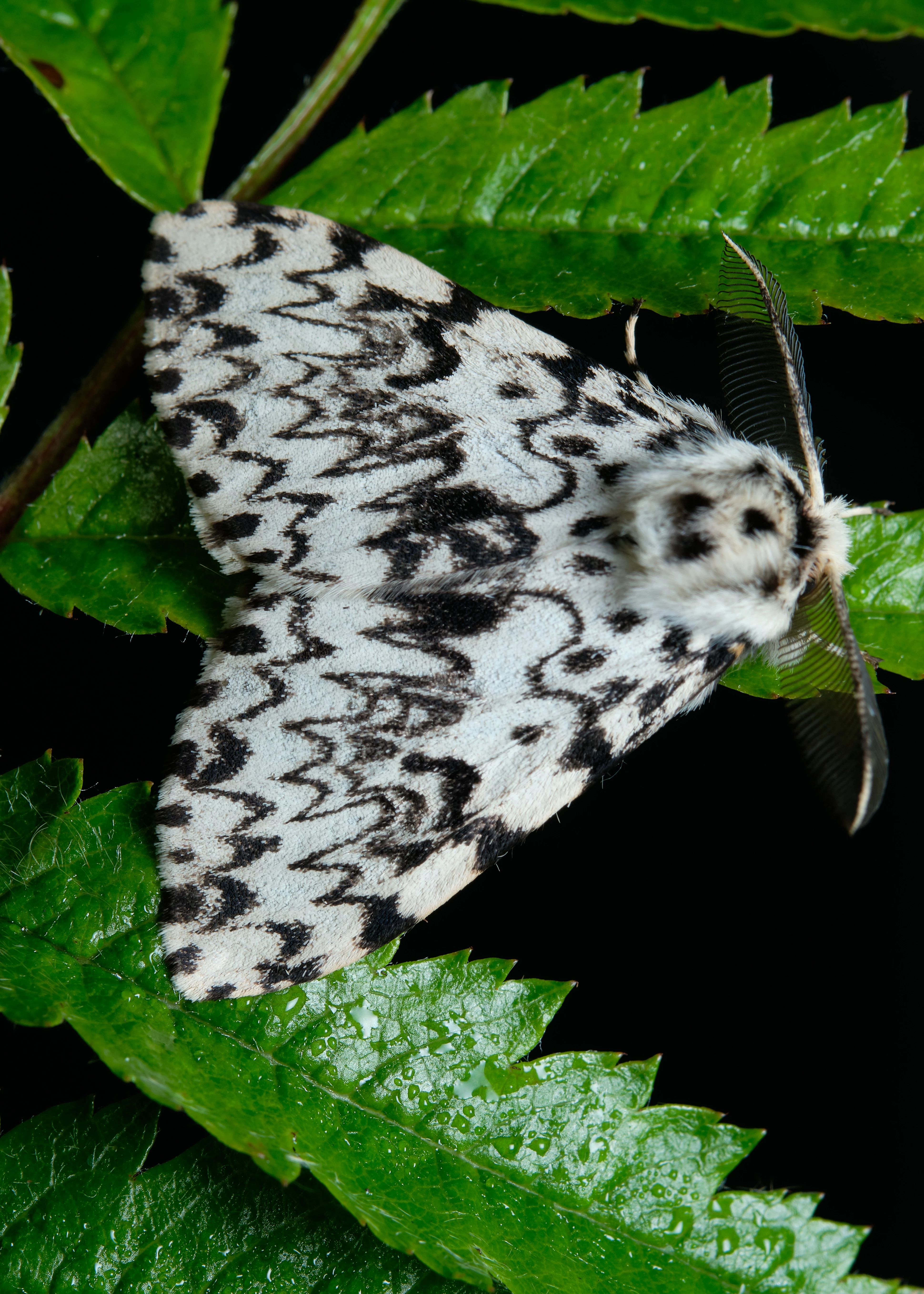
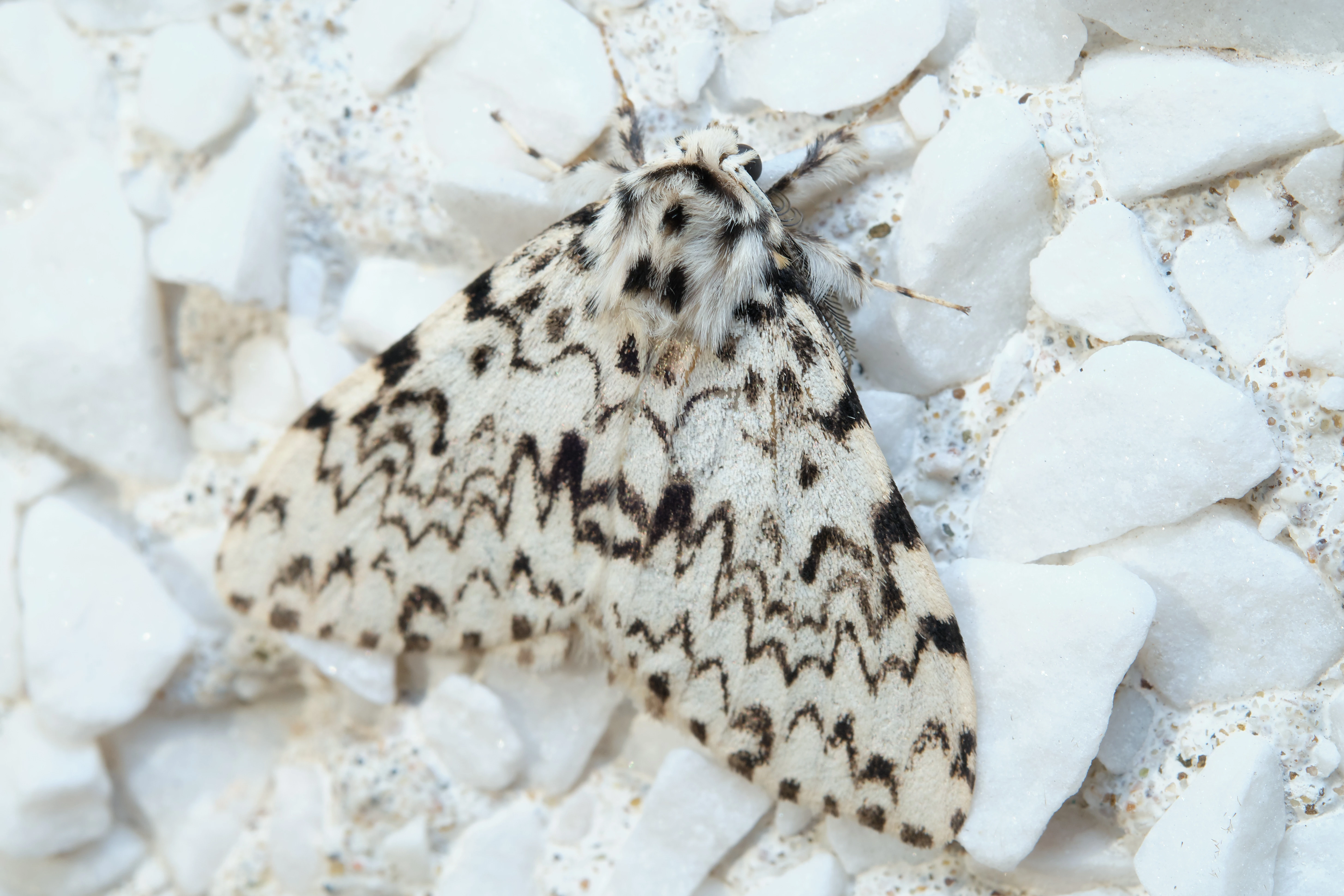
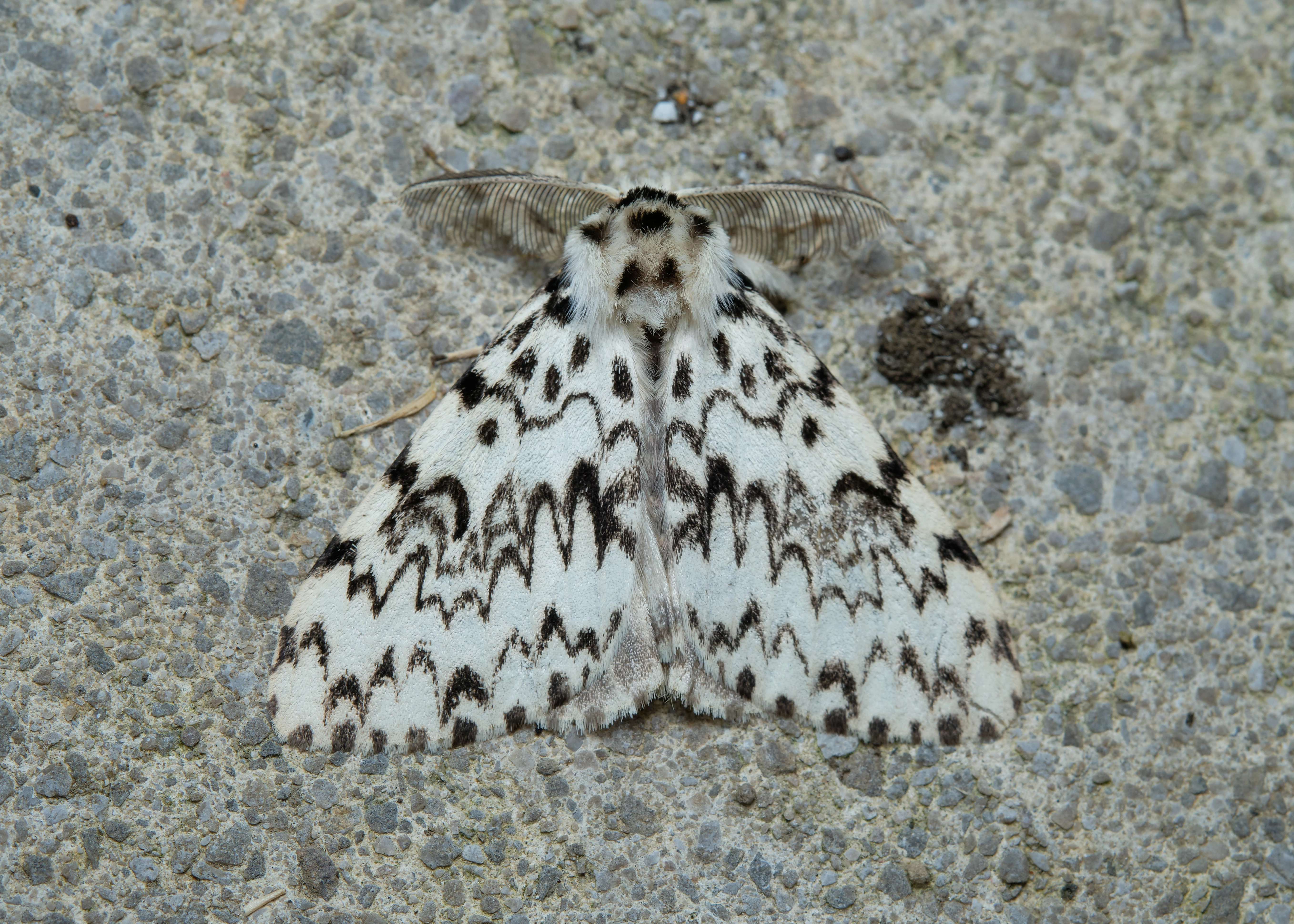
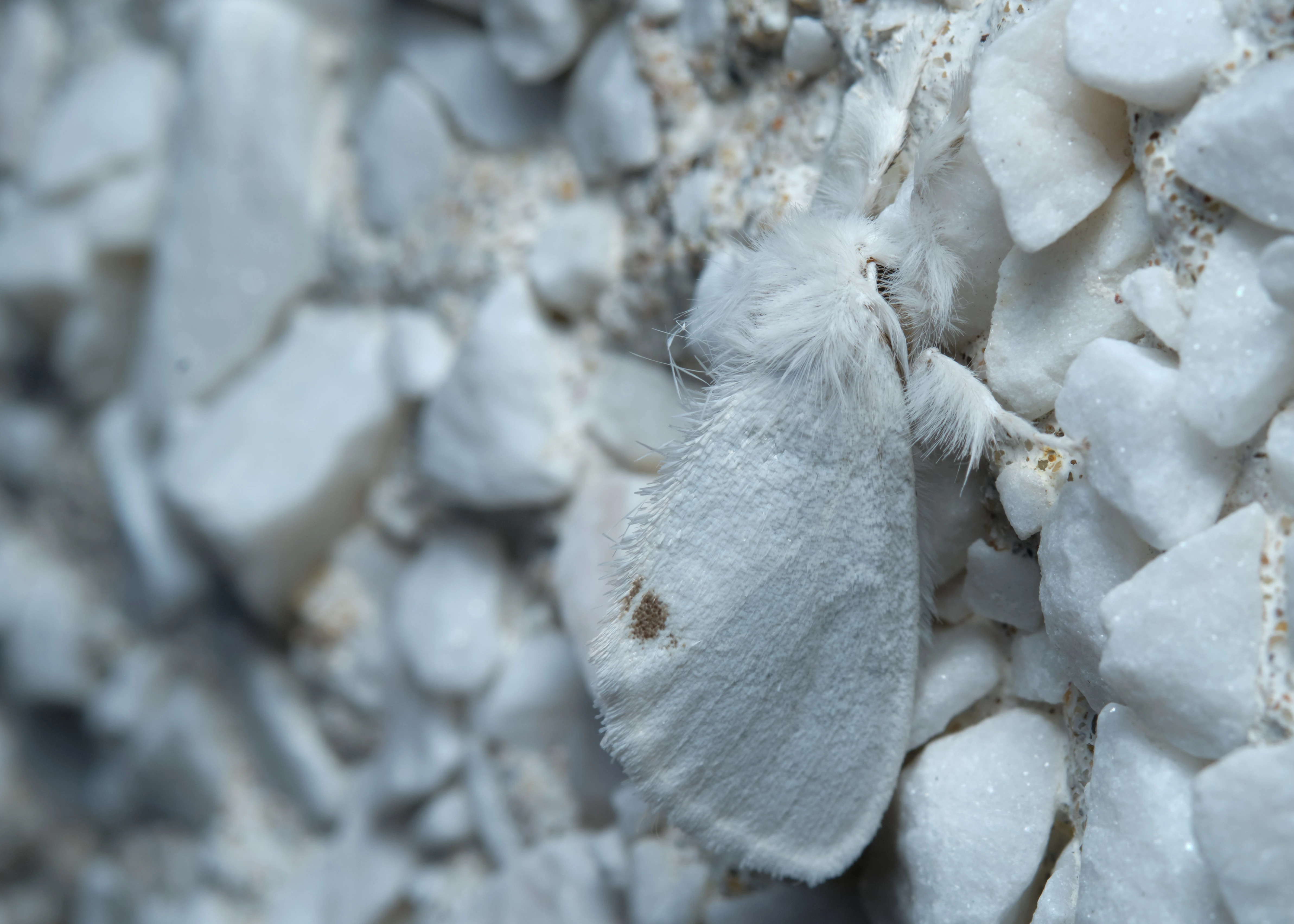
ALL images taken with the exact same settings, equipment and techniques, all at the same time (well at least within 1 hour of each other), rejected and accepted images share the same attributes (shallow depth of field due to being macro shots, closely cropped etc)
Obviously they're not all perfect images and some images could have been better, very frustrating vetting method and I use the term method lightly as there appears to be no dicernable methodology involved making it impossible to improve/change
So, it's pure "shotgun" approach for submission and re-submit those where reason is not clear at a later date