Answered

This topic has been closed for replies.
Hi,
You middle picture is probably the easyest. No details. THere are white patches and the pink structures, cables going to nowhere. Awful compression artefacts (well those could be introduced by publishing low resolution and quality pictures here, but I can only comment what has been presented here...). A picture like this needs to have fine details natuaral lights and careful editing.
Picture one: it's out of focus and I see chromatic aberration in the net. Alse the whole picture is to dark. If you are looking into the histogram, a whole range of information is missing:
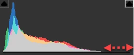
You see also a lot of noise, especially on the book.
The third picture is overprocessed: to much sharpening applied. There is a bad framing/cropping of the picture: the glass is cut off, the table sheet is not straight. As there is a clear geometric arrangement that should be respected. You should allow for some space between the main subject and the border of the image so that a potential buyer can do his cropping according to his needs. Also, the exposure is slightly of, this time the highlights are to prominent (reflections on the plate). The midtones could get a little push. If you do that, you see that the taple cloth is not perfect on the table. It should be perfectly stretched on an image like this.
(I'm moving this to the Contributor forum for more critiques from expeienced contributors)


Sign up
Already have an account? Login
To post, reply, or follow discussions, please sign in with your Adobe ID.
Sign inSign in to Adobe Community
No account yet? Create an account
To post, reply, or follow discussions, please sign in with your Adobe ID.
Sign inEnter your E-mail address. We'll send you an e-mail with instructions to reset your password.
 AdChoices