Answered
me pueden ayudar a porque rechazan estas fotos
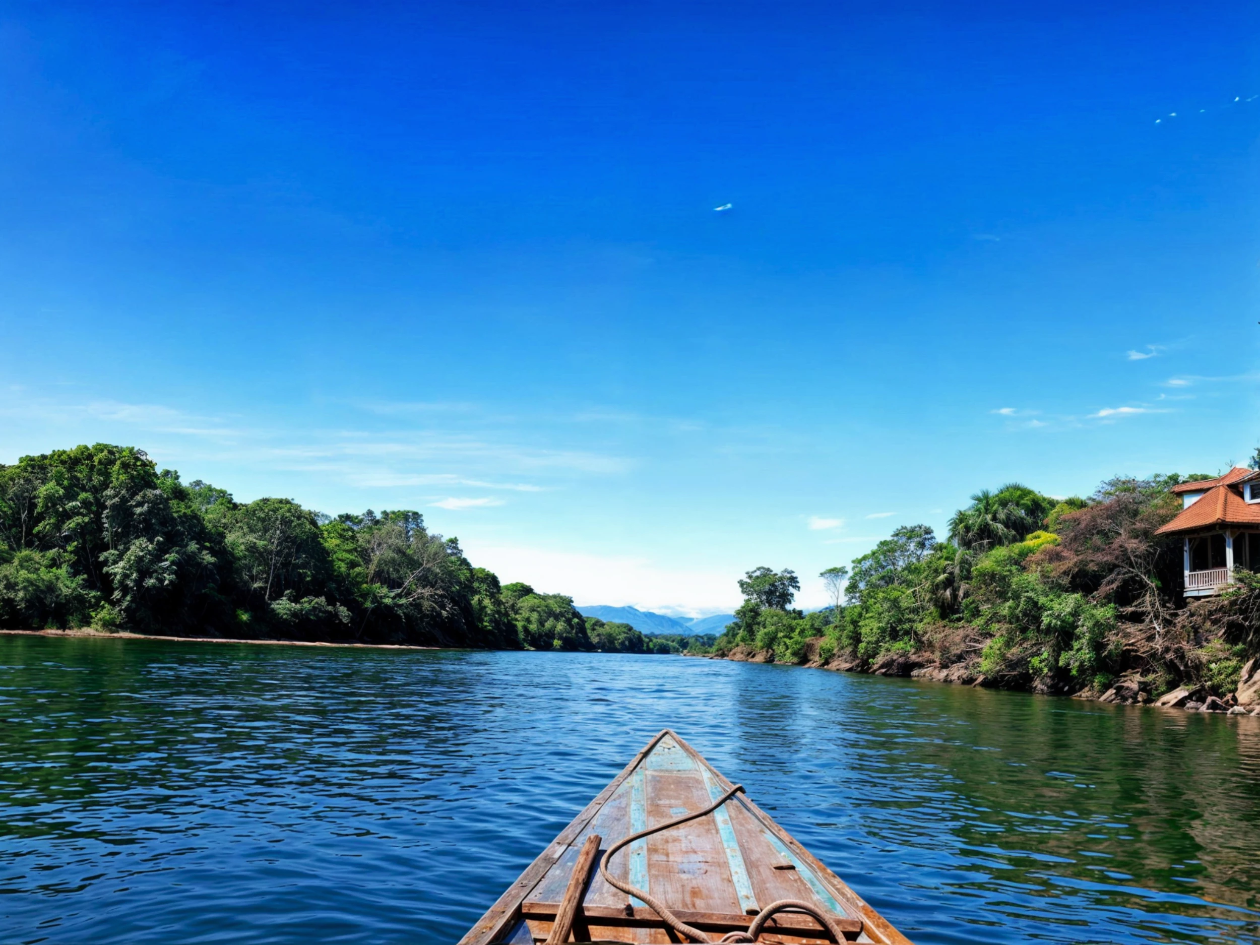
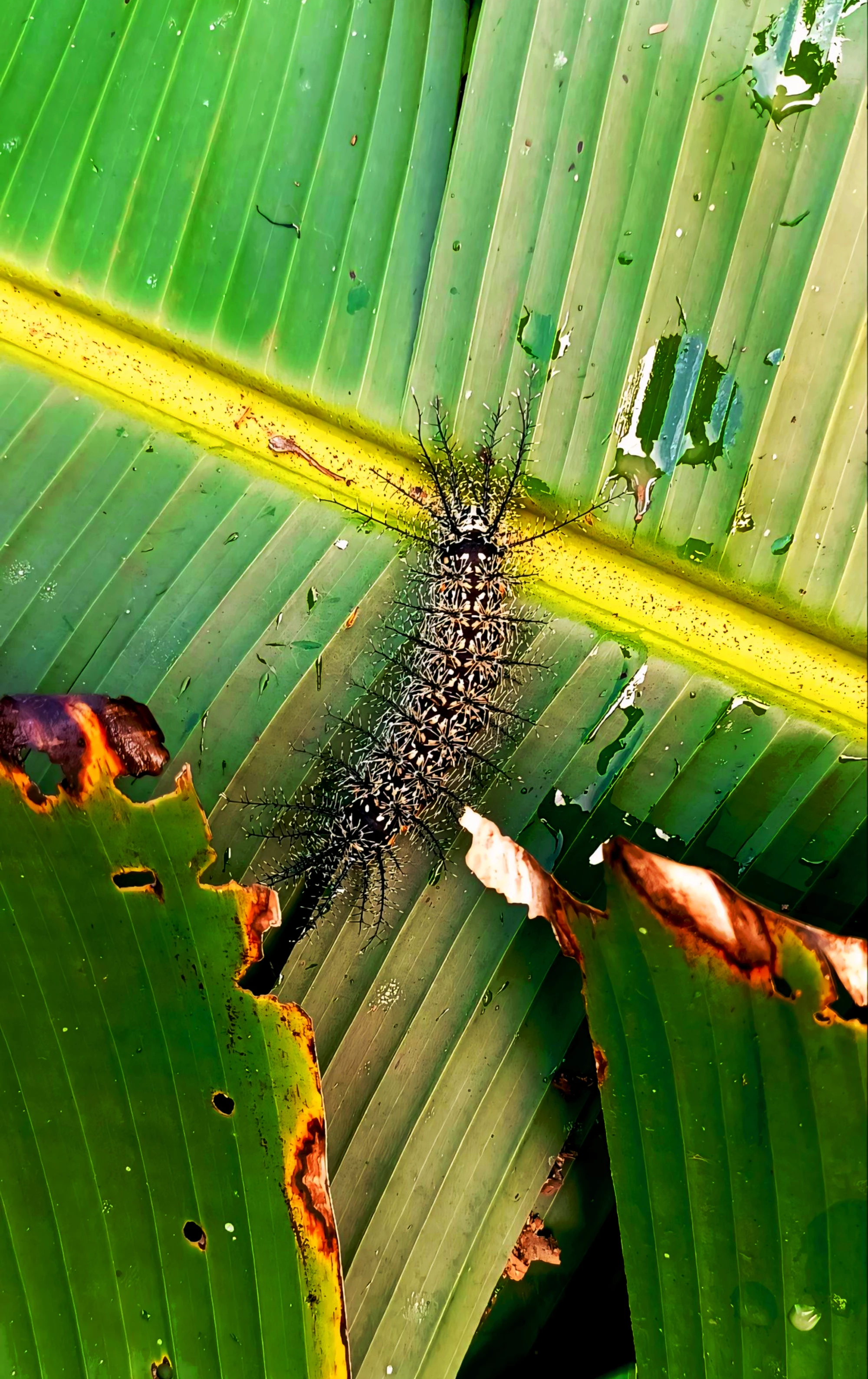
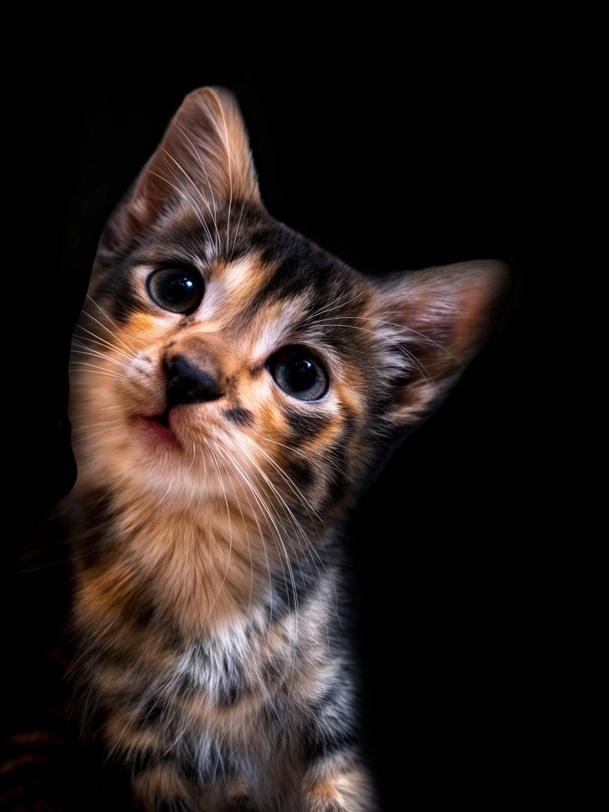

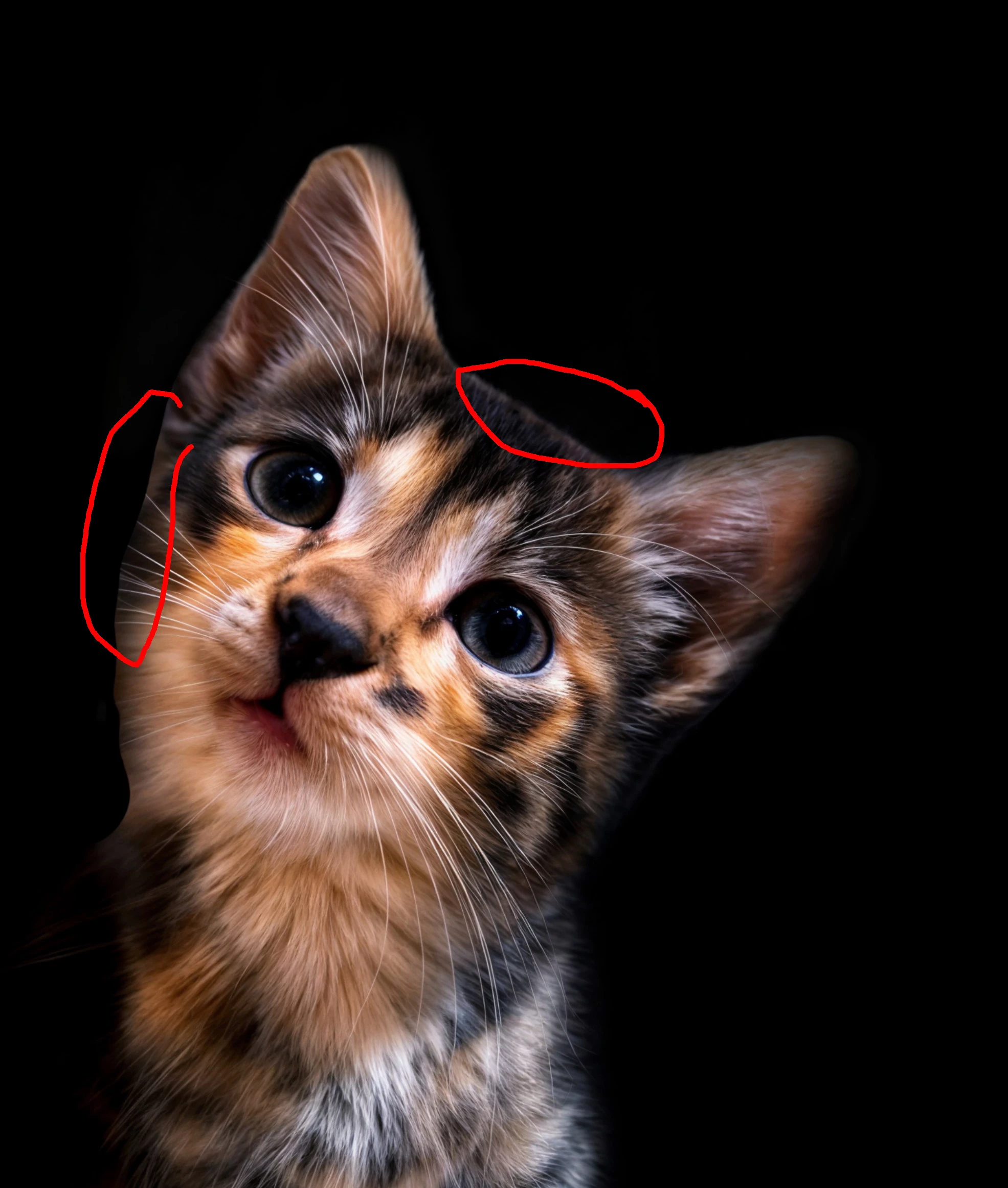
First one with the boat: slanted horizon line. The cat looks like a poor copy and paste against a black background.
Already have an account? Login
No account yet? Create an account
Enter your E-mail address. We'll send you an e-mail with instructions to reset your password.
