Need feedback on rejection – Scandinavian folk style Krishna illustration
Hi everyone,
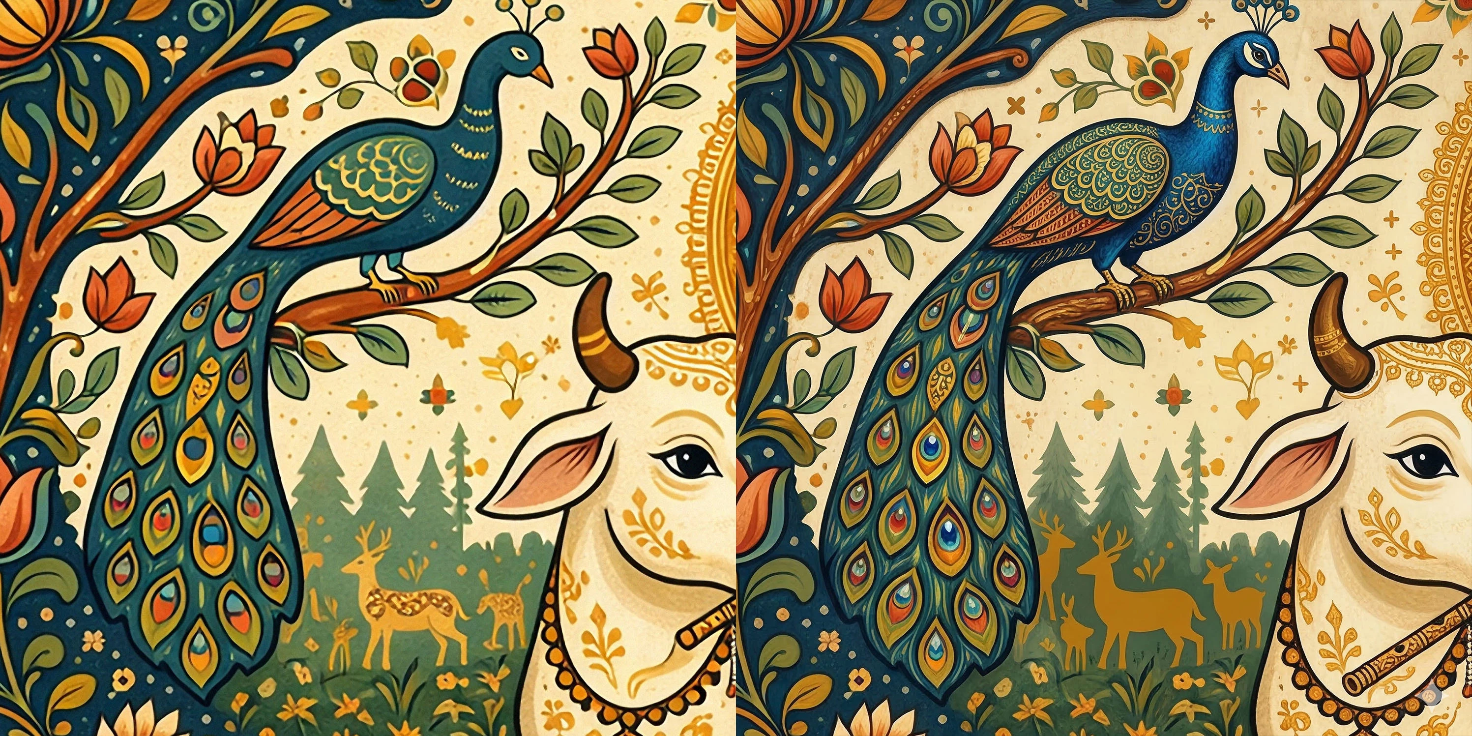
I recently submitted this illustration and it was rejected due to “technical quality issues (artifacts, filtering, or noise).” I would really appreciate some detailed feedback from experienced contributors.
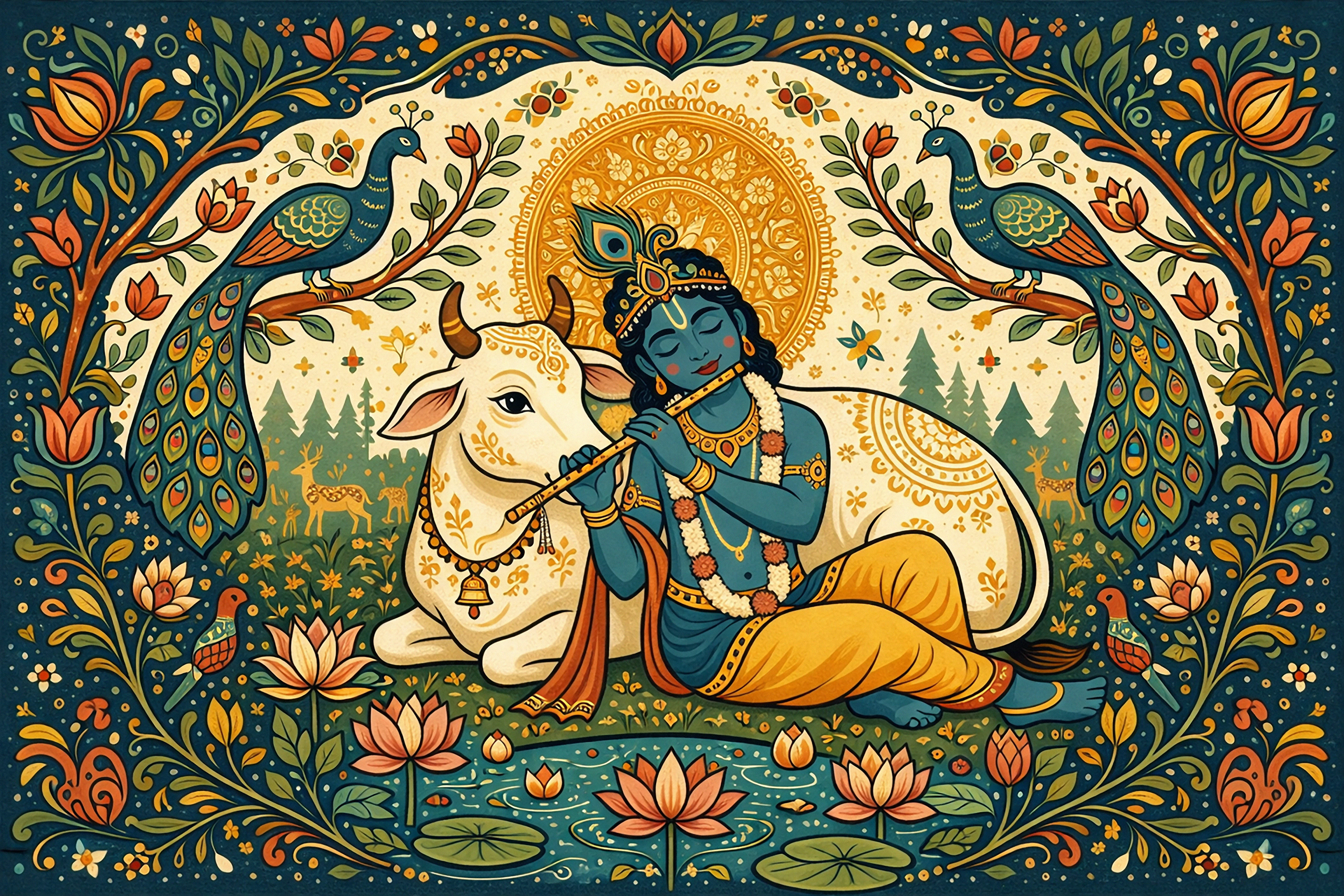
This is a Scandinavian folk art style illustration of Lord Krishna, created using AI and refined further. My intention was to keep a flat, decorative, symmetrical folk-art look rather than a realistic painting style.
I would like to understand:
-
Are there visible artifacts or edge issues that I might be missing?
-
Does the image appear too “AI-generated” or over-processed?
-
Is the flat folk-art style being interpreted as lack of detail/quality?
-
Does the symmetry or composition affect acceptance?
-
Would adding texture or grain improve approval chances?
I’m trying to align my work better with Adobe Stock’s quality standards, so any honest and critical feedback would be very helpful.
Thank you in advance!