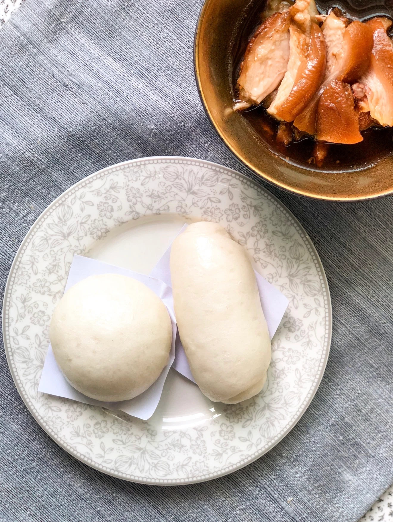
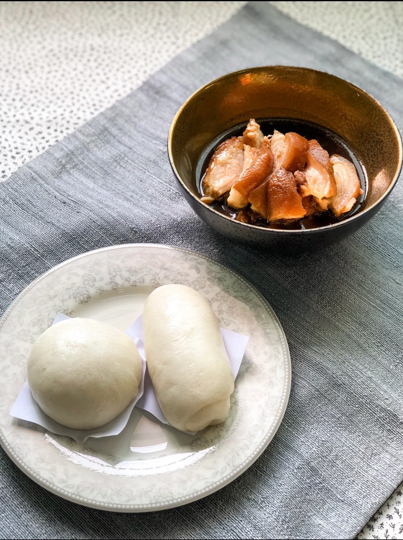
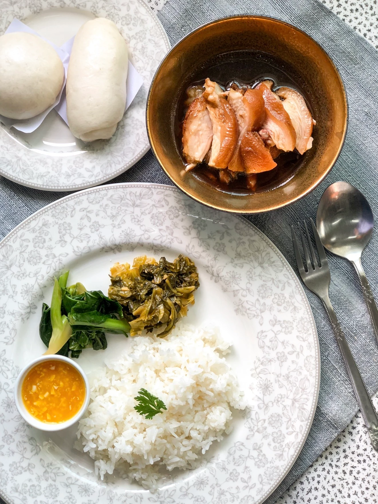
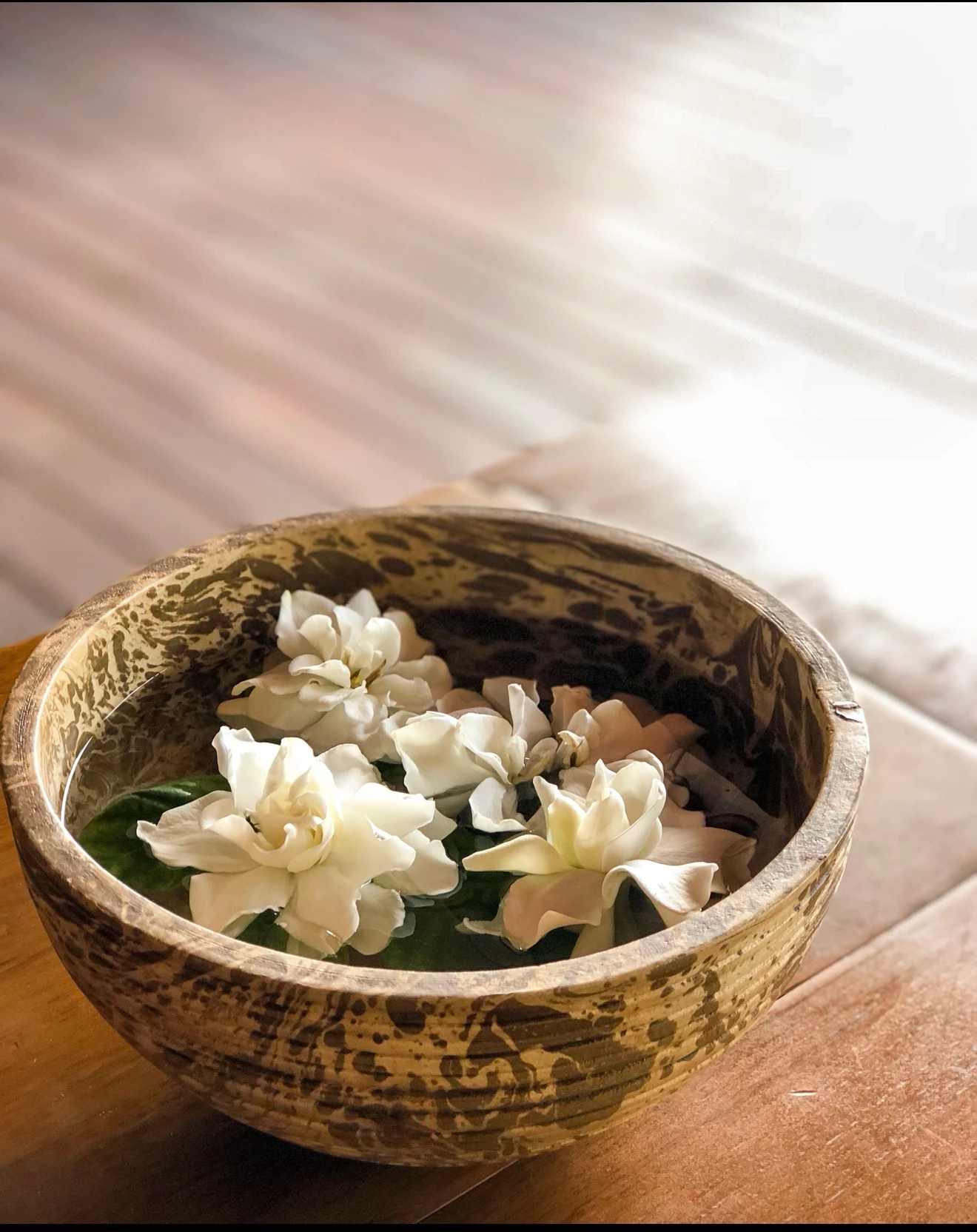
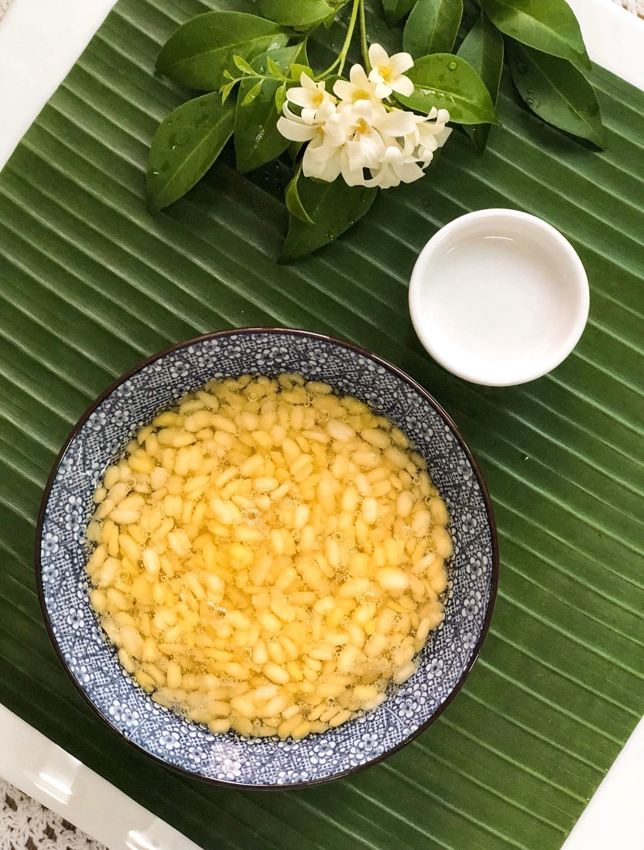
PraeHewan
Participating Frequently
June 3, 2026
Question

New contributor seeking feedback on Image Quality rejection

  • June 3, 2026
  • 7 replies
  • 161 views

Hi everyone,

I'm a new Adobe Stock contributor and this image was recently rejected for Image Quality.

I'm trying to understand what specific issues reviewers may have seen, as the rejection reason is quite broad.

Could you please help identify any potential problems related to:

  • White balance
  • Exposure
  • Contrast
  • Saturation
  • Sharpness
  • Noise
  • Composition
  • Commercial stock appeal

If you were reviewing this image, what would be the most likely reason for rejecting it?

Any feedback would be greatly appreciated. I'm still learning and would love to improve my future submission.


Thank you. (^/l\^)


    7 replies

    Ricky336
    Community Expert
    Community Expert
    June 8, 2026

    Hello,

    I think your composition could be improved as well as lighting. In my view the images are a bit flat.

    Composition

    Adobe has a good page on composition, so read that.

    Also, think about how colours work together and complement each other. 

    Also:

    Food photography


    June 4, 2026

    Hey ​@Prae+Hewan 

    The plating is beautiful.
    I would consider using a different colour plate: blue or something to really help bring out the food.
    I understand why you want vertical: we are going in that direction. Step back a bit though and provide a bit of space around your food.


    The top provides a bit of space for copy. 
    I like the idea of shooting vertical as this seems to be the way the market is heading.

    The white bowl was over exposed. When shooting, shot one or two photos that are slightly underexposed.

    Fill in the corners as well: all white for example.

    Cheers
    Nate

    PraeHewan
    PraeHewanAuthor
    Participating Frequently
    June 4, 2026

    Thank you for the detailed feedback and for taking the time to create an example image. It really helped me understand what you meant about giving the subject more room and leaving space for potential copy.


    For many years I was simply a home cook and baker who enjoyed photographing my own food, so I ended up building a large collection of images without ever thinking about stock photography requirements. I only recently started submitting some of those photos to Adobe Stock, and the learning curve has been eye-opening. :)


    Your comments about composition, copy space, exposure, and even future market trends have given me a lot to think about. I’ll definitely keep them in mind when shooting new work.


    Thank you again for sharing your experience and helping newcomer learn.

    Nancy OShea
    Community Expert
    Community Expert
    June 3, 2026

    Assets may contain multiple reasons for rejection.

    https://helpx.adobe.com/stock/contributor/help/reasons-for-content-rejection.html

    Stock reviewers are not allowed to check more than one box per submission. So your review ends with problem #1.  Keep that in mind if you decide to resubmit later under a new file name.  


    Good luck.


    Nancy O'Shea— Product User & Community Expert
    PraeHewan
    PraeHewanAuthor
    Participating Frequently
    June 4, 2026

    Thank you for clarifying that. I didn’t realize reviewers could only select one rejection reason per submission. That helps me better understand the review process and why there may be additional issues beyond the Image Quality rejection.


    I’ll definitely keep that in mind if I decide to revisit and resubmit some of these older files in the future. Thank you again for all the helpful guidance. 

    Nancy OShea
    Community Expert
    Community Expert
    June 3, 2026

    I see a potential IP problem with your plates.

    https://helpx.adobe.com/stock/contributor/help/ip-guidelines.html

    The plate pattern is likely protected by a design patent which identifies the maker. Switch to plain pattern-free dishes that can’t be identified. Look in thrift stores & 2nd hand shops for low-cost accessories. 


    The bowl of gardenias is too washed out on top. The white balance on petals could be a bit less yellow.

    https://stock.adobe.com/search?k=gardenias

    https://stock.adobe.com/search?k=gardenias+water+bowl


    Nancy O'Shea— Product User & Community Expert
    PraeHewan
    PraeHewanAuthor
    Participating Frequently
    June 4, 2026

    Thank you for pointing that out. I wasn’t aware that certain plate patterns could potentially raise IP concerns. These photos were taken several years ago, so I can’t easily recreate them, but I’ll definitely keep this in mind for future shoots and use simpler, pattern-free tableware whenever possible.


    I also spent some time looking at the Adobe Stock examples for gardenias in water bowls, and it was very useful to see how similar subjects are styled and composed by other contributors.


    As a new contributor, I’m finding these discussions incredibly educational. I really appreciate you taking the time to explain these points and share additional resources. 😊

    Jill_C
    Community Expert
    Community Expert
    June 3, 2026

    There are overexposed areas, nearly blownout, in images 1, 2, 3, 5 and 6. Additionally, I would note that shooting all in portrait orientation may not be the best decision in terms of composition. In image 4, the bowl is too close to the edge of the frame.

    Jill C., Forum Volunteer
    PraeHewan
    PraeHewanAuthor
    Participating Frequently
    June 4, 2026

    Thank you very much for taking the time to review all of the images and provide such detailed feedback.


    Your comments are extremely helpful. I hadn’t considered how the portrait orientation and tight framing might affect the commercial usability of the images, and your point about the overexposed highlights is something I’ll definitely pay closer attention to in future edits.


    This gives me a much clearer understanding of what reviewers may be looking for. I really appreciate your guidance. 😊

    Jill_C
    Community Expert
    Community Expert
    June 4, 2026

    Glad to be of assistance !

    Jill C., Forum Volunteer
    daniellei4510
    Community Expert
    Community Expert
    June 3, 2026

    The last one could use some tail in the highlights.


    Adobe Community Expert | If you aren't submitting your assets in sRGB, you probably didn't read the rules.
    PraeHewan
    PraeHewanAuthor
    Participating Frequently
    June 3, 2026

    Thank you for pointing that out.

    I hadn’t considered the highlight clipping issue before.

    I’ll pay closer attention to the histogram and try recovering some highlight detail before resubmitting.

    I really appreciate the feedback.😊

    daniellei4510
    Community Expert
    Community Expert
    June 3, 2026

    Happy to help. Good luck!

    Adobe Community Expert | If you aren't submitting your assets in sRGB, you probably didn't read the rules.
    daniellei4510
    Community Expert
    Community Expert
    June 3, 2026

    The first four images are cropped to closely and feel cramped. Give the buyer some room to crop as needed if they prefer to do so.

    Adobe Community Expert | If you aren't submitting your assets in sRGB, you probably didn't read the rules.
    PraeHewan
    PraeHewanAuthor
    Participating Frequently
    June 3, 2026

    Thank you very much for your feedback! 

    I’m still learning stock photography, so your comment is very helpful.

    I’ll try giving the subject more breathing room in future submissions. :)