Question
one or more technical issues
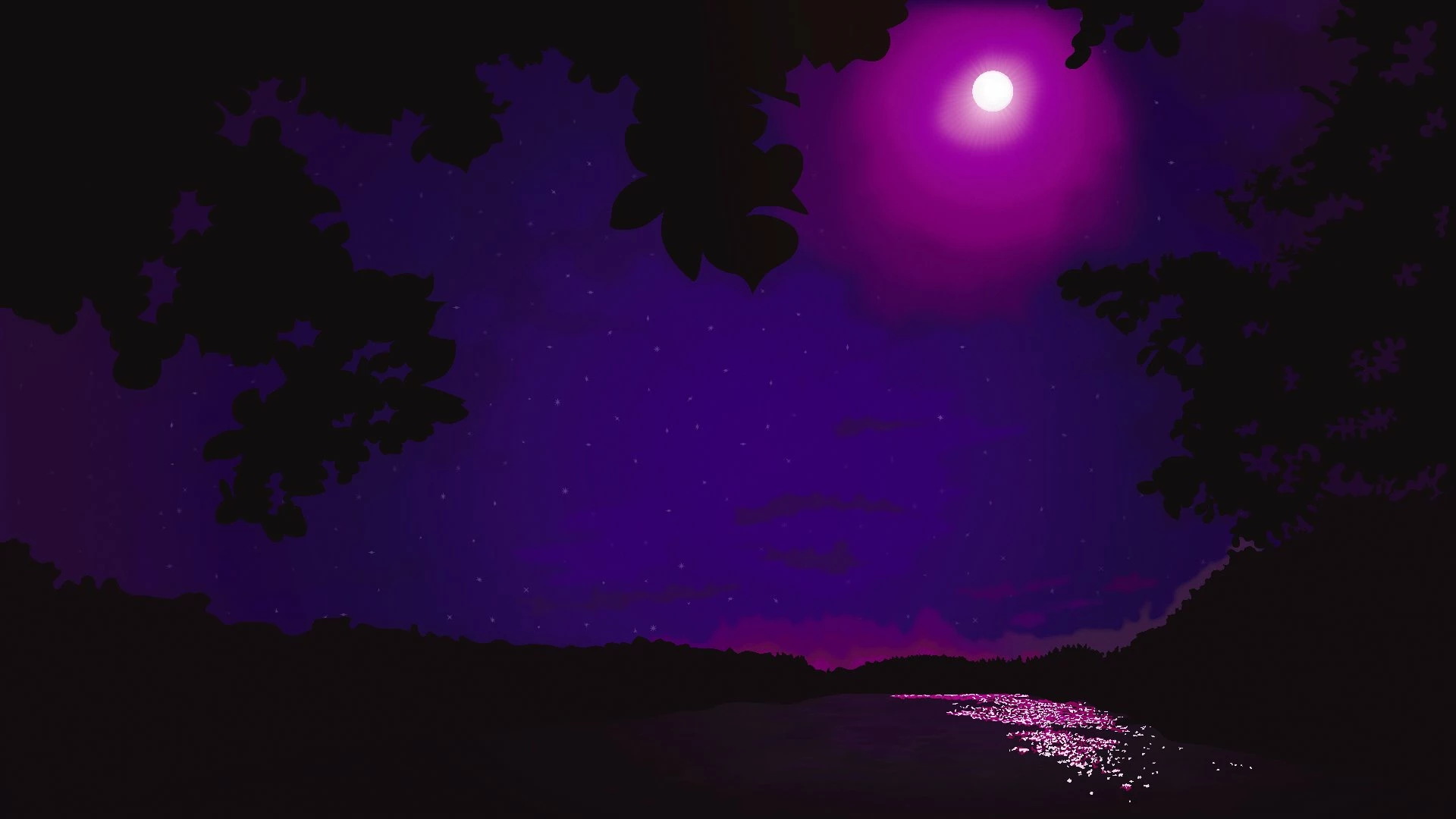
I got this illustration rejected. I'd like to receive more especific feedback to solve the causes of this rejection.
What are these reasons?
I got this illustration rejected. I'd like to receive more especific feedback to solve the causes of this rejection.
What are these reasons?
Already have an account? Login
Enter your E-mail address. We'll send you an e-mail with instructions to reset your password.