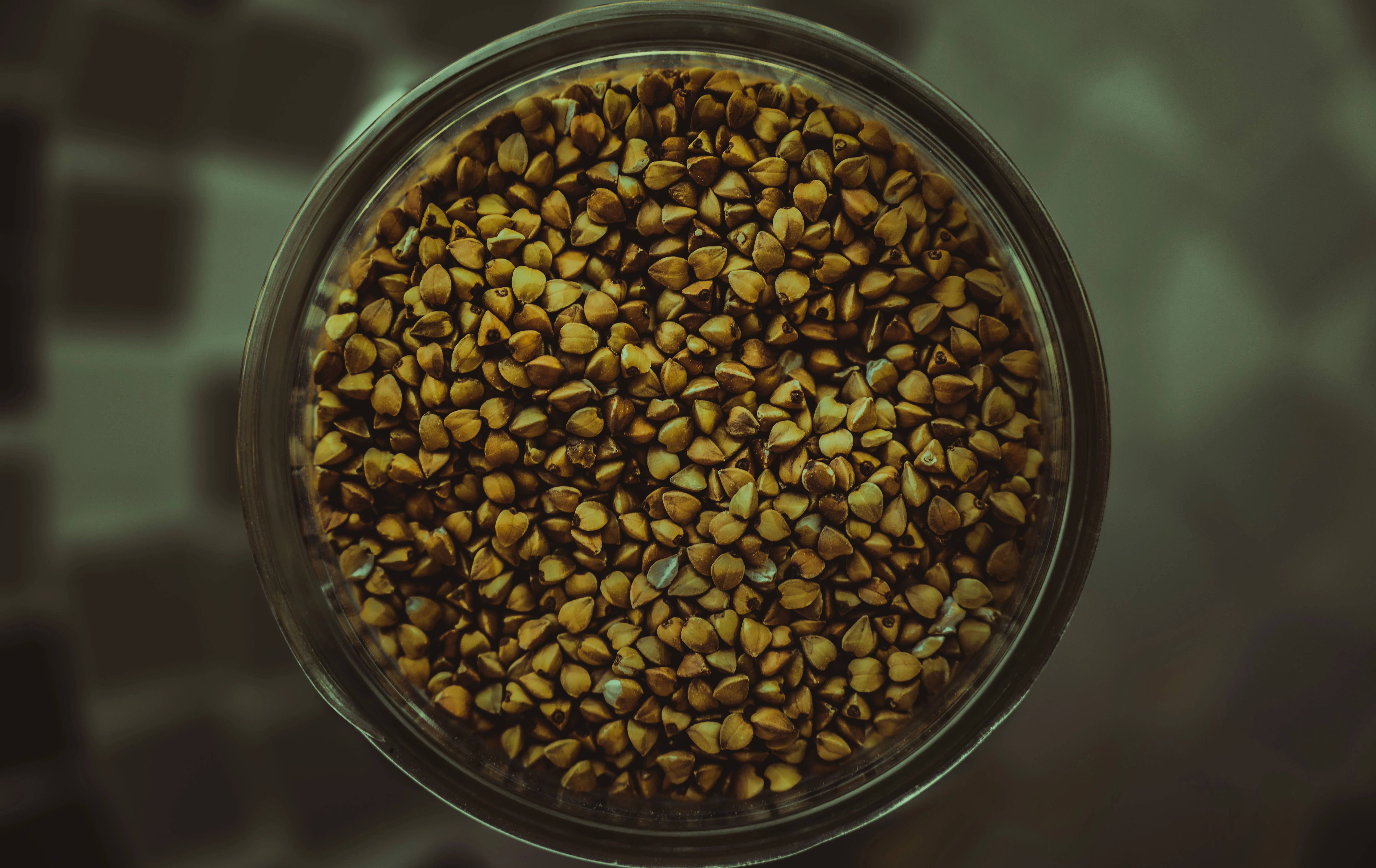
The first mage is too yellow and green. so you need to alter the white balance and maybe add a bit more contrast.
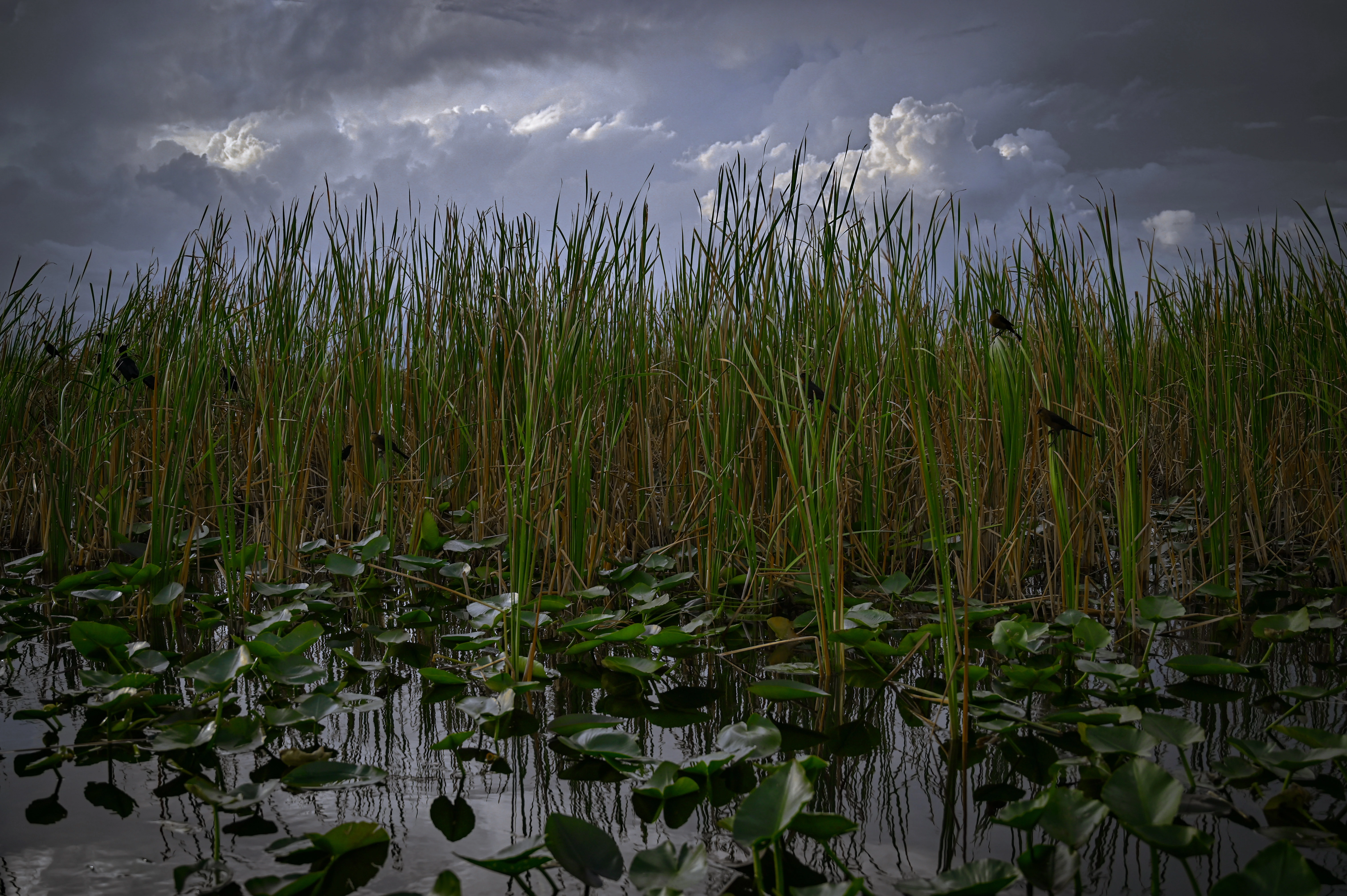
The second image, the white balance also needs to be changed a bit - it is a bit too cold - too blue, so you need to add more warmth - add a bit more yellow, and I think more contrast as well.
The composition isn't so good as well. I think in the first image you need more room around the jar - the circle is too squashed!
The second image - well, what does it show?
Did you add vignetting in the second image? The corners are dark. Not such a good idea for stock images.