This topic has been closed for replies.
Correct answer Abambo

IMG20220916113349_v2: Did you compare the competition of a cup of coffee? The framing with that Jeans leg in the picture is not really appetizing. The two coffee stains also do not contribute to improving the picture. I dislike to drink coffee now.


IMG20220919172852:

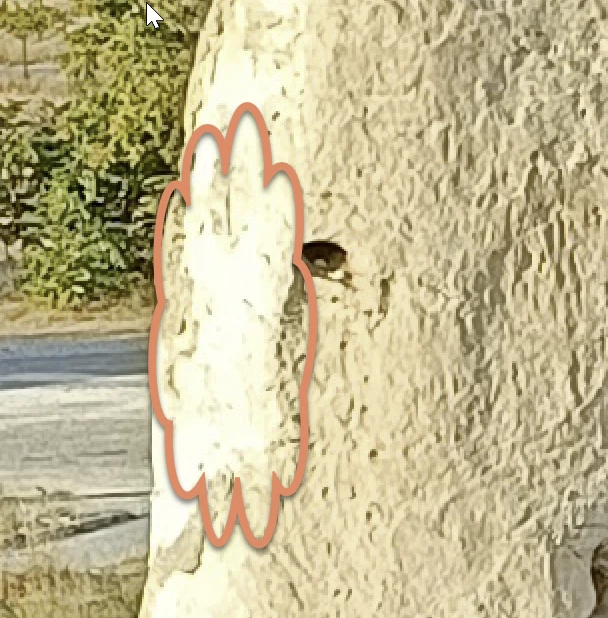
Nice try, but the foreground and the background need to be worked separately. The foreground is too cool, the background is overexposed. You have that painterly look, that makes any rescue effort lost. There is no detail left in the marked area:
IMG20220919170510_v2

You guess: painterly look:
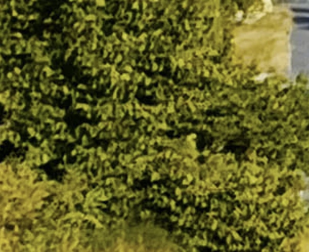
The overall image could be darker, especially the sky and the hills/mountains. It's a nice perspective, however.


IMG20220919171732_v2:

I suppose you submitted a model release for the people in the picture. If not, you will need one.

The white balance is off, too yellow.

As for the rest, the picture is overexposed (the sky is blown out) and you have this painterly look of overly noise reduction:
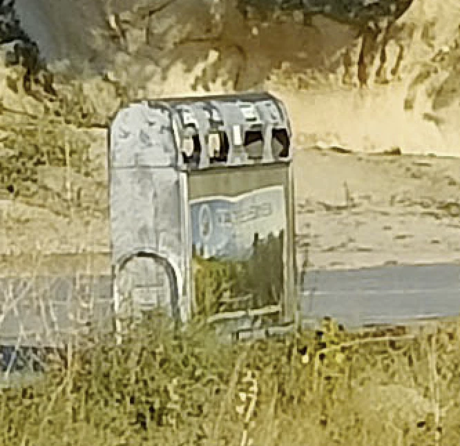
 

IMG20220916102005_v2:

All those pleasant details get lost by your excessive noise reduction.

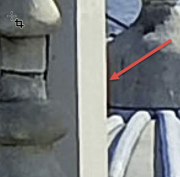
You also have chromatic aberration:


With all your images, you reach the limits of your camera. The best of your images (from a camera POV) is the coffee cup, and here also, you have strange reflections and low quality for the plates.


Most of your shoots are nicely framed, but are lacking simply the required quality that your camera does not provide.


3 replies

jacquelingphoto2017
Community Expert
Community Expert
January 21, 2023

Hi @Umberto28037719557m,

The first image is underexposed and not completely in focus. You either went in too close or had too much of a shallow depth of field.

The second file has a white balance issue. The highlights/exposure is a bit too high.

Too much of the third photo is out of focus. I believe you had too much of a shallow depth of field and also you place the focus at the wrong place.

There's also a white balance issue with the fourth photo. It's too cool.

The fifth image also has a white balance issue and a small amount of chromatic noise.

Best wishes

Jacquelin

Jill_C
Community Expert
Community Expert
January 21, 2023

I agree with all @Abambo comments. It should be easy to detect whether the image is in focus by zooming in on the roads sign in this  image: IMG20220919170510_v2.jpg.  It's not readable, therefore not in focus.


Jill C., Forum Volunteer
Abambo
Community Expert
AbamboCommunity ExpertCorrect answer
Community Expert
January 20, 2023

IMG20220916113349_v2: Did you compare the competition of a cup of coffee? The framing with that Jeans leg in the picture is not really appetizing. The two coffee stains also do not contribute to improving the picture. I dislike to drink coffee now.


IMG20220919172852:

Nice try, but the foreground and the background need to be worked separately. The foreground is too cool, the background is overexposed. You have that painterly look, that makes any rescue effort lost. There is no detail left in the marked area:

IMG20220919170510_v2

You guess: painterly look:

The overall image could be darker, especially the sky and the hills/mountains. It's a nice perspective, however.


IMG20220919171732_v2:

I suppose you submitted a model release for the people in the picture. If not, you will need one.

The white balance is off, too yellow.

As for the rest, the picture is overexposed (the sky is blown out) and you have this painterly look of overly noise reduction:


IMG20220916102005_v2:

All those pleasant details get lost by your excessive noise reduction.

You also have chromatic aberration:


With all your images, you reach the limits of your camera. The best of your images (from a camera POV) is the coffee cup, and here also, you have strange reflections and low quality for the plates.


Most of your shoots are nicely framed, but are lacking simply the required quality that your camera does not provide.


ABAMBO | Hard- and Software Engineer | Photographer
Participant
January 25, 2023

Hi ABAMBO, what do you mean when you say "painterly look"? I suppose you mean as a defect.

Ricky336
Community Expert
Community Expert
January 25, 2023

The so-called 'painterly' look is to say, that the pixels are compressed so much that it begins to look like brush strokes in a painting.

(Correction - The so-called 'painterly' look is to say, that noise reduction is aggressively used so much that the pixels begin to look like brush strokes in a painting.)

Another thing to consider is that ...

Most cameras use JPEG to save storage space. The pixels, which make up the image, are compressed together using a lossy compression method.  The file size of the image being compressed is permanently reduced by eliminating unnecessary (redundant) information. This results in artifacts - JPEG compression is the result. 'Painterly' can be used to describe this 'blocky' compression that @Abambo  has used. (Although, it is probably not a great word to use as it could cause some misunderstanding.)

In all your shots this 'blocky' appearance can also be seen. If it is a smartphone camera, JPEG compression can be more noticeable, especially if you enlarge the image! (As could be the case when used commercially.)

Using JPEG compression is great though, as you can have a lot of photos on one card.

However, there is always a trade-off - space vs quality!


Noise reduction and JPEG compression among others are important things to consider when regarding quality!
