
December 29, 2025
Question

Question About ‘Quality Issues’ Rejections on Adobe Stock

Hi,

I’m getting several rejections due to quality issues, and I’d like to better understand what reviewers usually flag under this category.


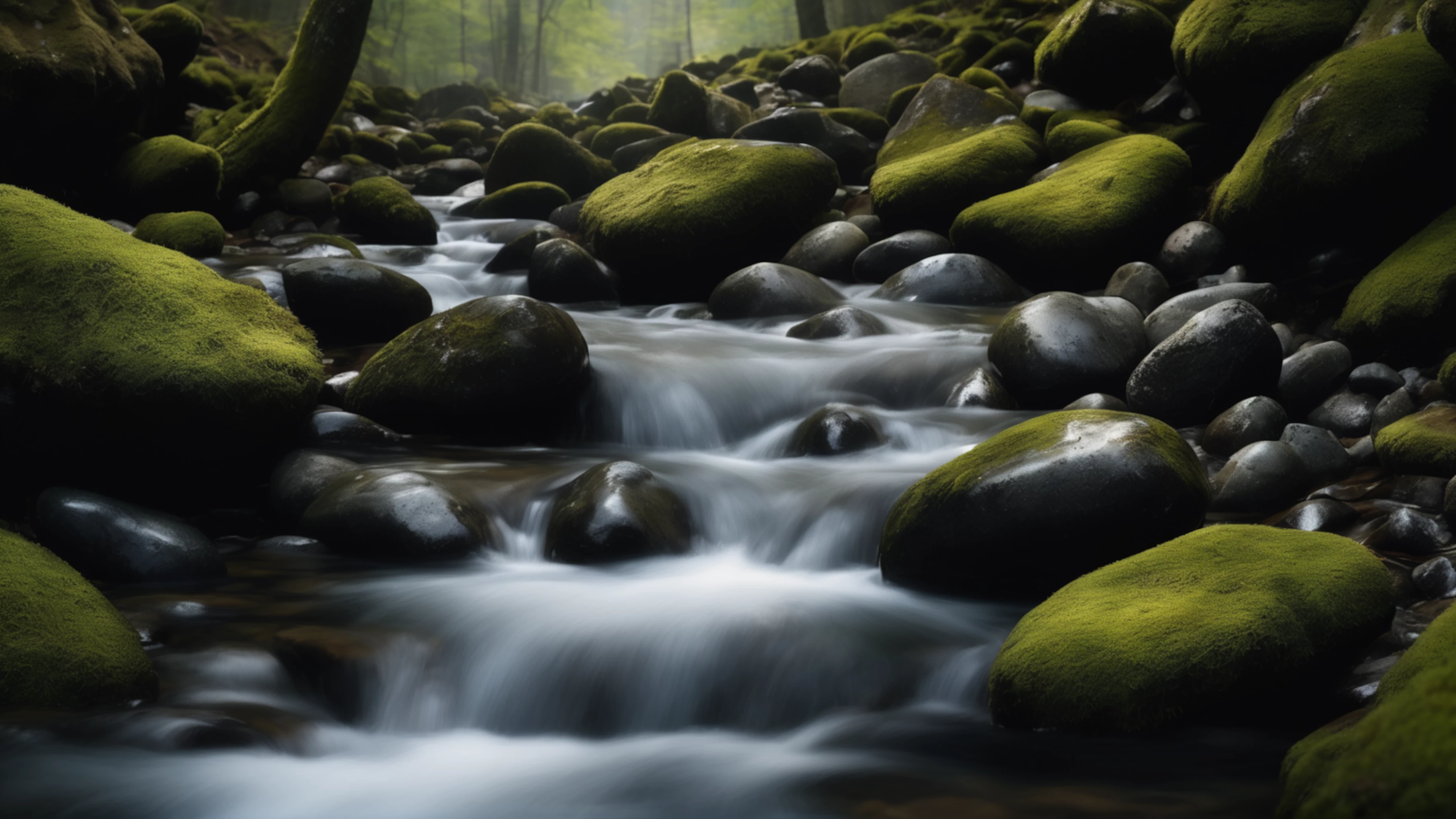
Below, I’ve attached a sample image that was rejected due to quality issues.
872045iA2DB6F7C8FBEF3AE.png


Are there specific technical details (noise patterns, upscaling artifacts, texture consistency, or maybe blur when zoom 200% etc.) that are commonly overlooked by contributors?


Any advice would be appreciated. Thank you.

4 replies

daniellei4510
Community Expert
Community Expert
December 29, 2025

In addition, the green cast, though it's very subtle, is in the water as well. As @Jill_C mentioned, I'm in agreement. One doesn't want to get too "artsy" when it comes to stock. 

Translate
Adobe Community Expert | I have miles to go before I sleep, but I'm all done on this end.
December 29, 2025

Thank you for pointing that out, as it gives me a new perspective and helps me better understand the concern about images becoming too “artsy” for stock. Finding the right balance between maintaining a natural look and still being visually appealing is something I’m still learning, and this feedback is very helpful in clarifying that perspective

Translate
Jill_C
Community Expert
Community Expert
December 29, 2025

The intentional blur here probably would not have caused a rejection. The image overall is underexposed in the shadows, and that's likely to be the reason. 

Translate
Jill C., Forum Volunteer
December 29, 2025

Thank you for the explanation, I really appreciate the insight.


Initially, I thought the issue might be related to the image appearing slightly soft when zoomed in, so I considered using an AI upscaler to add more detail. However, in my opinion, AI upscalers can sometimes introduce artificial or exaggerated details, which may result in an oversaturated or “AI-like” look.

Because of that, I’m often unsure whether it’s better to upscale and risk artificial detail, or to leave the image slightly soft but more natural when viewed at 100%.

Translate