Can someone please advise why this does not meet the quality standards? It was posted in a Nikon magazine with no quality issue so struggling to understand why it's declined for future ref.
Be happy with your publishing experience. Even is the asset has been used in a Nikon magazine, that does not mean that it is fit for stock. I do not know the QA of that magazine, but I would not have used this asset.
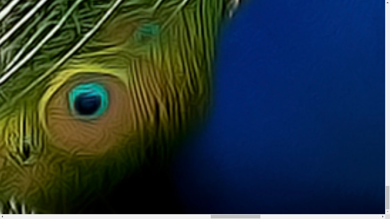
You have random out of focus parts...well and other errors.
Translate
ABAMBO | Hard- and Software Engineer | Photographer
It's beautiful in an artistic sense; but some of the feather quills (eyes?) are sort of pasted in and not attached to a quill and just sort of floating... I think Adobe is looking for more realism in these sort of images.
Adobe Stock customers expect the highest visual and technical quality for use in commercial projects. Posters, billboard ads & TV commercials, merchandise like t-shirts, tote bags and calendars... Read your Stock Contributor User Guide for more details on what's expected.
I agree with @jacquelingphoto2017 , the details appear both soft when viewing between 100%-200%. It also appears some noise reduction or heavy sharpening has been applied resulting in some unwanted artefacts.
With small print such as a magazine, I suspect this image would be fine. But I think it's important to keep in mind all of the uses a commercial stock asset may be used. I don't believe this would stand up well with a large print scenario.
Being rejected as a commercial asset doesn't mean it's a bad photo though. Congrats on being published in a magazine!




 AdChoices