Hi Be.Angeled,
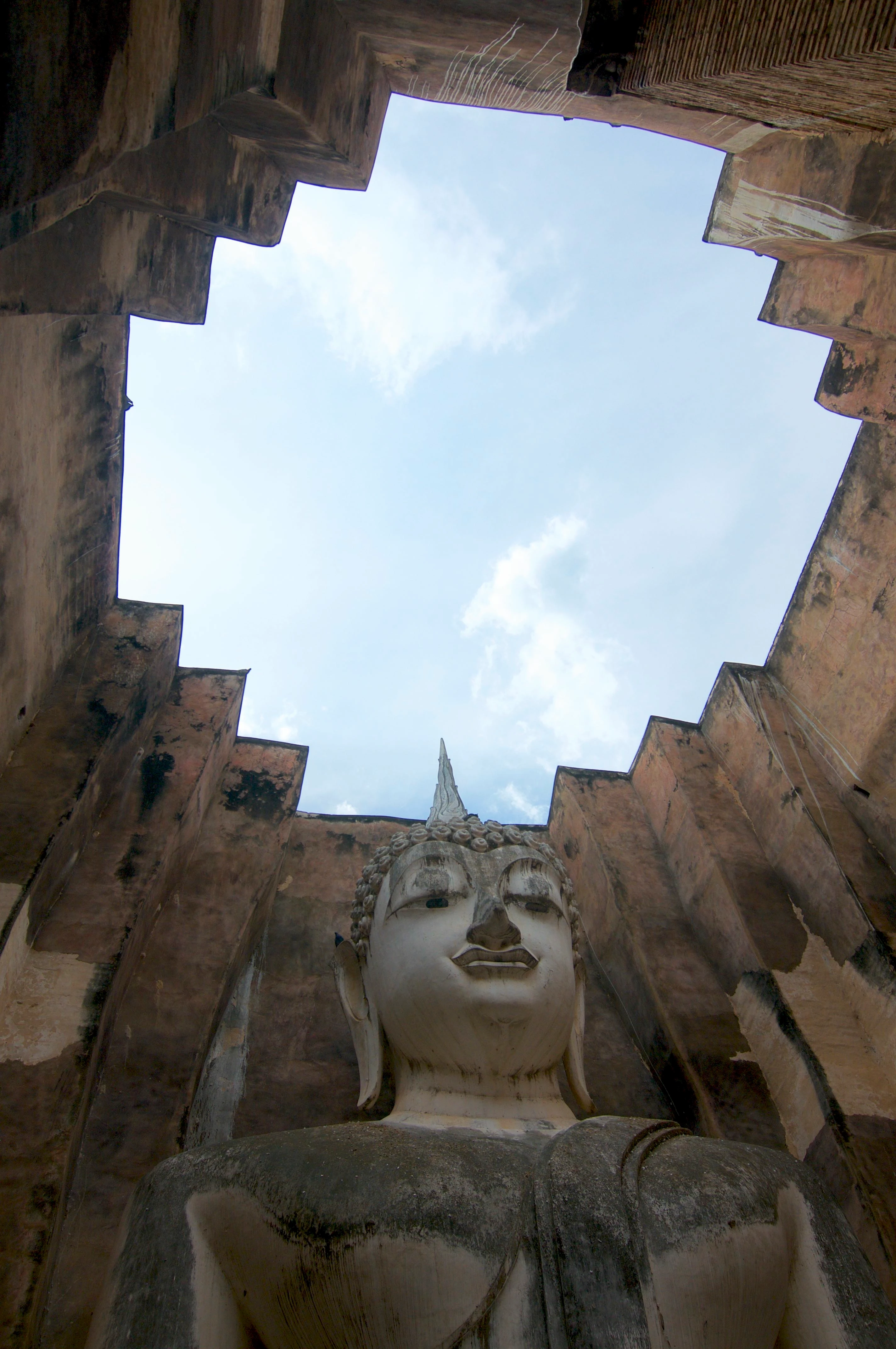
In the case of the first image I observe that there's color fringes around the inner edge of the wall. That can be reduced by making adjustment with the Hue Saturation Luminance (HSL) in Camera Raw of Photoshop. For other editors, I'm not sure what provision there is for that sort of adjustment. I am not sure if the apparent imbalance of the exit might also be a problem. While the statue might seem to be ok, looking at the exit it gives the impression of crookedness, The horizon is not straight across.
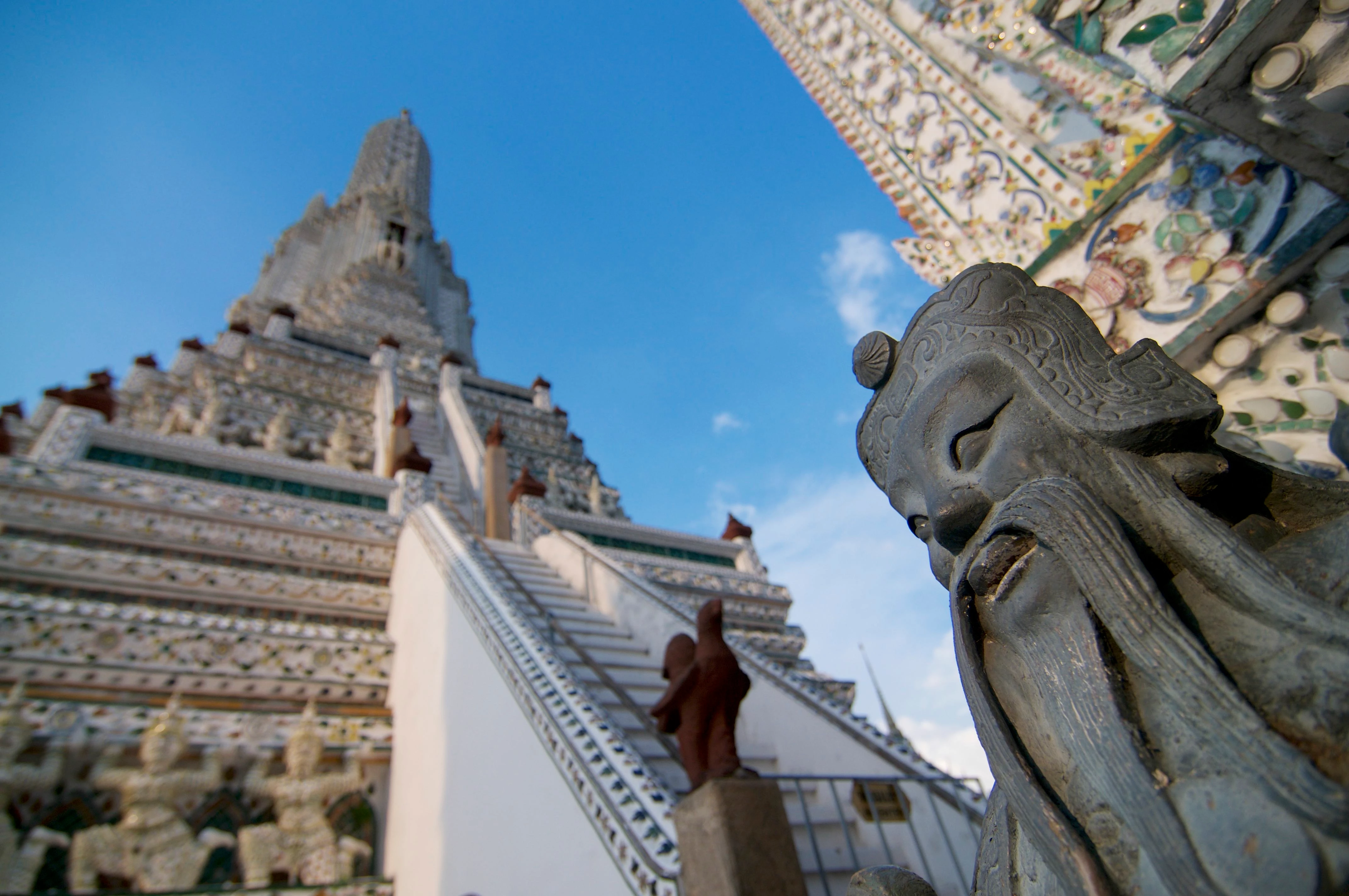
The second photo is a cropping issue. The image falls in the right corner. The image should be on the baseline of you crop.
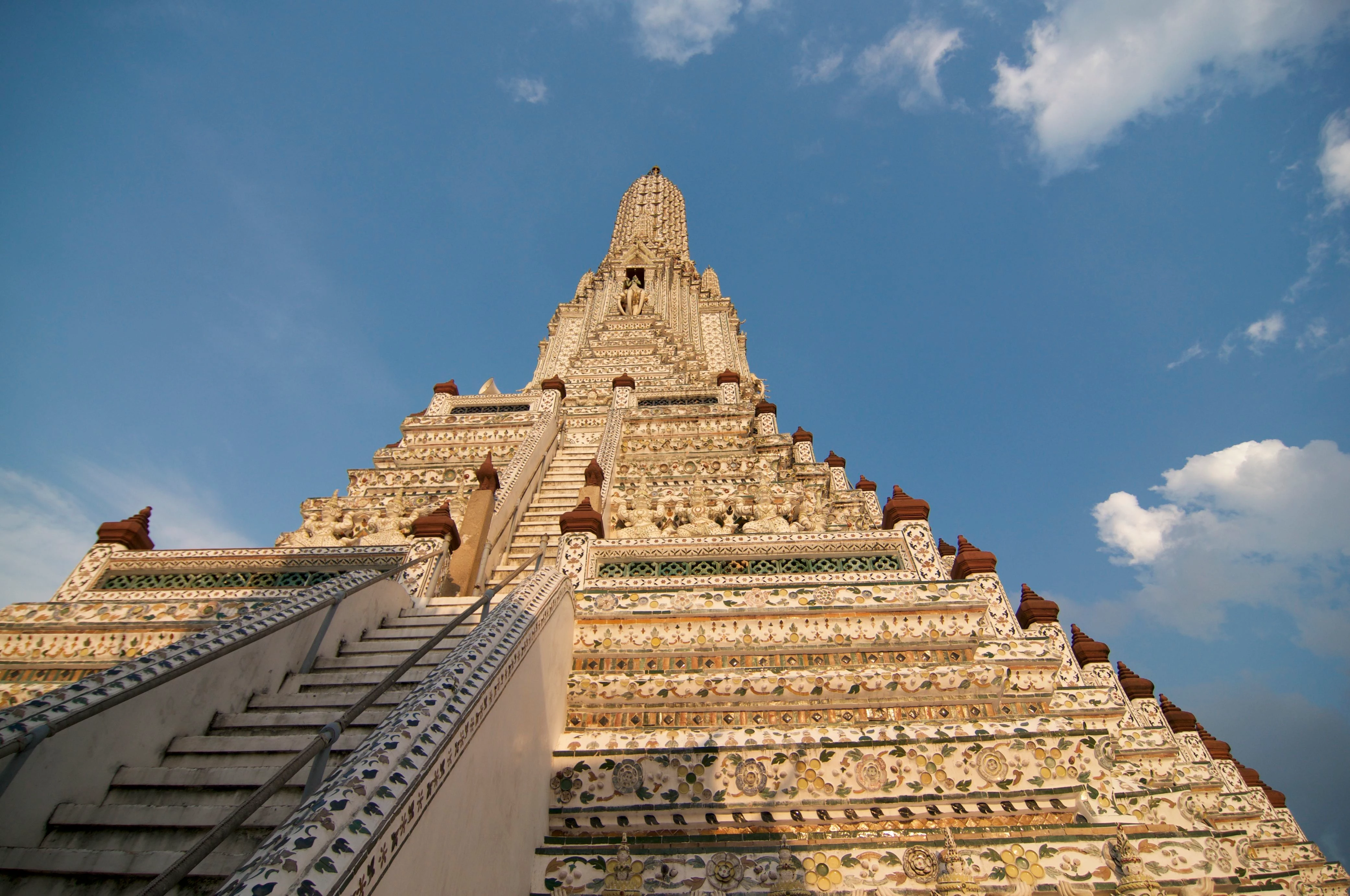
The third might also be cropping. The left side of the subject is cropped off. This I think, you should have reduced the zoom a little, so that you end up with the slope on both sides. In addition For stock photos, its better to include a little of the surrounding in your cropping, and or leave space for label cropping. Remember that customers, many times do not use images as they are taken, they might just want to take an item from the image. There must be allowance for this.
Reasons content is rejected at Adobe Stock gives an overview about the reasons for rejection. Page 2 cover technical issues. Be sure to read all the supporting links.
tagproducts_SG_STOCK-CONTRIBUTOR_i18nKeyHelppagetitle is the link to the Adobe Stock Contributor Guide. You will find all the links helpful.
Create better photos for Adobe Stock with 7 tips for success | also have some useful guidelines you can benefit from.
You will also find Do's and don'ts for selecting and editing photos for Adobe Stock useful.
I hope you find this helpful
Regards
JG