
Seeking Advice: Rejections for "Similar Content" on Unique Icon Sets
Hello everyone,
I’m looking for some guidance regarding a recent series of rejections for "Similar or Duplicate Content."
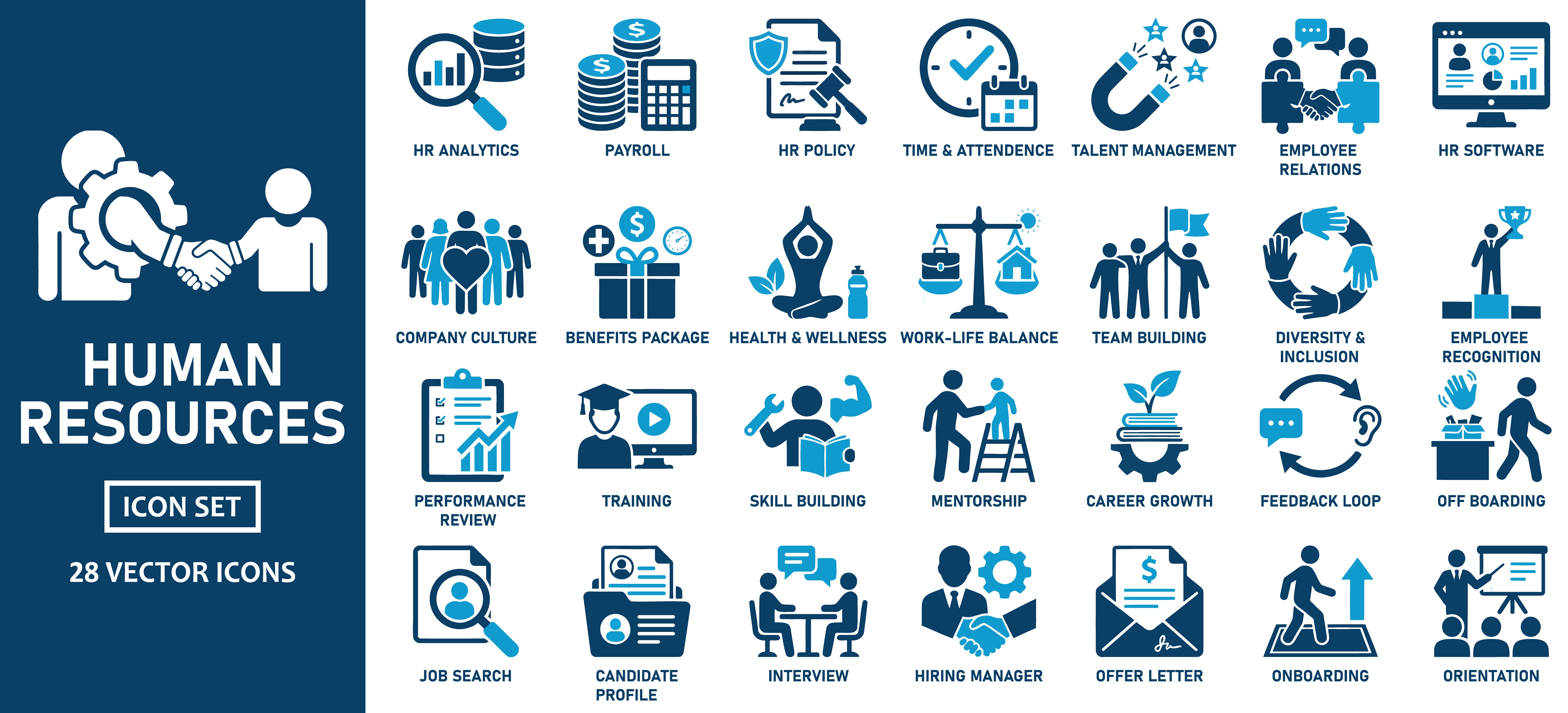
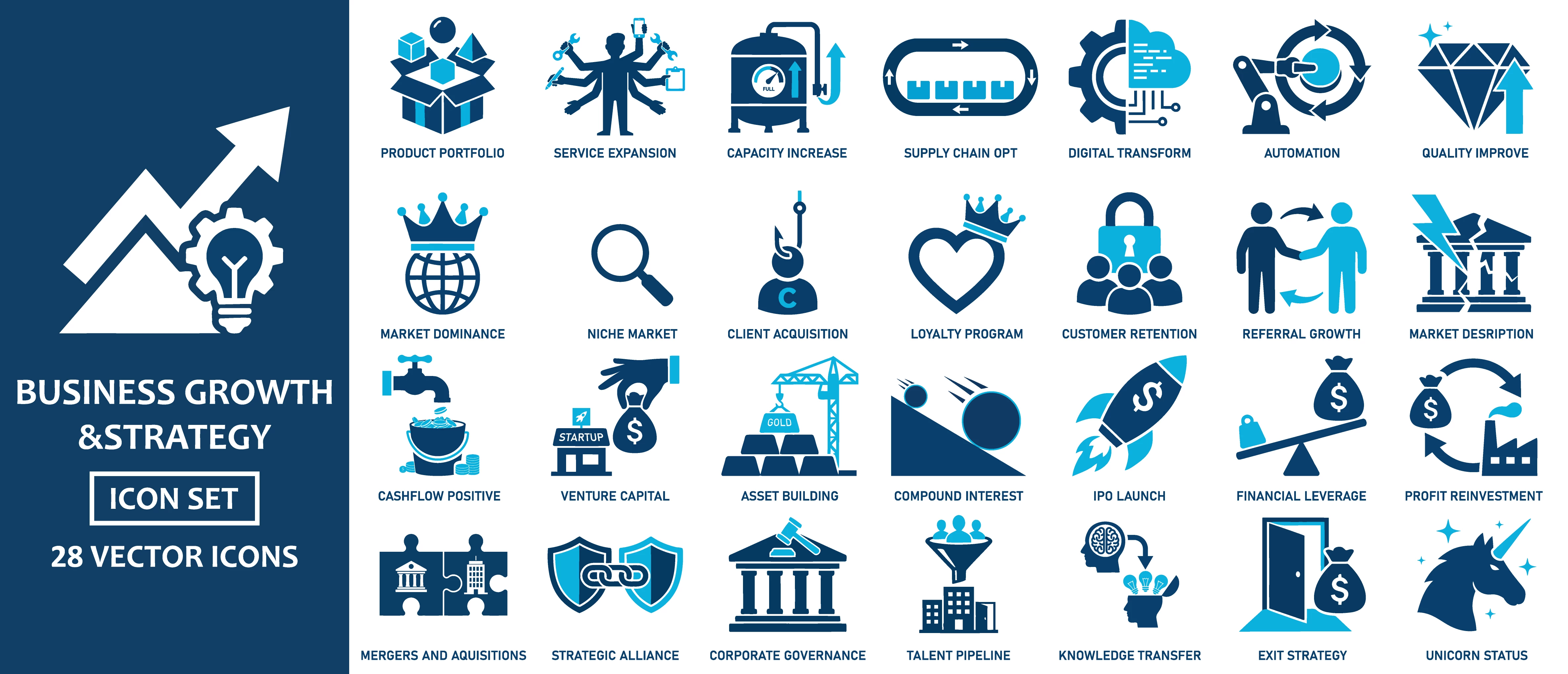
I have been developing a series of vector icon packs. While I maintain a consistent brand identity across my portfolio—using a specific duotone palette (Navy and Cyan) and a standard 4x7 grid layout—the actual subject matter of each set is distinct (e.g., one set is Travel Planning, another is Green Energy, another is Recycling).
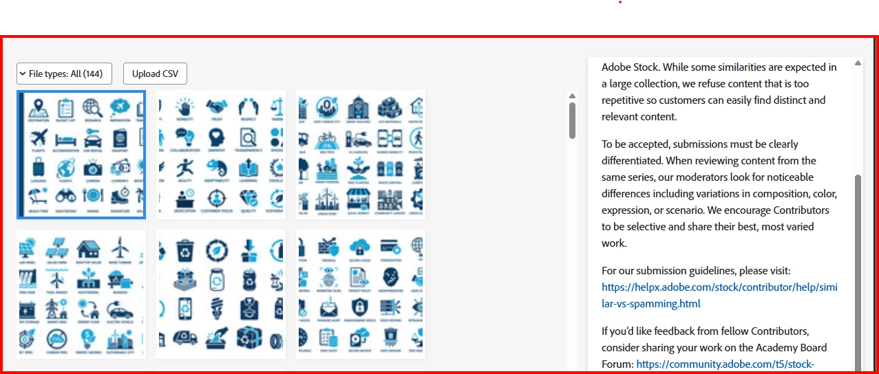
I’ve attached a screenshot of my dashboard showing the rejected files and a sample of the icon sets in question.
My goal is to provide a cohesive look for buyers who want to purchase multiple sets that match, but I am clearly hitting a wall with the "Similar vs. Spamming" policy.
My questions for the community:
Is the consistent 4x7 grid and color scheme enough to trigger a "spam" rejection even if the icons are different?
How can I differentiate my "Hero" or preview images to satisfy the requirement for "noticeable differences in composition" while maintaining a brand style?
Should I consider changing the background colors or icon counts for different categories to break up the visual repetition?
Any advice from experienced contributors who have navigated "Similar" rejections would be greatly appreciated.
Thank you!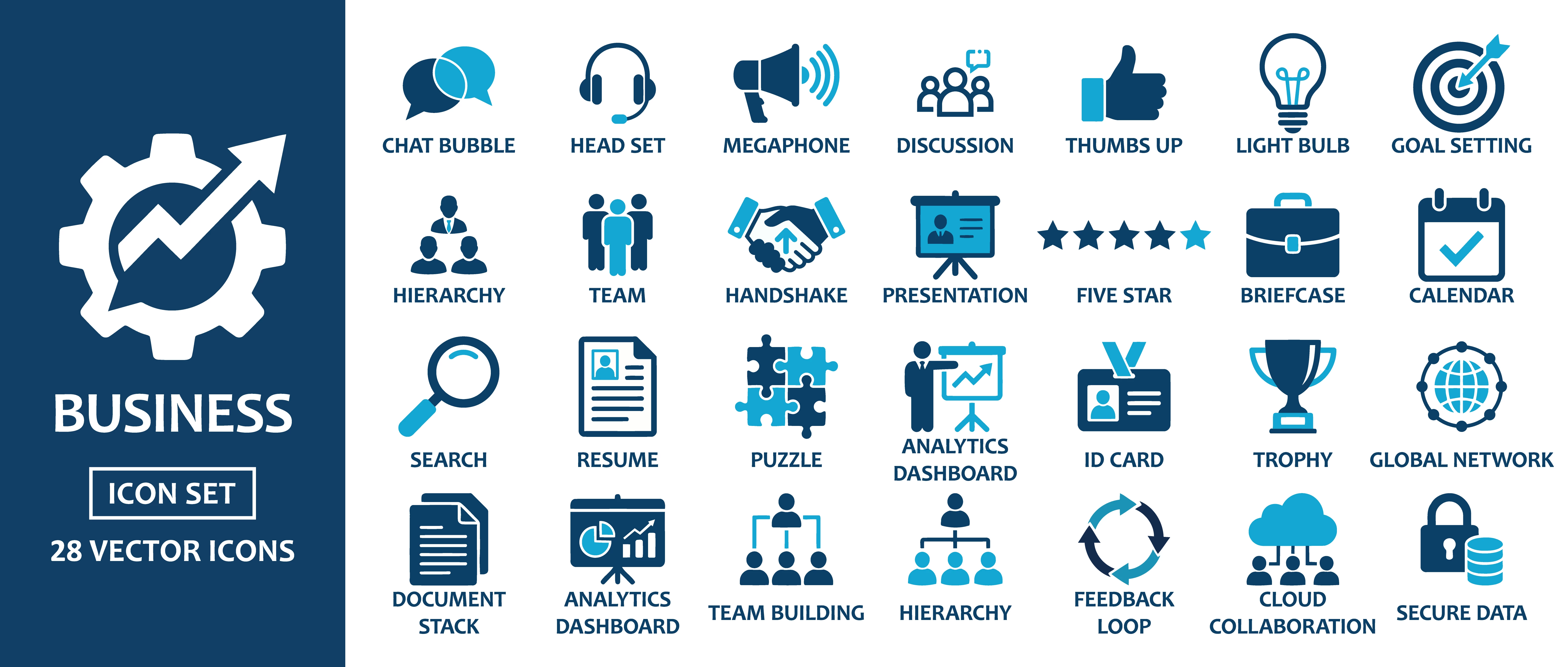


 AdChoices