Answered
These photos were rejected, can someone review my technical issue?

Kind regards!

Kind regards!
At a first sight: composition and exposure.
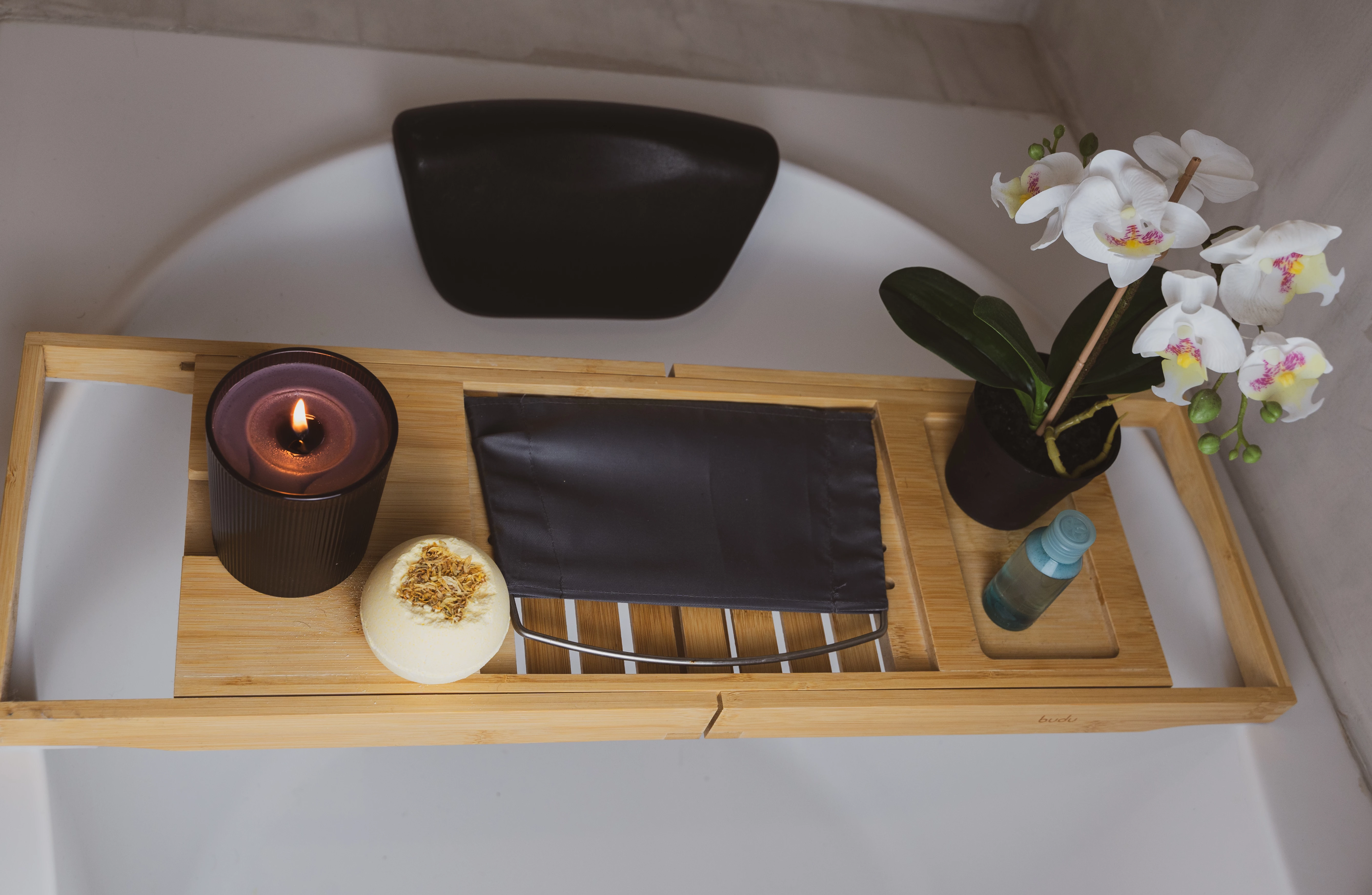
For your first: you really need to ask yourself who would like to use a picture, where the left of the plate is cut off and the whole has an unflattered angle.
Checking the exposure at the second image, you get this from the histogram:
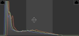
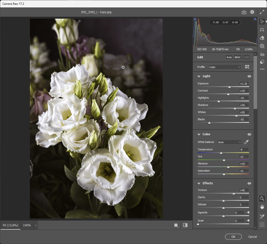
To the left, you see that blacks are absent, to the right you see that the asset is underexposed. A 2 minute tweaking of the parameters brings up something like this:
Already have an account? Login
No account yet? Create an account
Enter your E-mail address. We'll send you an e-mail with instructions to reset your password.
