Question
TIP: Harmonizing Colors in Artwork
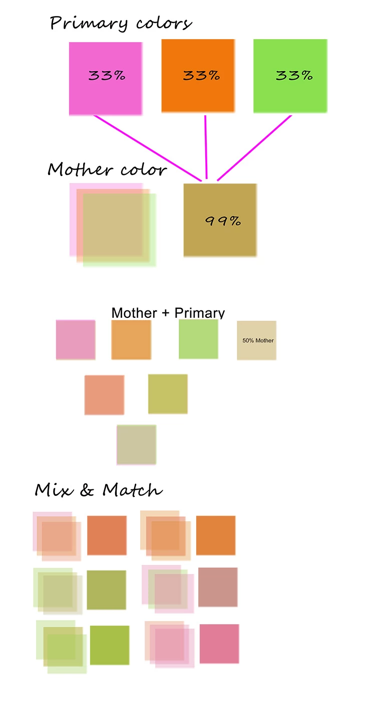
When you need a pleasing color pallet and don't know where to begin, this old painter's trick can come to your rescue. It's a simple method for creating color harmony that works equally well in digital or tangible artwork. Here's how it works:
- Pick any random paint colors and combine in swatch layers to form a 'mother' base color.
- I layered 3 color swatches each at 33% opacity. For 5 colors swatches, use 20% opacity, and so on...
- The value in the middle where all swatches overlap is the 'mother' of all your colors.
- When 'mother' is added to primary colors, voila! Instant color harmony.
It's a foolproof way to create harmonizing colors without a lot of tedious guesswork. I hope you'll give it a try.