cicerocastro
Participating Frequently
June 26, 2017
Answered

What I need to improve in this image?

  • June 26, 2017
  • 8 replies
  • 1162 views

This topic has been closed for replies.
Correct answer Ricky336

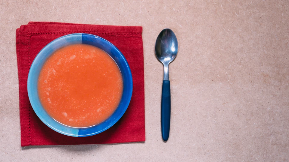
Any colour that is opposite or contrasts with orange - cyan, blue, black, white ... (you have the blue of the bowl, but this also needs to complement with what the bowl is placed on).

I disagree with Szalam. In a sunset you get different hues and shades of red and orange and other colours all mixed together. The colours also depend on the lighting conditions at the time and other factors. I would suggest reading about colour theory and how colours work together and how they can be best used in photography to complement each other. (However, how colours work together can create a huge debate).

8 replies

Legend
March 11, 2018

I'm certainly not a food photographer, but I have made some very quick alterations ...

Legend
March 11, 2018

Symmetric images are often Boring Images taken directly from above are flat. The image have no clear focus. The colors are simply horrible. The red napkin steals the color from the soup. The spoon is ugly. The background is dull And don’t add value to the motif. There should be some kind of parsley - something nice green stuff on the soup.

Search ‘soup’ at Adobe Stock and see what you are up against ...

Sherwood_Martinelli
Known Participant
March 11, 2018

First, think the colors are all wrong...I would have gone with a white, pale blue, even black if you swap out for a silver spoon.   The soup looks bland...add something to the center...perhaps a small dollop of sour cream, teaspoon of caviar, and a sprig of parsley to make it appealing and pop on the page.  What really bothers me...THE NAPKIN...it should have been A) ironed B) Folded so all four corners are perfectly matched up, then C) Ironed a final time once folded so you have good sharp crisp edges.  The napkin is not properly set...IE, if it is 2 inches from the top edge on the left side of the napkin, should be 2 inches from the top at the right side of the image.

Just my opinion, but you did ask.

deniscostille
Participating Frequently
July 17, 2017

With the napkin we can see that your image has a parallax problem, it's a trapeze. In real life, do you really see a NAPKIN under a plate ? That's weird. The sppon is rendered too dark, cutlery is bright. And there is that dark zone on the right of the photo. And I don't like the  color of the background.

Ussnorway7605025
Legend
July 3, 2017

at least clean the spoon

June 30, 2017

A simple question you can ask yourself is what you want people to take from this image - what do you want people to feel and think when viewing this image? What purpose would someone have for this image?

On a purely personal note I find the image to be lacking punch, it seems somewhat flat. The framing is odd and I don't find my eye drawn to anything in particular.

Ricky336
Community Expert
Community Expert
June 27, 2017

The colours clash. Red and orange! They are not complimentary. The overall colours clash with each other. You have to think about the colour composition. It is just as important as the composition itself!

Szalam
Community Expert
Community Expert
June 26, 2017

I don't particularly care for the colors. The soup in the bowl against the napkin are great. The countertop, on the other hand is rather off-putting in contrast with them.

cicerocastro
Participating Frequently
June 27, 2017

ricky336 using the vegetable soup that is orange, for you what colours you would use?

Szalam
Community Expert
Community Expert
June 27, 2017

I disagree with Ricky. I think the red and orange look great together. Lots of examples of red and orange next to each other in nature - flowers, sunsets, trees in autumn, etc. Plus, that ring of blue from the bowl really ties everything together. Blue looks great with red and orange too.

To me, it's the salmon pink of the counter that makes them look bad. If it were on a white counter, it would be much better.