Participant
January 4, 2025
Answered

What's wrong with these images?
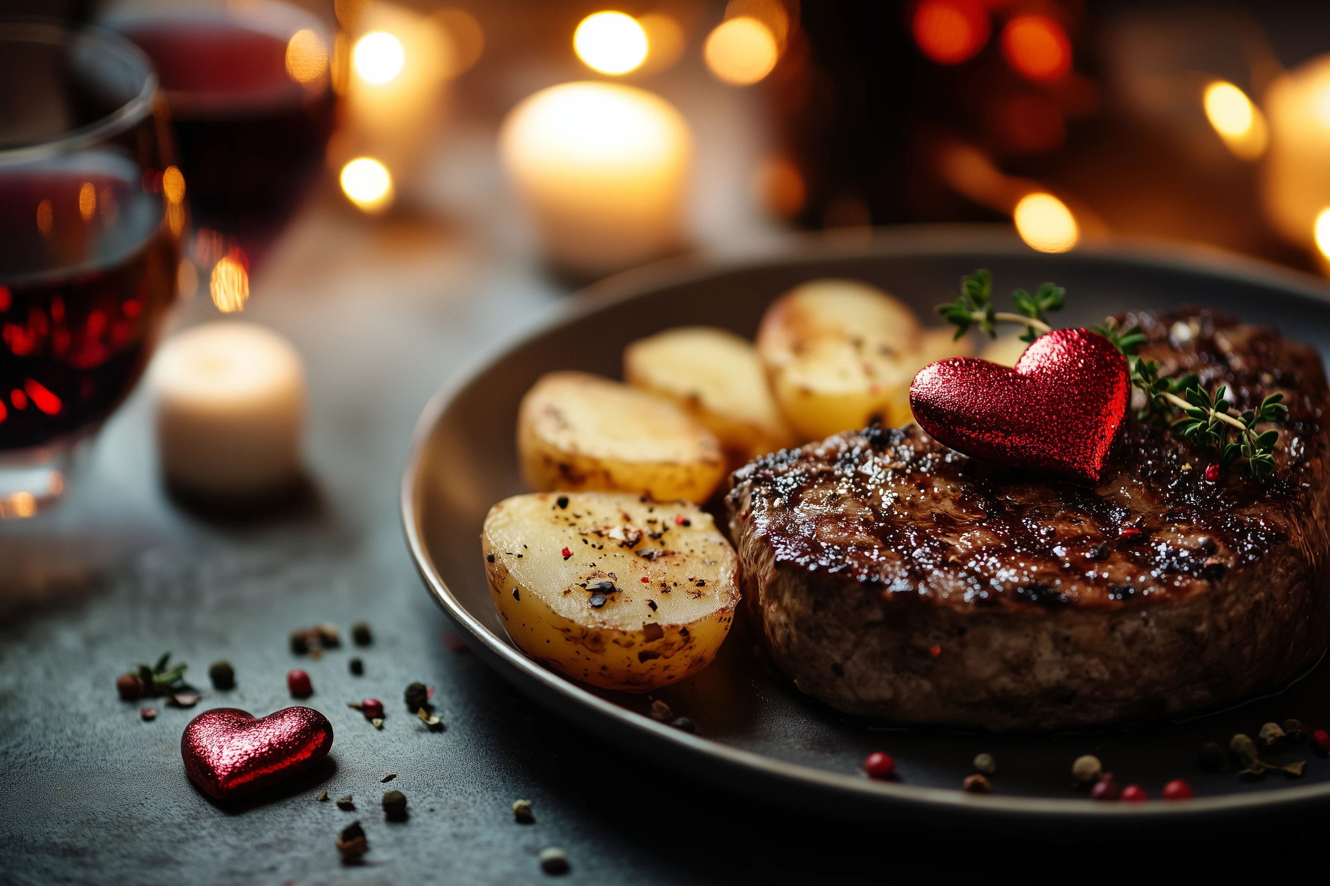
  • January 4, 2025
  • 7 replies
  • 651 views

Hello everyone, may
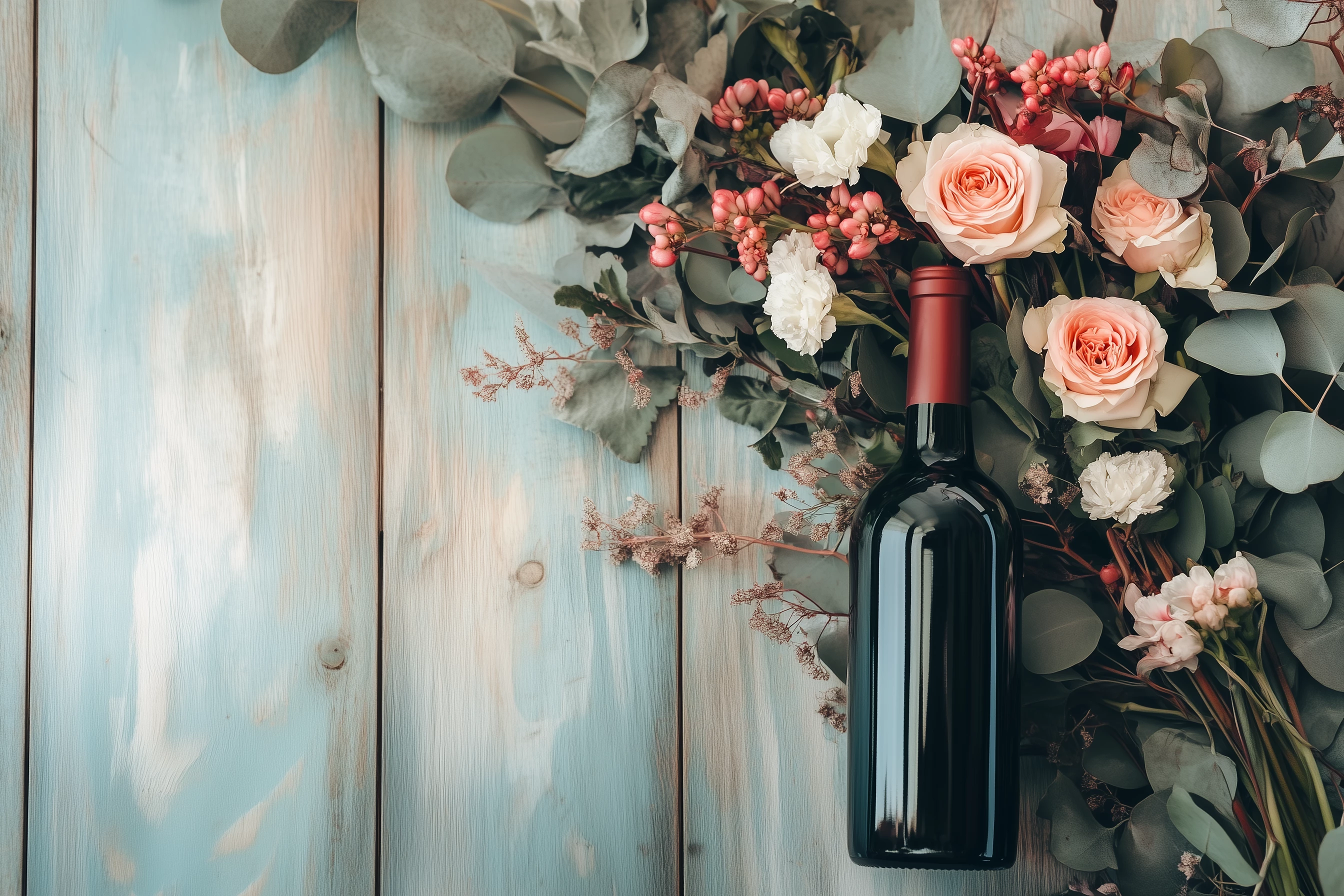
be you could let me know what I did wrong that these images were rejectes?. 

Correct answer oleschwander

Also the wine bottle in the first image is very small compared to the flowers. And the bottle is sort of levitating. A shadow is missing.

7 replies

oleschwanderCorrect answer
Legend
January 4, 2025

Also the wine bottle in the first image is very small compared to the flowers. And the bottle is sort of levitating. A shadow is missing.

Abambo
Community Expert
Community Expert
January 4, 2025
quote

Also the wine bottle is very small compared to the flowers. And the bottle is sort of levitating. A shadow is missing.


By @oleschwander

You're talking about the first picture?

ABAMBO | Hard- and Software Engineer | Photographer
Legend
January 5, 2025

Yes - sorry I didn't mention that.

jacquelingphoto2017
Community Expert
Community Expert
January 4, 2025

Hi @default989xq8sekjs5 

The first picture is lacking vibrancy and is underexposed.

The second file is grainy, too shallow and poor composition. I assume the flowers was the subject. You should include the entire bouquet  in the frame and focus or crop closer to the bloom you wanted to be the subject.

The third picture also has too much of a shallow depth of field and excessively noisy.

The fourth picture is underexposed, too shallow and noisy.

Too much of the fifth picture is out of focus. It's underexposed and grainy. The composition of this picture is also poor.

Too much of the sixth picture is out of focus and it's also underexposed. Poor composition. Your entire subject must be within the frame with space left for cropping.

To check on you pictures for errors, you need to zoom in at between 100 and 200% and examine them carefully. 


Best wishes

Jacquelin

Jill_C
Community Expert
Community Expert
January 4, 2025

Zooming in and scrolling around reveals some drawing errors. I also think the steak images are too similar.

Jill C., Forum Volunteer
Abambo
Community Expert
Community Expert
January 4, 2025

Did you check your assets before submitting? At least the nonsense text should grab your attention. 

Besides that, you have considerable noise on this picture. In addition this looks very syntetic: 


Before submitting, you absolutely need to check every asset from corner to corner at 100% for anything that might be erronous.

ABAMBO | Hard- and Software Engineer | Photographer
daniellei4510
Community Expert
Community Expert
January 4, 2025

Forgot to mention: I removed the hearts because I think you're limiting its sales potential by limiting it to a yearly holiday, when it could actually be of use year-round. That would apply to your other assets with hearts as well.

Adobe Community Expert | If you can't fix it, hide it; if you can't hide it, delete it.
daniellei4510
Community Expert
Community Expert
January 4, 2025

 I straightened this a bit. It was tilted.


Adobe Community Expert | If you can't fix it, hide it; if you can't hide it, delete it.
daniellei4510
Community Expert
Community Expert
January 4, 2025

Adobe Community Expert | If you can't fix it, hide it; if you can't hide it, delete it.
RALPH_L
Community Expert
Community Expert
January 4, 2025

You need to pay attention to details.