Hi @Yaseen, Thank you for sharing the outputs with their links attached, they were very useful!
I’ve looked into both generations, and here’s what I found:
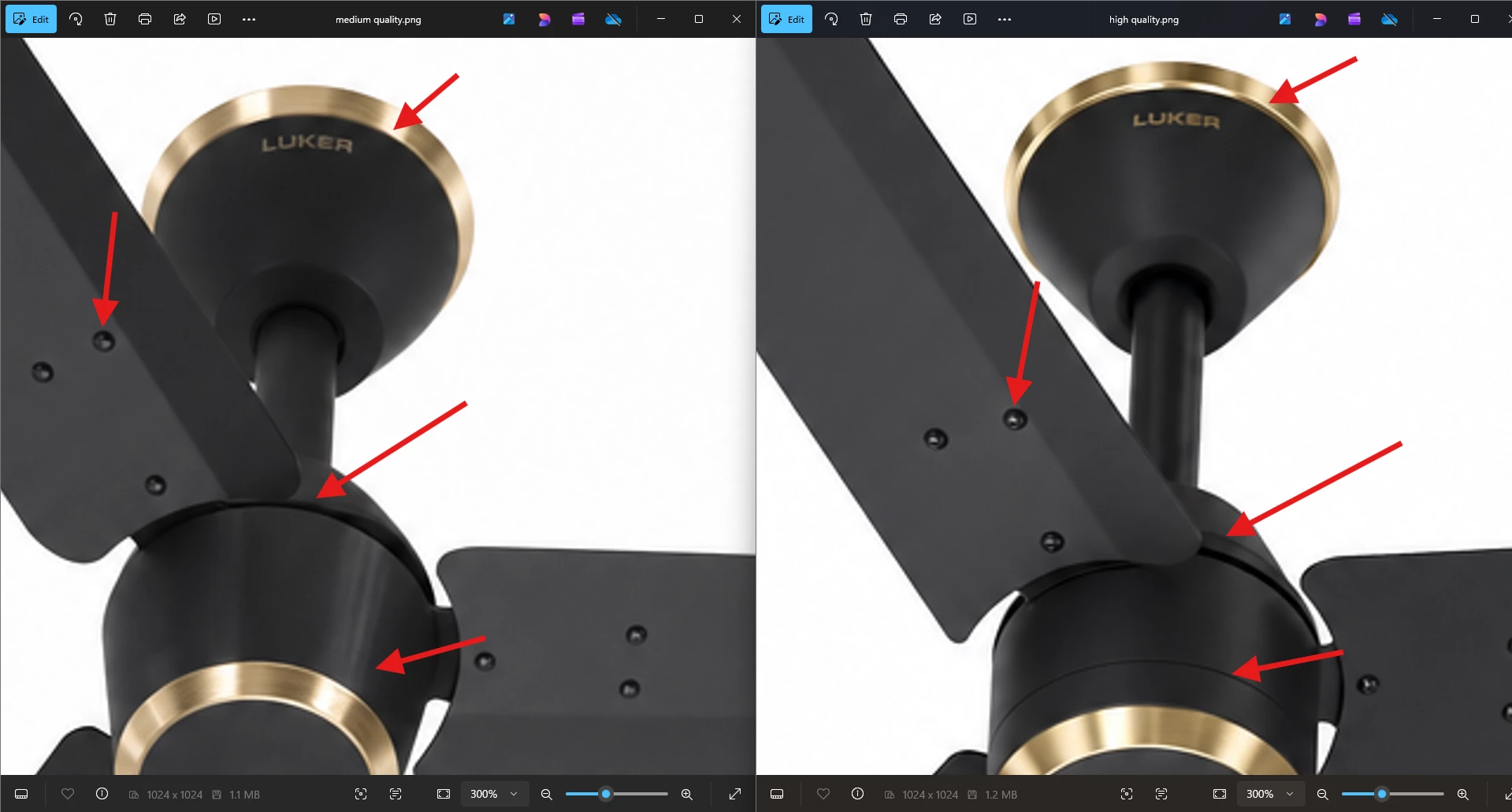
The difference between quality settings is subtle at first glance because Firefly keeps the overall look, colors, and composition consistent, the setting mostly affects fine details, not the big picture. That's why the two images look almost identical until you zoom in.
Here's a simple way to spot the difference yourself:
Zoom into small details: things like text, screws, edges, or anything with fine lines. This is where quality differences show up most.
Compare the same spot side by side: pick one small area (like a label or an edge) in both images and zoom into just that area at the same size. (I’ve used 300%)
Look for crispness vs. softness: the higher quality version will usually have cleaner, sharper edges and more readable fine text. The other version may look just slightly softer or blurrier in that same spot, even though the rest of the image looks the same.
Check the file size: this is an easy one and doesn't require zooming at all! Right-click each image and check its file size (or look at it in your downloads folder). The higher quality image will almost always be the larger file. That's because more fine detail simply takes more information to store, a bigger file size is a good sign that more of that detail was kept.
Hope this helps clear things up! Let us know if you have any other questions.
Thanks for reaching out! Could you please elaborate more about the issue you’re seeing? It would be great if you could share a screen recording of the issue to better assist you.
there is no resolution control and there is no aspect ratio control. I have reported this problem almost 2 month ago. In ComfyUI, I can fix this issue or most feature with Codex in like 10 mins or faster. Does it really take this long to understand why that’s a needed feature or implement this feature?
I have no credit now, so I cannot generate High quality anymore. Your team should confirm if you can generate an image in the size more than 2MB in GPT Image 2.
On Firefly I generated an image with with GPT image 2 one medium size and one high size, but they rendered same size, meaning there was no difference in size just difference in pricing. The High image was 80 credits and medium just 20. why is that?
Hi there, This happens all the times with GPT Image 2. It is either a bug or a joke. No quality improvment to see at all for 6 times higher credits. If your theory shall be right that there is a slightly higher level of details this would justify for a maximum of 2x higher costs. 600% for not visible difference is ...
The price difference between Medium and High is about how much thinking the model does. GPT Image High quality runs roughly 4x more compute under the hood than Medium, which is why it costs more. For a lot of image types, Medium really is nearly as good.
That's not a bug, it's just how the model works: the extra compute helps in specific cases, and for simpler or less detail-dense prompts you won't see much difference. This is exactly why Medium is our default setting, since it's the right choice for most use cases. Where High tends to actually earn its cost:
Images with a lot of text in them (labels, signs, logos, dense copy)
Complex layouts with many small elements or fine details
Final production renders where you want to squeeze out the last bit of quality before publishing
We take the feedback that the quality labels could be clearer about what you're paying for, and we'll note it. In the meantime, hope this helps you make better use of your credits going forward.
The quality parameter and the size (aspect-ratio) parameter are two independent settings
Dimensions/aspect ratio controls the pixel dimensions of the output (e.g., square > 1024×1024).
Quality controls how many internal image tokens the model spends generating that fixed canvas i.e., how much detail work goes into filling those same pixels, not how many pixels there are.
On the file size, since you kept everything else identical between the two generations, same aspect ratio, same model, same prompt, and the same reference images, the two outputs were always going to come out very similar to begin with. The higher quality setting adds extra fine detail on top of that shared foundation, but it doesn't change the composition, subject, or reference content. So with the base image already this close, there's only so much room for that extra detail to meaningfully add to the file size. That's why the gap between 1.23MB and 1.14MB is real, but smaller than what it could’ve been if the settings weren’t too similar.
I hope this clears up the confusion, let us know if you have any other questions.
Hi @Yaseen, Thank you for sharing the outputs with their links attached, they were very useful!
I’ve looked into both generations, and here’s what I found:
The difference between quality settings is subtle at first glance because Firefly keeps the overall look, colors, and composition consistent, the setting mostly affects fine details, not the big picture. That's why the two images look almost identical until you zoom in.
Here's a simple way to spot the difference yourself:
Zoom into small details: things like text, screws, edges, or anything with fine lines. This is where quality differences show up most.
Compare the same spot side by side: pick one small area (like a label or an edge) in both images and zoom into just that area at the same size. (I’ve used 300%)
Look for crispness vs. softness: the higher quality version will usually have cleaner, sharper edges and more readable fine text. The other version may look just slightly softer or blurrier in that same spot, even though the rest of the image looks the same.
Check the file size: this is an easy one and doesn't require zooming at all! Right-click each image and check its file size (or look at it in your downloads folder). The higher quality image will almost always be the larger file. That's because more fine detail simply takes more information to store, a bigger file size is a good sign that more of that detail was kept.
Hope this helps clear things up! Let us know if you have any other questions.




 AdChoices