
Bugs in Minion 3
I'm a professional phonetician using the Minion 3 font for IPA symbols. I'd like to report two bugs in the font, and have no idea how or where. So I'm doing it here, and I'd ask that anyone with the power (Adobe employees, I assume) forward it to the responsible parties.
Bug 1: Incorrect spacing after IPA Uptack Diacritic (U+031D ̝ COMBINING UP TACK BELOW)
When this diacritic is placed under "t" or other narrow characters, a jarringly excessive amount of space is placed after it when the following character is boldfaced. This can be seen in example 1a, below, in "xt̪x" -- the space after "t̪" is far, far too wide. In example 1b, no characters are in boldface, and the spacing is correct. In example 1c, the "x" before the "t̪" in "xt̪x" is bolded, and the spacing is correct.
In the rightmost column, the same text is shown in Charis SIL Unicode, which is one of the de facto standard IPA fonts in linguistics.
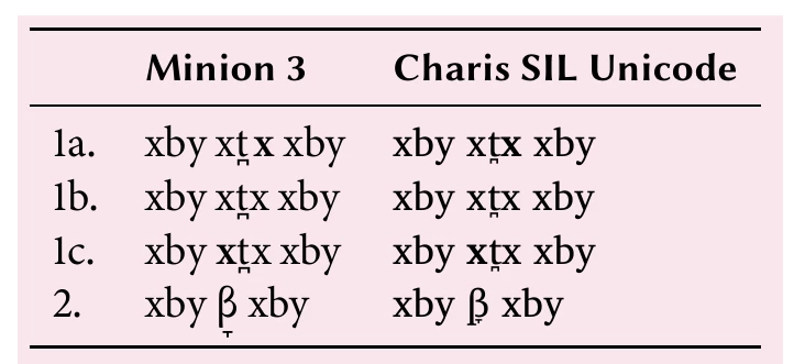
Bug 2: Incorrect vertical alignment of COMBINING DOWN TACK BELOW (U+031E, Nonspacing_Mark)
When placed under GREEK SMALL LETTER BETA (U+03B2), as is very frequent in Spanish, for example, the combining down tack below is vertically aligned below U+03B2's descender, rather than under its baseline, as it should be. Example 2, above, illustrates this. The rightmost column, Charis SIL Unicode, shows the correct vertical alignment.
Minion 3's vertical alignment of U+031E is unprecedented. In almost 20 years in the field, I have never seen this diacritic aligned this way in a professionally typeset text (though I can't discount the possibility that one or more of the world's fonts with dreadful IPA support does it this way, of course -- there are just too many of them).
BONUS
Although I realize it may have been conceived as a stylistic choice, Minion 3's GREEK SMALL LETTER BETA (U+03B2) is almost disturbingly different from the rest of its IPA symbols. It looks almost cursive, and it certainly stands out and calls attention to itself. So much so that the first time I used it, I though I had selected the wrong character -- perhaps something taken from a cursive Greek font, in fact.
