Participant
November 18, 2022
Answered

Lato font does not space correctly with "fi" "ti" "ff" and "tt"

  • November 18, 2022
  • 1 reply
  • 2620 views

I loaded the Lato font 2 years ago and did not have any spaces issues between lower case t and i, f and i, f and f, t and t. When I got the an update of Photoshop, InDesign, and Illustrator beginning of this year it seems the font does not have enough space between the above mention letters. For example:

  • first (the f blends into the i and the dot over the i is missing)
  • solutions (the t blends into the i)
  • capabilities (t blends into the i)
  • fluffing (this one really looks bad - the f's run together and there is no dot over the i)
  • batting (both t's and i merge, but the dot is visible over the i)

Microsoft does not have this issue when using Lato. Also, Google only has the issue with the "f" and "i". I've attached examples.

Note: After talking to Adobe support, they had me uninstall and reinstall Lato. This did not work.

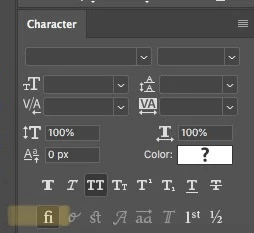
Currently, (as a work-around) I am adding a space between the these letters and taking that space down to 1px to get it to look right. Kerning adjustment did not work. 


Does anyone have any other ideas to get this font to work as it should? 😊 

    This topic has been closed for replies.
    Correct answer jane-e

    @jeank48373130 wrote:

    Does anyone have any other ideas to get this font to work as it should? 😊 


    It actually is working as it should! What you are seeing is ligatures, which is proper typography. See this article from Nigel French:

    https://creativecloud.adobe.com/cc/discover/article/taking-typography-to-the-next-level


    All the same, ligatures can be turned off in the Character panel (Window menu). It's a character setting, so you need to select your text first. There is a button or you can use the panel menu.


    I know some people hate it, but look in some magazines and books and you find out that you've been seeing them all your life and it's never bothered you until now.


    Ligatures are the same in all three applications, by the way.


    I'm surprised Adobe support didn't know this.


    Jane


    1 reply

    jane-e
    Community Expert
    jane-eCommunity ExpertCorrect answer
    Community Expert
    November 19, 2022

    @jeank48373130 wrote:

    Does anyone have any other ideas to get this font to work as it should? 😊 


    It actually is working as it should! What you are seeing is ligatures, which is proper typography. See this article from Nigel French:

    https://creativecloud.adobe.com/cc/discover/article/taking-typography-to-the-next-level


    All the same, ligatures can be turned off in the Character panel (Window menu). It's a character setting, so you need to select your text first. There is a button or you can use the panel menu.


    I know some people hate it, but look in some magazines and books and you find out that you've been seeing them all your life and it's never bothered you until now.


    Ligatures are the same in all three applications, by the way.


    I'm surprised Adobe support didn't know this.


    Jane


    Participant
    November 29, 2022

    Hi Jane,


    Thank you! This was exactly what I needed. Yes, I was totally surprised that Adobe support didn't suggest this too. I find it mind boggling that each Adobe product has these ligatures in different places and that each time there is an update, I'm always resetting my preferences.

    Again, thank you Jane for the quick and very helpful response!

    jane-e
    Community Expert
    Community Expert
    November 29, 2022

    You’re welcome, @jeank48373130. In spite of ligatures being proper typography, many people hate them — or their bosses hate them — and they want them turned off! 🙂 You are not alone!


    Jane