
Aspect Ratio and Dynamic Sizing for Desktop Screens
Hi All,
I'm a bit new to Prime so I appreciate any light you can shed here.
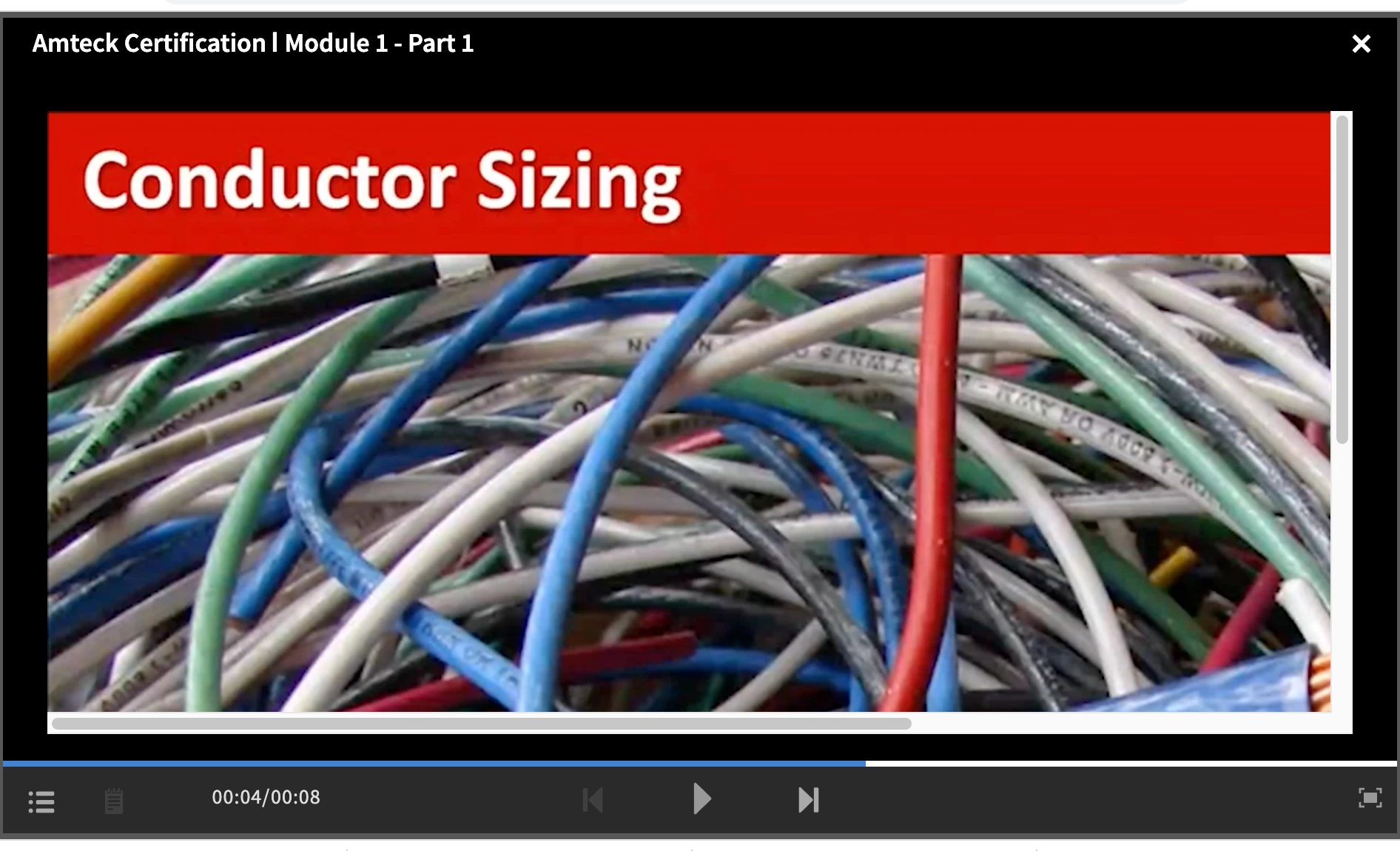
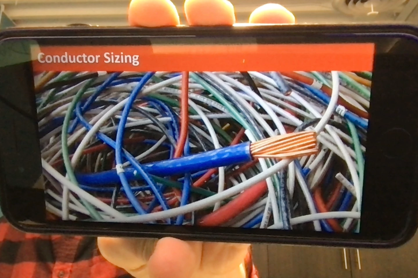
I have made a bunch of learning projects in Captivate in 1920x1080 aspect ratio because I wanted my HD slides and videos to be in HD. I published them to my Prime account and when I access them on my mobile device, everything looks great. When I view them on my desktop, everything is HUGE and not adjusted for the size of my browser, but is instead clipped (see attached pictures).
I assume the issue is in Prime, because that's the application displaying the learning material based on the browser and device information of the learner. So, can someone help me determine where I need to adjust my settings so students on desktops get the same experience as those on mobile devices? Thanks!

 AdChoices