
Question
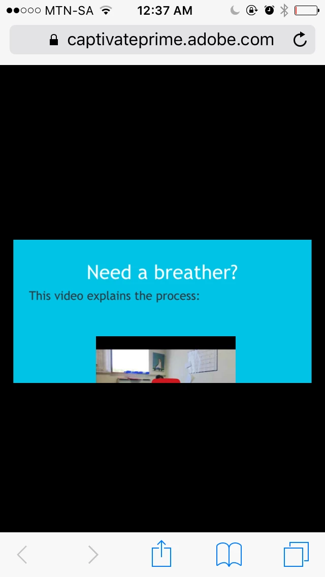
Mobile view (Prime) - supposed to look like this?
Hi, all
I have designed a responsive module in Captivate 9, with four mobile breaking points (tablet portrait and landscape; the same for phones). All previews look normal (everything fits onto the slide in all orientations) but when I publish in Prime and view on an iPhone, the portrait view looks like this. Is the content window supposed to be that small (it means the user has to scroll up and down to see all the content)?
Thanks in advance for your help,
Liesl

 AdChoices