The problem is that you are going to have to deliver it in a deliverable format. Nowadays most deliverables are H.264!
You could try doing a QuickTime with the PhotoJPEG codec and see if the colors are closer to what you want. Check how that file looks by importing it back into AE or Premiere.
This could be a bunch of things. Are you using Color Management? Does your media player support color management? Does the rendered file look different when you import it into AE and compare it with the original comp?
You should be aware that MPEG compressed color does not like red against white, especially if the lines are thin. Color compression happens in blocks of at least 4 pixels and 2 red and 2 white do not equal 2 red and 2 white when compressed. There is not much you can do about that if you have to deliver a compressed file except make the red slightly less red and the white slightly less white. You should also work around the limitations of broadcast color space if the project is destined for television. SD TV is limited to slightly less than 256 colors per channel. The common standard is no value below 16 and no value above 235.
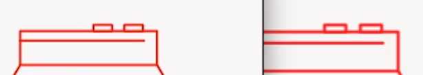
I looked at your posted image and can tell that the lines are very thin and not precisely lined up with the pixel grid. This, combined with MPEG compression (h.264 or h.265) is going to give you a color shift. If you want to work with such thin lines then you should be very careful about aligning them on the pixel grid, precisely positioning them so that they are positioned precisely on the color compression pixel grid (multiples of 4 pixels) and that you fall within a manageable color space.
Just for fun, while I was waiting for a render, I put together a simple comp that checked the colors using an expression. The biggest difference is in the white levels and they affect everything else. This tells me that either color management is not being used or is improperly applied and that most likely the media player is the problem. Here's what the comp looks like:
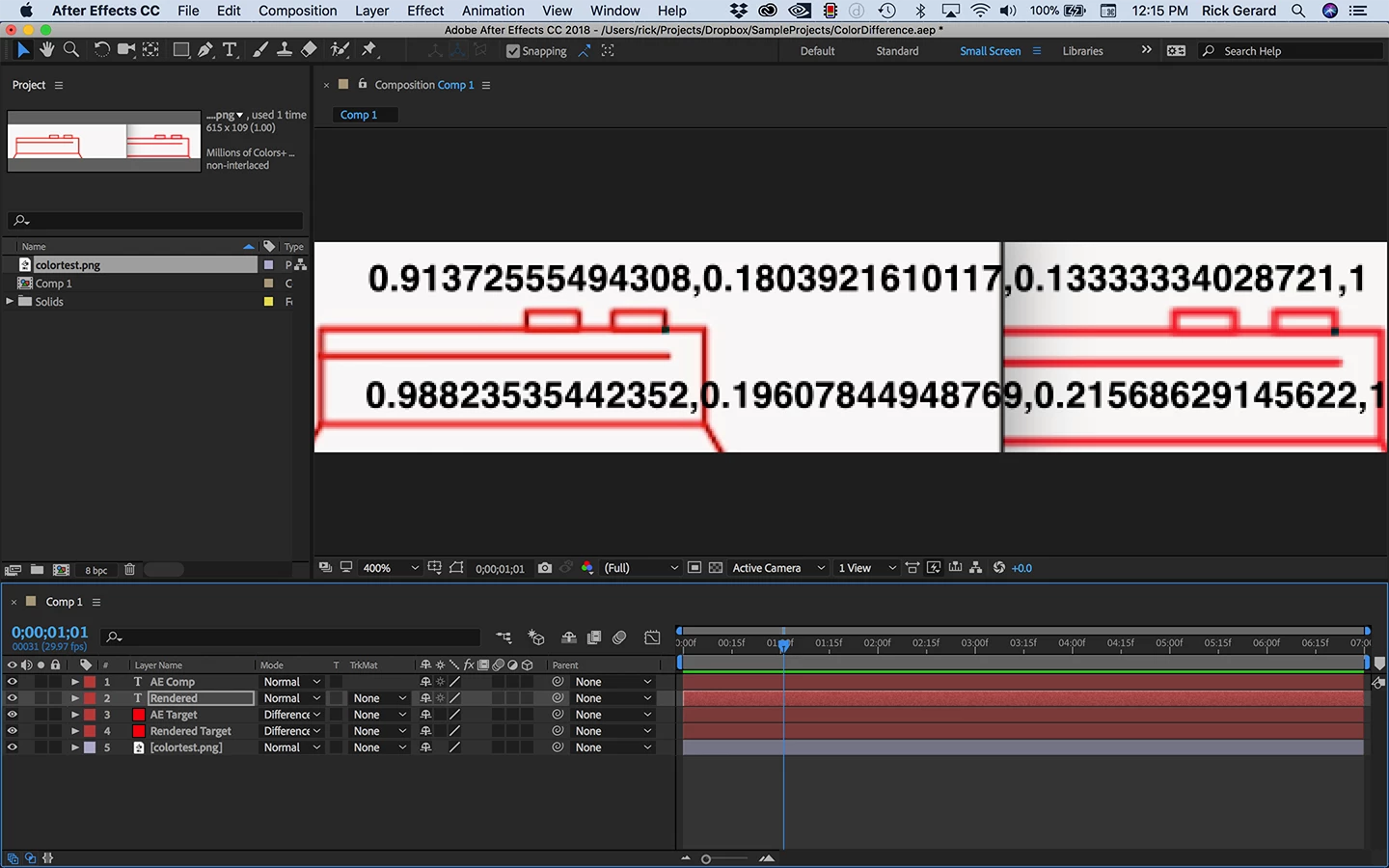
If you want to play with it here's a link to the project file. You'll just need to put your uploaded image in the project pane. Dropbox - ColorDifference.aep
You can move layer 3 and 4 around to see the color values of different sample points (the dark boxes - which change to cyan the white areas).
If you want the colors to be more accurate you have to line up your artwork and it's thin lines precisely with the pixel grid. If you created the artwork in Illustrator you can turn on snap to pixel and Pixel preview to help you line things up.