Answered
Font size - pt vs px
A client asked for the font text to be 63pt (pt not px).
What should I do in your opinion?

A client asked for the font text to be 63pt (pt not px).
What should I do in your opinion?
Points are pixels. A pixel is a TV line, just in case you are fulfilling a legal requirement. Unfortunately, one 63 point font may be a different height than another 63 point font, and therefore not the right number of TV lines.
Did you follow that?
If I remember right political disclaimers must be 4% of vertical picture height and visible for 4 seconds and have sufficient contrast to be easily read. 4% of 1080 is 43.2 pixels. You always round up to be safe. You should test the font, I find that the easiest thing to do is create a solid that is 44 X 44 pixels. If you wanted a capital A using Helvetica Bold to be 44 pixels high you would have to use a font size of 59 in AE. This will keep you legal. If you did not double check and just set the font to 43.2 it could be way too small to meet the legal requirements. It's easier to see how the font fits over a solid than it would be to set up guide lines.
Here is how I would test a font to make sure that the specifications are met. A broadcaster will check the font size using a scope.
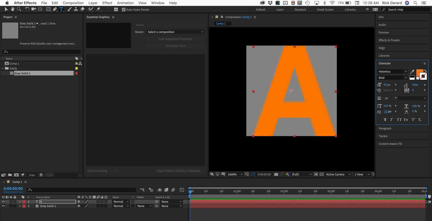
If the client wants a font that is 63 points I would create a solid that is 64 x 64 (even numbers are easier to work with) and put a capital A above it, then increase the font size in AE until it filled the square. That will keep you safe.
On the other hand, the client may not know what they are talking about. To protect yourself, make sure you ask them to explain exactly what they need, why they need it.
I hope this helps.
Already have an account? Login
Enter your E-mail address. We'll send you an e-mail with instructions to reset your password.