Answered
Is it too much for one unneded button?
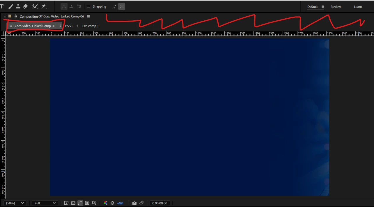
Hello,
when I edit on my 16 inch laptop, I need more space than on a big screen,
and I noticed that this "UI design", when only one unneded button (I can press TAB when I need it) takes too much empty space,
could you please fix it, or place it inline with above or switch it off, or make a preference to hide it?