Known Participant
July 8, 2022
Question

Levels Affect Causing Pixilation

  • July 8, 2022
  • 1 reply
  • 199 views

Hi everyone! Need some help on this one!


I'm trying to mimic a Ben Marriot video tut (I would post it here, but I'm not sure if it would be seen as a 'promotion') on how to create a 'fake morph' from one text to another, and I'm running into a glitch. 


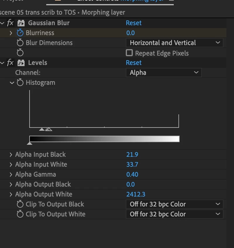
Basically, I'm cross-fading from one simple b&w vector gfk to another (which happens to be a vector gfk of text). Then I create an adjustment layer with a gaussian blur animating from 0 to 100 to create a nice blob in the middle of the transition. Next, I apply the 'levels' effect to clean up the lines of the blur and make them crisp. Now, here's where I run into trouble. Everything goes pixilated when I apply the 'levels.' In the video example, Ben fixed the issue by placing the black and white values in the 'levels' farther apart, but when I got them far enough apart to smooth the edges, I lost the effect entirely!


Here's what I've tried / checked -

- Resolution: Full

- Adaptive Resolution: Off

- Continuous Rasterization: On

- When I turn the 'levels' effect off, everything smooths out again, so it's definitely something in the effect


Here are some screen grabs - 



This is the text with 'levels' off


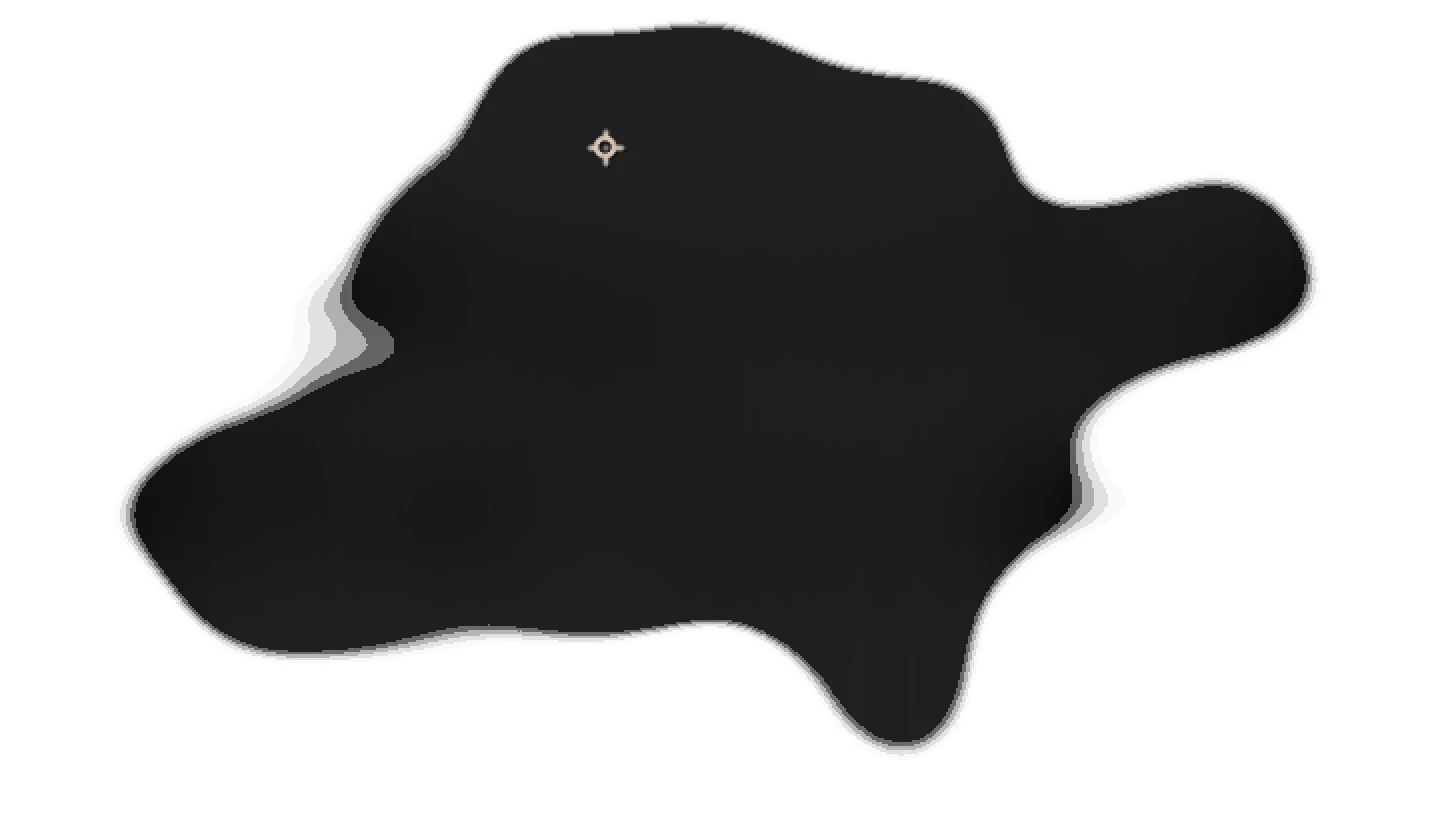
The is the text with 'levels' on - it's hard to see the pixelization here.


These are my 'levels' settings.


Here you can see the pixelization better in the banding on the side.


Any thoughts about things I could have overlooked would be helpful!

This topic has been closed for replies.

1 reply

Mylenium
Legend
July 9, 2022

Nothing wrong. That's just how it works. You've compressed your values to about 10 levels and of course that will cause quantization artifacts and pixelation, especially once you further "divide" the available range when applying the opacity animation. You are asking the computer to display a colorful van Gogh painting with only three colors, basically. That's what it comes down to. That's the crux of all these techniques. You have to balance out the values of the blurs/ feathers and the succeeding other effects until you find a combination that works. That's why such tutorials also often fail - values that work for one scenario do not necessarily produce the same result in other scenarios and each and every effect you add or parameter you change can affect the outcome. So the only advise really is to keep trying. In your case it may also help to switch the project to 16 bpc as it increases precision, but otherwise there's really no way of saying use this and that or dial in those values...


Mylenium

Known Participant
July 9, 2022

Thank you for the explanation! I think you're right about changing the bpc, but I'm curious to see what it does to render times. I'll give it a shot anyway. THANK YOU for your response!