
Question
Spectrum UI needs improvements
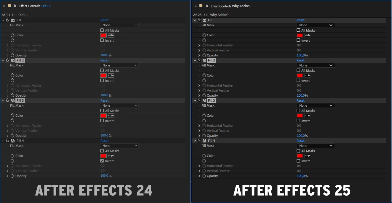
Try to work and stare at this UI for long hours, seriously. Take the Effect panel as an example; every effect has a highlight, making it seem like everything is selected; why?
I'm trying to stick with AE 24 until there are some updates on the new Spectrum UI, but it's been months, and these changes make AE 25 horrible to work with. I can't even enjoy new features because it's awful; the visual contrast is gone.
I hope there's some update planning for this because it's unacceptable
